
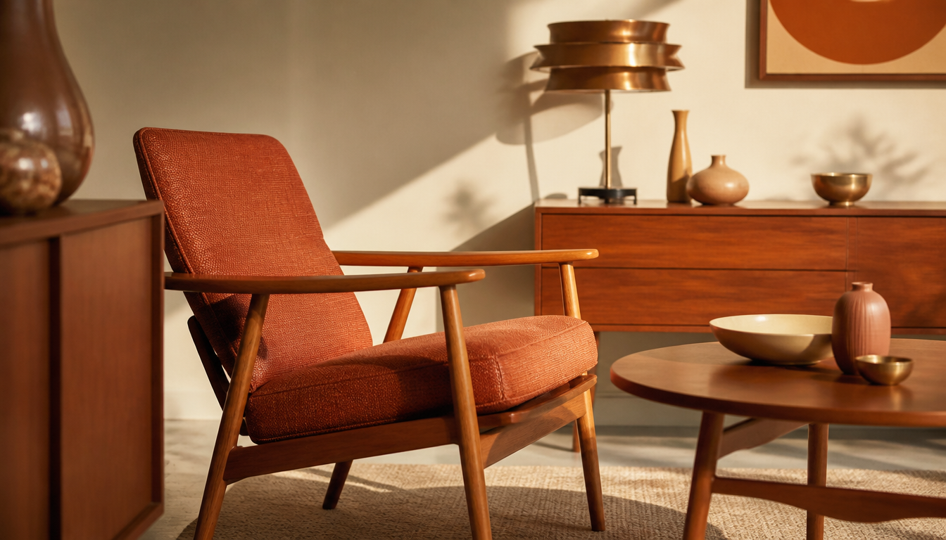
Danish Teak Classics marks a new high point in the comeback of the warm-tone aesthetic of the early 1960s with its Fall Dining Sale 2026 — the era when Danish teak first became a transatlantic icon. Red-gold, amber, and the velvety brown of oiled teak formed a color palette in the early 1960s that is now resurfacing everywhere. Understanding why Scandinavian designers chose precisely these wood tones back then means that styling a vintage interior is no longer a matter of chance, but of conscious, historically grounded decisions.
Red-Gold & Teak: The Warm-Tone Palette of the Early 1960s and Its Scandinavian Furniture Partnerships
The early 1960s introduced a color world into the living rooms of Europe and North America that is now back in full swing: red-gold, amber, burnt orange, and warm umber dominated the interiors of that era, finding their ideal counterpart in the light, coarsely grained teak from Scandinavian workshops.
The Key Fact: Warm Tones and Teak Belong Together Structurally
Danish midcentury design of the early 1960s deliberately relied on teak as the primary material for dining rooms, sideboards, and chairs. Dealers such as Danish Teak Classics and Teak New York still actively trade these pieces today, which attests to the enduring demand. The red-golden brown tones of teak correspond directly with the color palette of that period: the grain itself reads like a painted warm tone. This was no coincidence — it was deliberate design thinking.
4 Practical Tips for Achieving This Look Today
1. Teak Needs a Color Anchor on the Wall
A teak sideboard or dining table can look coloristically lost against white walls. The solution from the original 1960s decoration: a bold wall accent in ochre yellow, terracotta, or deep rust red. A vintage-style poster or a large-format Bauhaus poster in yellow-ochre tones takes on this role today with elegance and without any renovation work.
2. Geometric Patterns Discipline the Warm-Tone Palette
Too many reds at once can quickly tip into the overwhelming. Scandinavian interior design of the era used clear geometric textile patterns as a counterbalance. The Scandinavian pattern hexagon wall art or the Sweden pattern hexagon wall art bring exactly this structuring coolness into a warmly designed room.
3. Cushions as the Cheapest Test Ground for New Color Tones
Before painting an entire wall in terracotta, the cushion test is recommended. Warm-tone combinations from the 1960s can be trialed well through textile accents. The Abstract Retro Cushion and the Vintage Style Cushion introduce organic color nuances that harmonize with teak surfaces without dominating them. The reetro Sale regularly features discounted pieces from this category.
4. Botanical Prints Extend the Natural Line of Teak
Teak is an organic material. Those who consistently follow the natural line turn to botanical wall art, as was common in Danish and Swedish interiors of the early 1960s. The Lavender Botany Poster or the Peach Botany Poster pick up warm tones without distracting the room from its wood furniture focal point. Those who prefer a large statement print will find a wide selection in the reetro poster shop.
Sources
- Danish Teak Classics | Midcentury Modern Danish Furniture
- Scandinavian Home Decor | Teak New York | New York
FAQ
Why do red-gold tones pair so well with teak furniture from the early 1960s?
Teak naturally has a warm, golden-brown undertone with a slightly reddish shimmer. This is precisely what makes it the perfect partner for the red-gold palette that was so popular in Scandinavian interiors in the mid-twentieth century. One reinforces the other without clashing. It is no coincidence that dealers like Danish Teak Classics still deliberately work with this color mood today.
Which Scandinavian furniture pieces from the 1960s work best with a warm-tone palette?
Dining room furniture in particular — that is, dining tables and chairs in Danish teak — harmonize strongly with red-gold and amber tones. Danish Teak Classics features exactly these kinds of pieces in the Fall Dining Sale 2026: tables, seating, and storage furniture, all in typical midcentury design. Add to that lighting, such as from Georg Jensen Lighting, which closes the warm-tone circle with brass and gold tones.
Is Danish teak design from the 1960s still relevant for modern living spaces?
Absolutely. Dealers like Teak New York and Danish Teak Classics show that demand for original midcentury Danish furniture remains consistently high. The warm-tone trend currently sweeping through interior communities is even giving these pieces fresh momentum. Red-gold accents in textiles or lighting can be effortlessly combined with a Danish teak classic.
How do I care for teak furniture to preserve its warm color?
Without care, teak fades to a silvery gray, which noticeably diminishes the warm-tone effect. Regular oiling with a suitable teak oil keeps the red-brown color tones vibrant. Danish Teak Classics offers a dedicated furniture care line specifically tailored to midcentury teak.
Where can I find original Danish teak furniture from the 1960s, and what should I look for when buying?
Specialist dealers such as Danish Teak Classics or Teak New York (with its new online shop Lägenheten) are good points of contact. Important when buying: look for genuine wood grain, clean joints, and original hardware. Many pieces carry manufacturer’s marks from Danish workshops that verify their origin. Danish Teak Classics also purchases furniture pieces themselves, which points to a well-grounded understanding of quality.
This article was generated automatically by an AI system. Disclosure pursuant to Article 50 of the EU AI Act.