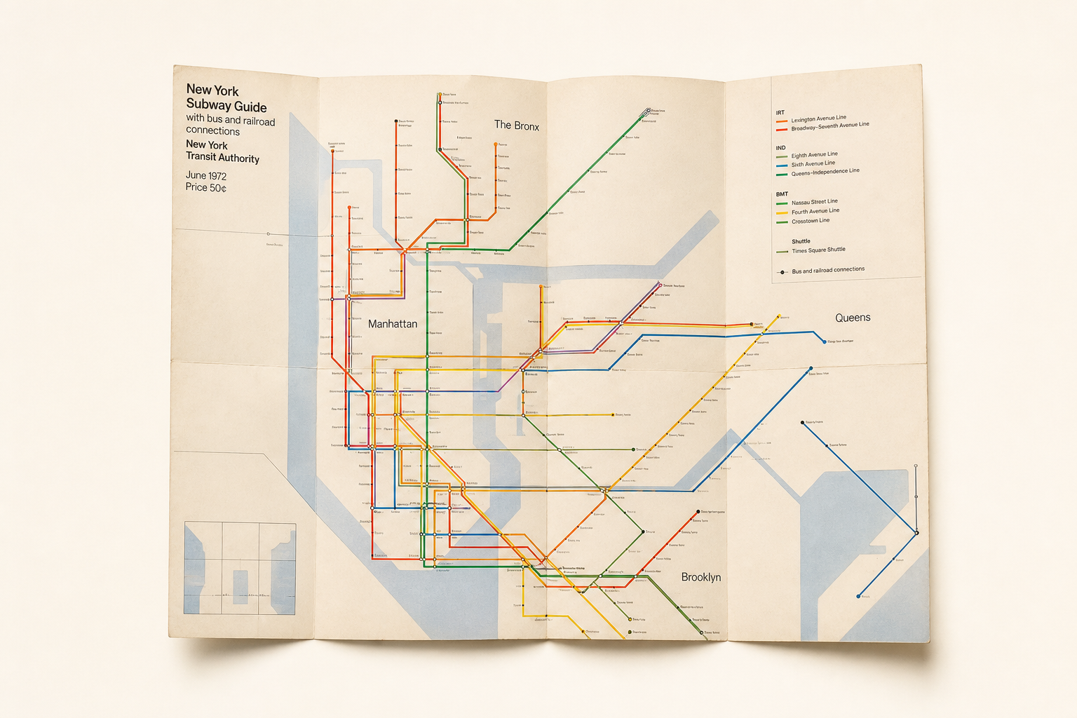
Few printed city maps are recognized as quickly as the 1972 NYCTA subway map. What makes it interesting for Reetro is not only its status as an icon, but its construction as a deliberate printed object: a foldout guide that compresses orientation, typography, and graphic reduction into one surface. The New York Transit Museum notes that the New York City Transit Authority introduced the map in August 1972 and that it was the first map published by the Authority to be designed by an established design firm.
A city map treated as a diagram
The strongest move was formal. According to the New York Transit Museum, the map combined several ideas that had not previously been brought together in one transit map: a service diagram drawn with straight lines rather than curved ones, and the removal of details that did not add information for riders. The shift was especially visible in the treatment of topography. The museum explains that most of New York’s physical detail was stripped away, leaving boundaries defined largely by water. That is why the map still reads less like an illustration of the city than like a precise information diagram.
Unimark rather than in-house graphics
The authorship is documented with similar clarity. The Transit Museum identifies Unimark International as the design firm and names principals Bob Noorda and Massimo Vignelli, along with other designers including Joan Charysyn. AGI’s page on the New York City Transit Authority subway map frames it in related terms: the map was designed by Massimo Vignelli in 1972, following his work on the NYCTA signage system at Unimark in the late 1960s. That matters because it shows the map was not an isolated gesture, but part of a broader rethinking of public information across the transit system.
Made as a portable guide
For Reetro, an important detail is that the object worked not only as a graphic image but as a piece of use-oriented print. The New York Transit Museum describes the 1972 “pocket map” as a customer format meant to be carried: on one side it presented the system diagram, a key, and a simplified list of services; on the reverse, a more detailed breakdown of routes, stops, times, and notes. That dual character is part of the map’s force. It is severe and abstract, but never detached from practical use.
Information at the point of decision
The Vignellis’ attitude toward transit graphics appears clearly in the archival texts presented by the Vignelli Center. In a quoted statement, Lella and Massimo Vignelli argue that transportation graphics must convey information “at the point of decision” — never before and never after. That sentence helps explain the 1972 map. Its reduction is not decoration or theory for its own sake, but an attempt to make choices legible under pressure. The foldout map becomes a piece of everyday modernism whose elegance is tied directly to its function.
Later replaced, never really settled
Its afterlife is part of the story as well. AGI notes that the map was later replaced by geographically more accurate versions. Yet that is precisely what keeps the 1972 design alive: it was never trying to reproduce the city naturalistically, but to make the system intelligible. That fits Reetro’s interest in printed matter that earns its visual force through selection, rhythm, and clarity rather than decorative overload. If you respond to that kind of graphic order, it often leads to large-format posters or tightly structured framed art where form itself becomes the image.