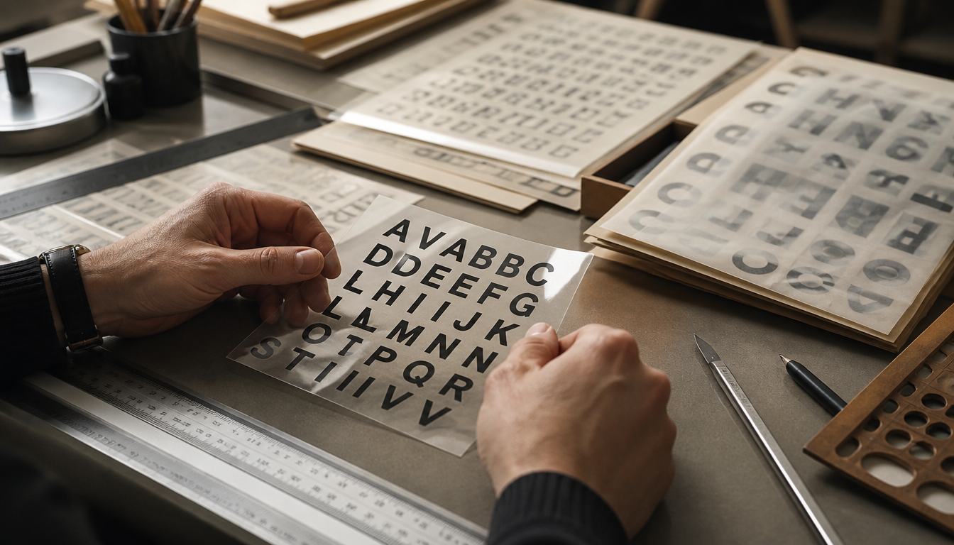
Letraset, founded in London in 1959 and launched in 1961 with its dry transfer lettering system, gave graphic designers the ability for the first time to apply professional typefaces letter by letter directly at their own desk, without having to commission typesetters or artists. Before Letraset, decent typography was expensive, time-consuming, and reserved exclusively for professionals with industry access. With pre-printed transfer sheets available from the local art supply store, you could suddenly set headlines yourself, experiment with kerning, and get started right away. This was no small step forward: from the 1960s through the 1980s, Letraset fuelled the entire counterculture, from punk fanzines to underground magazines, because creative independence suddenly became affordable and accessible.
Letraset and Instant Typography: How Transfer Lettering Revolutionised Everyday Graphic Design, 1960–1980
Letraset was founded in London in 1959 and launched its dry transfer lettering system in 1961 — suddenly placing professional-looking typography on every desk, without a print shop, without a typesetter, without any waiting time.
What Was Behind the System?
The original Letraset system consisted of an extensive library of transfer sheets on which typefaces were pre-printed. Whoever needed a letter placed the sheet on the paper and rubbed it down with a stylus — one by one, character by character. It was painstaking work. According to contemporary accounts, the process was simply unsuitable for body text: typesetting an entire novel, or even a single magazine article, this way was plainly unrealistic.
Nevertheless, Letraset was a genuine turning point. Because before the era of high-quality desktop printers, the system meant you could produce attractive headlines and graphics directly at your own desk — without costly commissions to typesetters or draughtsmen. The transfer sheets were available in every art supply store, and anyone who wanted to experiment could try out placement, tracking, and spacing on their own.
According to sources, Letraset played a significant role in the explosion of countercultural media from the 1960s through the 1980s — from fanzines to underground magazines. Guerrilla typography in the truest sense.
From 1964, the company even extended the technique to children’s toys: the so-called “Action Transfers” brought the rub-down picture principle into children’s rooms and later evolved into Kalkitos and similar product lines.
4 Practical Lessons from the Letraset Era
1. Typography suddenly became democratic. Before Letraset, you had to pay and wait for typeset text. With transfer sheets, anyone — whether a small publisher, a student group, or an advertising agency — could get started immediately. Accessibility fundamentally transforms creative culture.
2. Handcraft creates character. Because each letter was rubbed down individually, misalignments, slants, and slight tears crept in. These very “mistakes” are now regarded as a distinctive stylistic hallmark of printed matter from that era — and are deliberately referenced in modern retro design. Anyone who loves this look will also find it in contemporary graphics such as the Bauhaus poster or the Bauhaus advertising poster.
3. Format determines application. Letraset only worked for headlines and short text elements — not for body copy. This constraint forced designers to achieve maximum impact with minimal words. No wonder poster design in this era developed such a distinctive visual language of its own. Retro cinema posters such as the Charlie Chaplin poster or the classic retro cinema poster still carry this DNA today.
4. Retail availability was crucial. If you ran out of the letters “E” or “A” mid-project — which happened quickly — you simply headed to the nearest art supply store. This “immediately available, immediately usable” principle shaped later design tools as well. Today, the same impulse lives on in curated print-on-demand: in the reetro shop you’ll find, for example, vintage posters and retro canvases that capture this spirit.
Legacy and Context
Letraset was later acquired by the Colart group and is today part of Winsor & Newton. The company itself still exists — but the era of rub-down sheets as an everyday tool came to an end with the rise of desktop publishing in the late 1980s. What remains is an era in which typography was handmade, risky, and surprisingly alive.
Sources
FAQ
What exactly is Letraset and when was it invented?
Letraset was founded in London in 1959 and immediately introduced a completely new tool for graphic designers with the Letraset Type Lettering System. In 1961, the real centrepiece followed: the dry transfer lettering system, also known as dry transfer. The idea was simple but revolutionary: typefaces were pre-printed on transparent sheets, and you could rub each letter down onto your surface one by one using a stylus or ballpoint pen.
How did Letraset change everyday graphic design before computers existed?
Before Letraset, producing professional-looking headlines required either commissioning a typesetter or having an illustrator draw them by hand. Both cost time and money. With Letraset, you could produce clean headlines directly at your desk, experiment with placement and tracking on the spot, and simply start over if needed. The range was available in every art supply store, which democratised typography and contributed to the explosion of countercultural media from the 1960s through the 1980s.
What kinds of text was Letraset suited for, and where did the technique reach its limits?
Letraset was excellent for headlines, logos, posters, and any situation where a few powerful words were called for. For body text, the technique was simply impractical: since every single letter had to be rubbed down manually, it was plainly unrealistic to use it for a longer article, let alone a book. The process was time-consuming, and a small alignment error could leave a letter looking crooked or torn.
What typefaces and elements could you use with Letraset sheets?
The original Letraset system encompassed an entire library of transfer sheets pre-printed with a wide variety of typefaces. In addition to standard alphabets, the sheets also included geometric elements such as circles and squares as well as decorative motifs. This gave the sheets broad coverage of design needs, ranging from serious serif faces like Clarendon to sans-serif classics like Futura Bold.
What became of Letraset, and does the brand still matter today?
With the rise of high-quality desktop printers and digital typesetting software, Letraset lost its original core purpose. The company was eventually acquired by the Colart Group and is today part of its subsidiary Winsor & Newton. The dry transfer technique itself, however, lived on in other areas: as early as 1964, Letraset applied the same principle to Action Transfers, a craft toy for children that later gained worldwide recognition under the name Kalkitos.
This article was generated automatically by an AI system. Disclosure pursuant to Article 50 of the EU AI Act.