Lester Beall’s posters for the Rural Electrification Administration are among those rare printed objects where graphic design is not merely selling a product, but making a public infrastructure project visible. Poster House describes the REA as a 1935 Roosevelt administration program that brought electricity to areas where private companies refused to operate. Beall was hired to communicate that work, and according to Poster House he created three series of posters over a five-year span.
Why these posters were needed in the first place
The Library of Congress states the historical pressure very clearly: the REA was launched by executive order in May 1935 and supported by the Rural Electrification Act in May 1936. At that moment, nearly 90 percent of farms in the United States lacked electricity; by 1950, according to the Library of Congress, that figure had dropped to about 20 percent. The posters had to work in that gap between policy and daily life. They were not meant to pose avant-garde riddles, but to make electricity legible as a practical gain.
Three series, three modes of communication
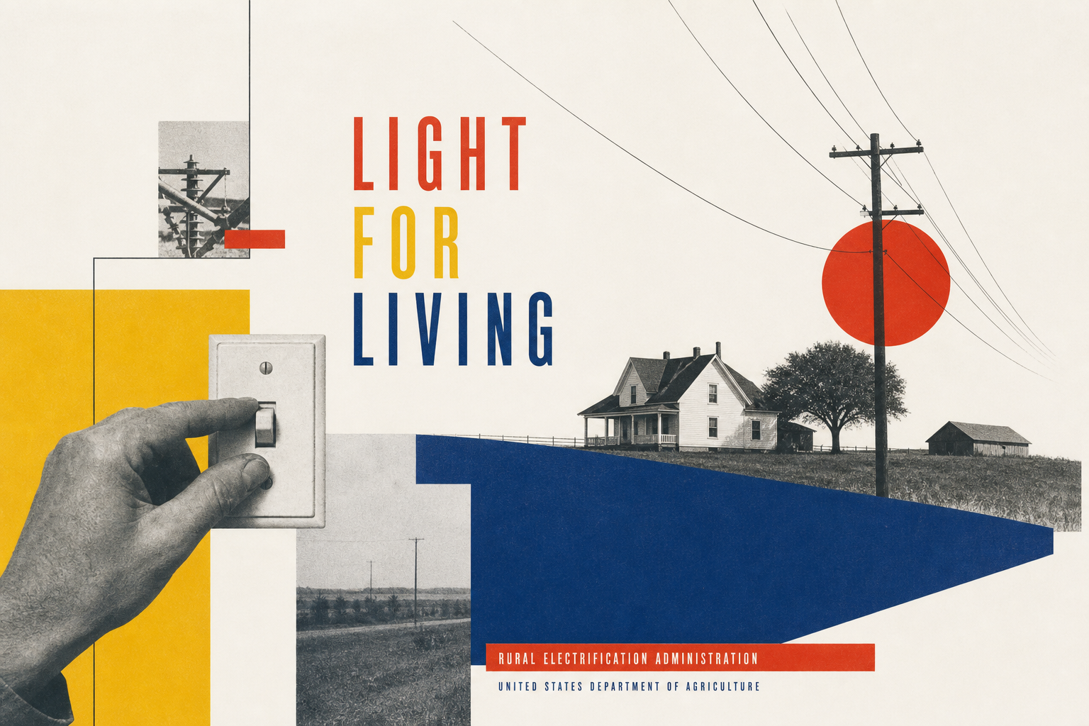
The sequence of the campaign is also well documented. The Library of Congress writes that Beall’s first series communicated the immediate benefits of electricity in simple terms: light, radio, powered tools, water, and other everyday relief. In a second series, he shifted the focus toward results and used photomontage to place real people inside the image. The third series showed electricity directly in action — on the farm, at work, and at the turn of a hand. The posters do not rely on one formal trick; they adjust their visual language to the argument being made.
Modernism, translated for America
That is where their design strength lies. Poster House argues that Beall did not simply import European avant-garde ideas, but translated them into a new American form of clear visual communication. Creative Review also quotes curator Angelina Lippert saying that Beall’s posters were a significant part of a broader PR campaign. The same article notes a formal detail that matters here: many of the sheets were made almost entirely in silkscreen and often used simple elements of photomontage. That helps explain why the works feel both rigorous and immediately direct.
Why these printed objects still stay with you
Beall’s REA posters do not remain memorable because they romanticize rural life. They work because colour, contrast, diagonals, typography, and cropped imagery are compressed into statements you can grasp at once. Creative Review notes that by the time the final poster was printed, the United States had reached roughly 50 percent rural electrification, climbing to around 90 percent by the end of the decade. That does not make the posters solely responsible for the historical outcome, but it does show how firmly they belonged to an effective public communication effort.
Why it fits Reetro
For Reetro, what is especially appealing here is the way these posters turn utility into form. No decorative overload, just clean fields, strong colour, and readable energy. If that attitude speaks to you, it often leads to large-format posters or more structured framed art where a motif holds through composition rather than visual noise. Beall’s REA series shows how light and modern a historical print can feel when design is genuinely solving a problem.