Josef Müller-Brockmann’s First June Festival Concert from 1960 feels like a strong Reetro object because a cultural event is not merely decorated here but organized in print. The V&A record supplies the firm work data: a poster from Switzerland, made in 1960, executed as a colour offset lithograph on paper, and measuring 127.8 × 90.1 cm. Even those plain facts already suggest that the sheet is best read not as a singular artistic gesture but as a precise public-facing printed object.
A concrete concert, not an abstract design manifesto
What makes the piece especially convincing is how specific the occasion remains. In the V&A’s translated inscription, the poster announces the first June festival concert of 1960 for the Tonhalle Society, scheduled for Thursday 2 June at 8:15 p.m. in the large Tonhalle concert hall. It names Georg Solti as conductor and Claudio Arrau as soloist, with Brahms, Beethoven, and Schumann on the programme. That matters because the poster does not simply work “in the spirit of music”; it remains a fully legible print system for a real event.
Why the sheet is typical of Müller-Brockmann
The V&A describes Müller-Brockmann’s signature language as one based on simple geometric grids, complementary or contrasting colours, and sans-serif typefaces. In that sense the museum presents this poster as typical of his prolific graphic output. It also adds a small but useful biographical detail: his connection to music was personal as well, because his wife Verena Brockmann was a violinist. That does not explain the design by itself, but it helps clarify why concert graphics were not a marginal sideline in his work.
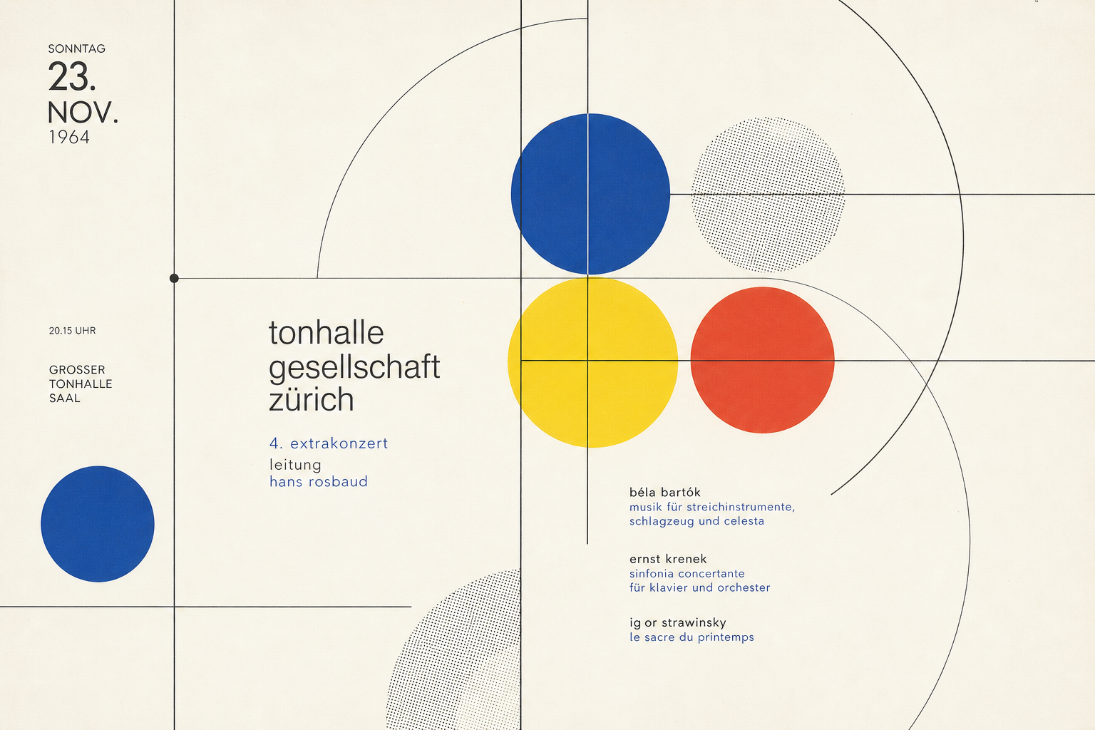
A repeatable concert-poster system
A second V&A object shows that this was not an isolated success. Extra-Konzert from 1957, also by Josef Müller-Brockmann and also catalogued as a colour offset lithograph, records another Zurich Tonhalle concert, this time with Carl Schuricht and Johanna Martzy and music by Bach and Bruckner. Read together, the two records make clear that Müller-Brockmann developed a repeatable printed language for concert advertising. The broader background fits well with the traits Wikipedia outlines for the International Typographic Style: grids, sans-serif typography, clarity, and objectivity. That is why First June Festival Concert still feels fresh today — not as a nostalgic music poster, but as disciplined information graphics on paper.
Why it fits Reetro
For Reetro, the poster is compelling because it shows how little is needed to create strong wall presence: scale, typography, print precision, and a calm, controlled modernism. If you respond to that kind of factual graphic lightness, it often leads to large-format posters or crisply considered framed art where information, surface, and material awareness matter more than decoration alone.