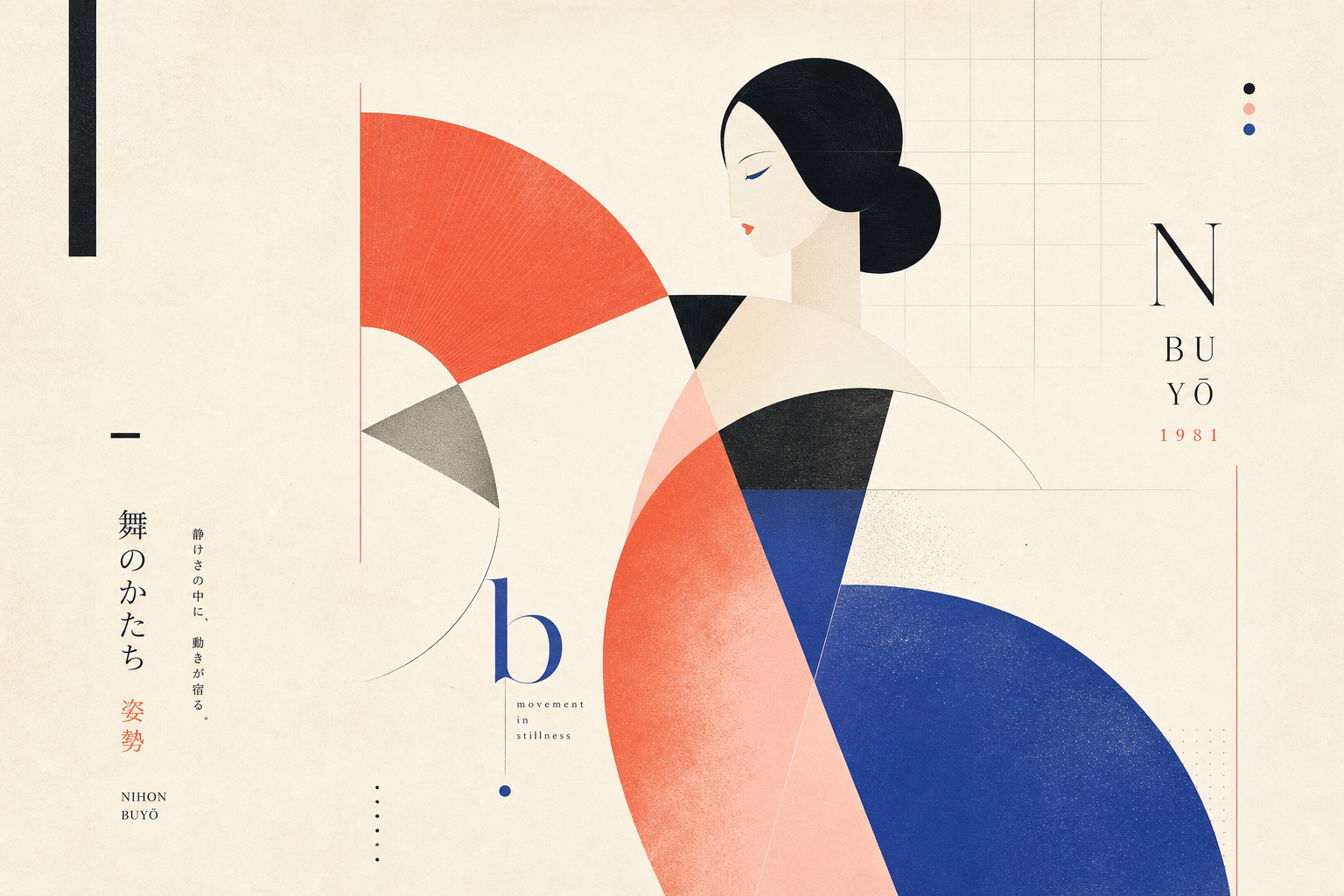
Ikko Tanaka’s Nihon Buyo from 1981 feels like a strong Reetro object because it does not need volume to hold attention. The Museum of Modern Art’s object record supplies the hard data: 1981, offset lithograph, 103 × 72.8 cm, printed by Toppan Printing Co., Ltd. On that factual base, it becomes easier to see how precisely Tanaka works with very few forms.
A poster made for a specific performance context
The occasion matters first. Cooper Hewitt describes Nihon Buyo as a poster for a traditional Japanese dance performance at UCLA’s Asian Performing Arts Institute. The V&A adds the wider frame: in 1981 the poster belonged to a series of twelve posters by Japanese graphic designers curated by critic Masaru Katsumi. They marked lectures, masterclasses, and performances devoted to five kinds of traditional Japanese theatre, dance, and music, presented by the Classical Performing Arts Friendship Mission of Japan.
Geometry instead of illustration
That is exactly why the image solution is so convincing. Cooper Hewitt describes the figure as a simplified geisha built from a limited palette, geometric forms, and a grid. Hair arrangement, red makeup, and pink cheeks remain recognizable even though nearly everything has been reduced to a few flat components. The poster does not offer a naturalistic scene so much as a print concept: face, hair, and kimono are constructed from sharply placed forms that feel strict and welcoming at the same time.
Why the reduction does not feel cold
Cooper Hewitt stresses that Tanaka’s modernism never stays purely mechanical. Western modernist aesthetics and Japanese tradition are merged, but with playfulness rather than pure severity. That is what makes Nihon Buyo especially interesting: the grid stabilizes the composition, yet the figure does not feel technical. It remains open and almost ceremonially polite. The V&A’s description of nihon buyo as a quieter form of dance, accompanied by the shamisen, fits that sense of a controlled and calm printed surface.
Why it fits Reetro
For Reetro, the poster is compelling because it shows how much atmosphere can be built from little material: generous paper-white space, few colours, crisp contours, clear typography. If you respond to that kind of controlled graphic lightness, it often leads to large-format posters or more restrained framed art where form, field, and print presence matter more than decorative overload. Tanaka’s sheet is a reminder that a printed object can work at once as cultural translation, event graphics, and an image in its own right.