
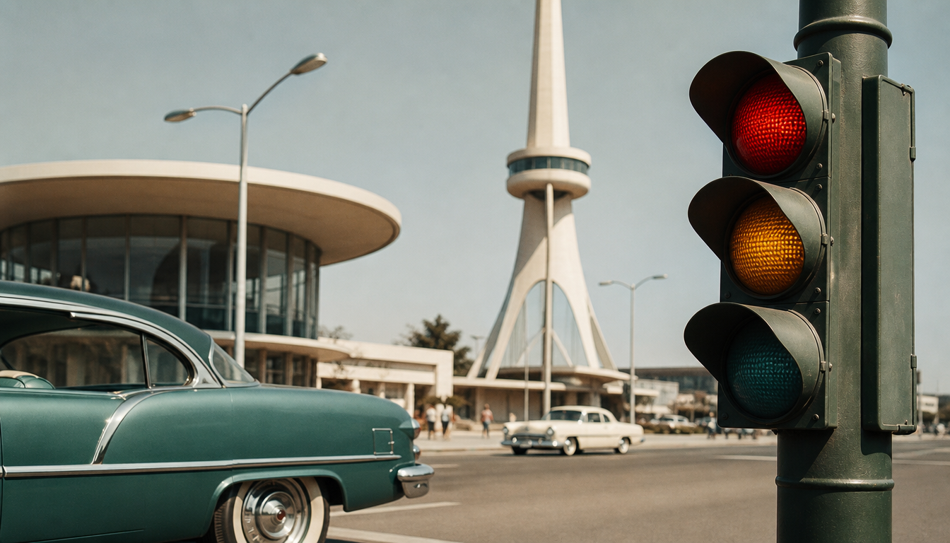
Futura, designed by Paul Renner in 1927, so thoroughly dominated US advertising and traffic typography in the 1950s that, together with Hermann Zapf’s Optima (1958), it shaped the visual identity of an entire decade. When you hold a vintage sneaker from the late fifties in your hands today, the lettering on its box often carries the same geometric DNA that was simultaneously conquering US road signs, magazine ads, streets, and shop windows. In that era, Futura and Optima forged a typographic unity between everyday culture and advertising that continues to influence consumer design to this day — and reveals why typefaces are not a side note, but style markers of their time.
Futura, Optima, and the Road Sign Legacy of the 1950s: What Typography Has to Do with Style
The letterforms that America printed on road signs, advertising posters, and product packaging in the postwar years remain anchored in our collective visual memory to this day. Two typefaces dominated the visual world of the 1950s above all others: the geometric Futura (Paul Renner, 1927) and the humanist Optima (Hermann Zapf, 1958). Both shaped US advertising typography and influenced early traffic sign design, before the standardized Highway Signage of 1968 unified the visual language of the American road.
What the Choice of Typeface Reveals About an Era
Futura was considered the modern typeface par excellence in the 1940s and 1950s. Its circular forms, unadorned strokes, and geometric rigor made it the typeface of choice for advertising agencies seeking to communicate progress and functionalism. At the same time, Hermann Zapf introduced Optima — a typeface that combined the clarity of a sans-serif with humanist proportions. That was midcentury typography in its purest form.
Eero Saarinen, the Finnish-American architect, was known in this era not only for his sculptural buildings but also for his sense of unified visual language. The formal vocabulary of his surroundings — organically curved yet precise — is directly mirrored in the typography of his time.
For everyday American life in the 1950s, this meant something concrete: anyone reading a road sign, a cinema listing in the newspaper, or a product label in the supermarket was encountering a typographic system optimized for legibility in motion, while simultaneously conveying aesthetic conviction.
4 Practical Takeaways for You as a Retro Enthusiast
1. Typography is style, not decoration The choice between geometric sans-serif and humanist softness was no minor matter in the 1950s. When you hang a vintage poster on the wall today, you are also choosing a stance. A Bauhaus exhibition poster brings that typographic rigor directly into the living room, as does the Bauhaus advertising poster of the art school.
2. Advertising typography of the 50s lives on in travel posters Airline posters and tourism advertising from those decades are the purest archive of contemporary typeface use. The Retro Airline Travel Poster Glasgow or the Jamaica Airline Retro Poster show how type and image worked together back then. No frills, clear hierarchy, maximum impact.
3. Cinema posters as typographic documents of their time Hollywood in the 1950s used typography deliberately as a dramatic element. The classic retro cinema poster or the Charlie Chaplin cinema poster are therefore not mere nostalgia, but living typography history. The Vertigo reprint cinema poster belongs in this category too.
4. The midcentury feel can be captured in smaller formats too You don’t need to redesign an entire wall. A Bauhaus-style decorative cushion or an abstract retro cushion brings the era’s visual language to the sofa in a reduced form. Those looking for more surface area will find what they need in the poster shop or among the canvases.
A Brief Look at Traffic Sign Design
In the United States, the Federal Highway Administration only introduced binding typeface standards for road signs in 1968 with the MUTCD (Manual on Uniform Traffic Control Devices). Before that, a colorful mix of local solutions prevailed, with typefaces such as Highway Gothic gradually gaining the upper hand. The visual tension between this pragmatic legibility typeface and the aesthetically ambitious advertising and poster typefaces of the same decade is an underappreciated chapter in American design history.
Anyone interested in the interplay of type, city, and image will find a distinctive kind of typographic city portrait in city map posters such as the New York City Map Poster or the Chicago City Map Poster.
Sources
FAQ
What does architect Eero Saarinen have to do with typography?
Eero Saarinen is best known as an architect, for example through the TWA Flight Center or the Gateway Arch. In the 1950s, however, he was also involved in the overall visual language of major projects in which type and space were conceived together. His design environment was strongly influenced by Bauhaus typography — in particular by Futura, which was considered the modern, functional typeface par excellence at the time.
Why was Futura so ubiquitous in US advertising of the 1950s?
Futura, designed by Paul Renner in 1927, stood for progress and clarity. In the 1950s, this was a perfect fit for American postwar optimism. Advertisers used its geometric, sans-serif forms to present products as modern and forward-looking. From automobile brochures to household appliance ads: Futura was the typeface with which America spelled out the future.
What is Optima, and why is it considered so characteristic of this era?
Optima was designed by Hermann Zapf in 1958 and is a sans-serif typeface with slightly flared stroke endings that are reminiscent of classical serif typefaces. It combines humanist warmth with modern clarity, which made it a popular tool for upscale advertising and signage in the late 1950s and early 1960s. To this day, it is engraved on the Vietnam Veterans Memorial in Washington.
Which typefaces were used on US road signs in the 1950s, and why were they later changed?
In the 1950s, alongside the construction of the Interstate Highway System from 1956 onward, US road signs were lettered primarily in Highway Gothic — a sans-serif typeface developed specifically for legibility at high speeds. It was considered functional, but was never a typographic masterpiece. It was not until 2004 that Clearview was officially introduced as its successor to improve nighttime legibility, before the FHWA restricted its approval again in 2016.
How did 1950s advertising typography influence the retro design we see in brands like reetro today?
The clean geometric forms of Futura, the humanist character of Optima, and the functional directness of the era’s sign lettering left behind a distinctive visual language. Modern retro brands draw on precisely this aesthetic because it conveys trust, craftsmanship, and a time when design was made with genuine conviction. It is not about nostalgia for nostalgia’s sake, but about the substance behind the forms.
This article was generated automatically by an AI system. Disclosure pursuant to Article 50 of the EU AI Act.