
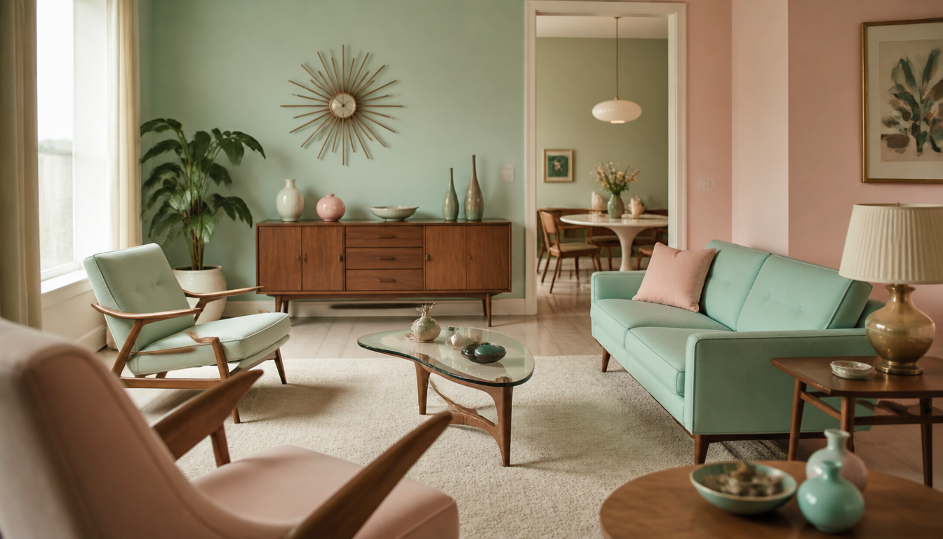
In the 1950s, pastel shades such as mint green, baby pink, and cream white defined the Western living room: after the end of the war, the US paint industry grew to more than 4,000 standardized household color variants by 1955. Color back then was not a decorating trend but a genuine survival strategy for the psyche. After years of grey and khaki, the home was meant to radiate safety and optimism. Pastel tones and the playful boomerang patterns of Atomic Age furnishings signaled: the war is over, life is starting anew. Those who wear vintage kicks from this era today carry a piece of that emotional spirit of new beginnings with them.
Pastel Tones and Boomerang Patterns: How the 1950s Discovered Color as an Emotional Tool
The Fifties were not an accidentally colorful decade. After years of deprivation and the grey tones of World War II, millions of households consciously reached for mint green, peach, sky blue, and soft yellow. Color was a statement, not a coincidence.
The Key Fact: Pastels as Collective Recovery
Color psychologists and design historians describe the post-war period as a phase in which interior colors were systematically linked to emotional goals for the first time. The living room was meant to radiate security, signal optimism about the future, and at the same time embody a lightness that people had not been able to afford for years. Pastel tones fulfilled exactly this function: they appeared friendly, not intrusive, and made rooms look optically larger than the often modest post-war apartments actually were.
Adding to this was the so-called “boomerang pattern,” a graphic motif of sweeping, organic shapes that appeared in fabrics, wallpaper borders, kitchen tabletops, and decorative objects. Symbolically, it stood for movement, the future, and an optimism that set itself apart from the static rigidity of the pre-war decades. The pattern had no single inventor — it emerged simultaneously in several countries as an expression of the same post-war mood.
4 Practical Implications for You
1. Pastel Tones Work as Calming Anchors in Modern Rooms
What arose in the Fifties out of emotional necessity has a real psychological foundation. Muted colors with a high proportion of white — classic pastel tones — reduce visual stimuli and feel less oppressive in small rooms than saturated tones. When you work with a mint or apricot cushion today, you are drawing on the same effect. The Pastel Cushion with Monstera from our range plays in exactly this color world, without feeling historically overbearing.
2. Organic Shapes and Curved Patterns Create Warmth
The boomerang motif of the Fifties was not decorative filler — it was a reaction to the harsh geometry of the war years. Curved, non-symmetrical shapes feel more inviting than strict grids or right angles. You can activate this principle today with an abstract retro cushion or a geo retro cushion — both combine an organic gesture with contemporary design.
3. Reading Wall Design as an Emotional Statement
The Fifties established the concept that walls do not have to be neutral. Pictures, patterns, and colors were deliberately used as mood-setters. Today, large-format posters and canvas prints take on this function. A vintage-style cushion or a canvas print in vintage style can give a room the same character that a carefully chosen wallpaper had in a 1950s living room.
4. Mid-Century Color Palettes Are Combinable, Not Museum Pieces
A common misconception: if you use retro colors, you have to furnish consistently in a historical style. That is not true. The pastel palette of the Fifties can be mixed with modern shapes without looking kitsch. An MCM hexagon wall picture or a Bauhaus hexagon picture brings the geometry of post-war modernism into a contemporary form. Those who prefer working with flat surfaces will find many points of connection to this color history in the poster shop or the cushion section.
Sources
FAQ
Why were pastel tones so dominant in interior design during the 1950s?
After the years of deprivation during World War II, many people yearned for lightness and a fresh start. Pastel tones such as mint green, baby pink, and sky blue signaled optimism and new beginnings without being overwhelming. From a color psychology perspective, they had a calming effect and conveyed a sense of security that was particularly sought after in a devastated Europe and a war-weary America. The post-war living room was deliberately staged as an emotional counterpoint to the grey reality of wartime.
What exactly are 'boomerang colors' and where does the term come from?
Boomerang colors do not describe a single color but a color concept closely linked to the iconic boomerang pattern of the 1950s. This sweeping, organic motif adorned laminate tabletops, wallpapers, and fabrics — often in contrasting color combinations such as turquoise and coral or mustard and dark brown. The name derives directly from the pattern. The color combinations appeared dynamic and forward-looking, which perfectly matched the spirit of optimism of the post-war economic boom.
Did women and men in the 50s have different color preferences for their homes?
Color design in the post-war living room was indeed strongly shaped by traditional gender roles. Interior magazines and manufacturers directed their color concepts almost exclusively at housewives, as they were considered the primary decision-makers when it came to the home. Pastel kitchen tones such as peach or cream were explicitly marketed as ‘feminine’ and ‘cheerful,’ while darker, more saturated tones such as burgundy or dark green appeared more often in studies or men’s rooms.
What role did the emerging television industry play in the color design of living rooms?
The living room in the 1950s increasingly organized itself around the television set, which directly influenced color choices. Since early TV sets broadcast exclusively in black and white, interior design advisors deliberately opted for bright pastel tones and patterned wallpapers to give the room a visual warmth that the grey screen could not provide. Colorful upholstered furniture in turquoise or salmon was staged as an emotional counterbalance to the monochrome screen.
Are the pastel tones and boomerang patterns of the 50s really making a comeback in design today?
Yes, clearly. The retro wave of recent years has firmly established mint green, peach, and organic patterns in modern interior design. What was once considered old-fashioned is today celebrated as ‘Mid-Century Modern’ and deliberately reimagined. Designers combine the original color concepts with contemporary materials. The emotional quality remains the same: warmth, playfulness, and a nostalgic sense of coziness that evidently has timeless appeal.
This article was generated automatically by an AI system. Disclosure pursuant to Article 50 of the EU AI Act.