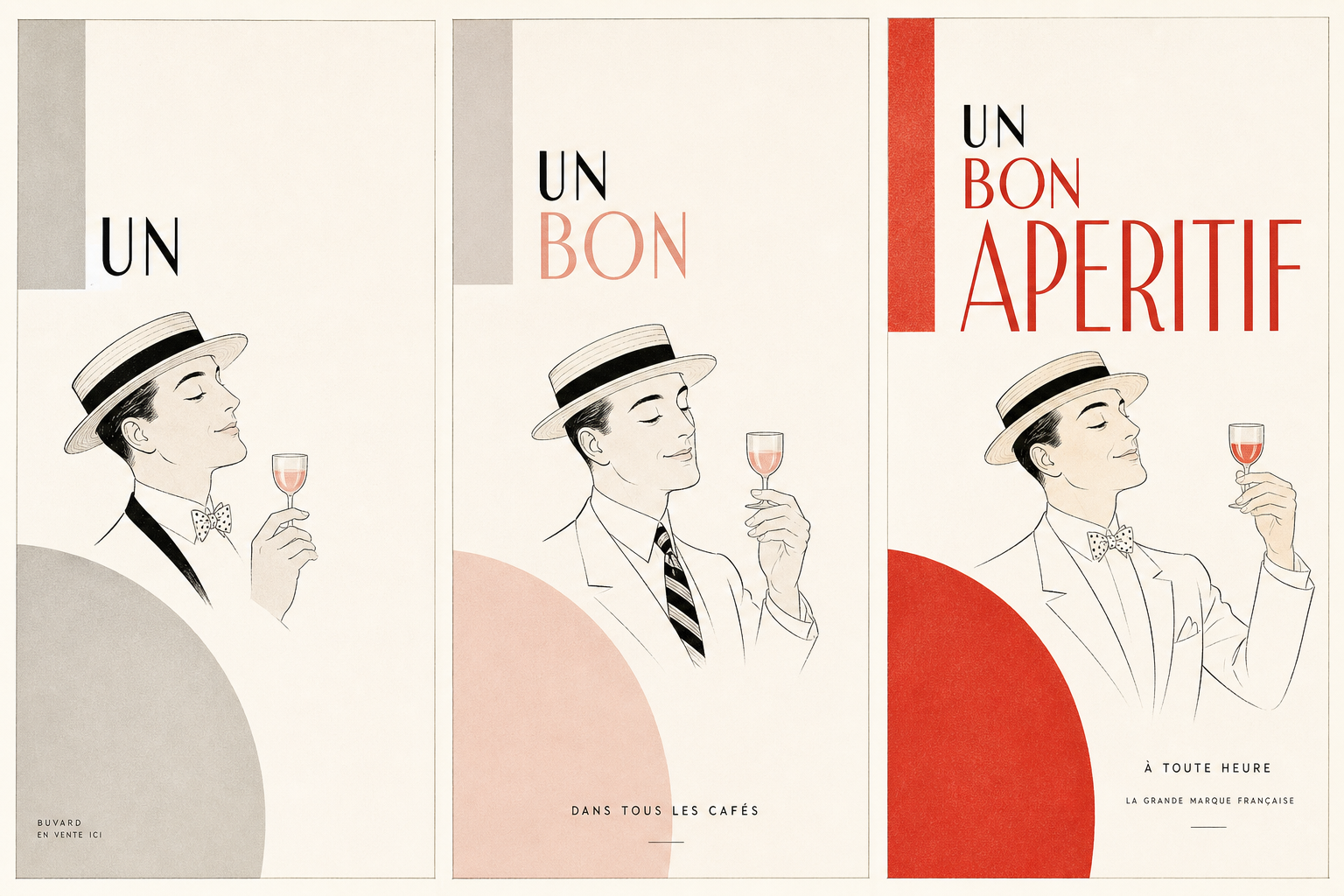
Cassandre’s Dubo, Dubon, Dubonnet is so effective because it does not stay a single advertising sheet. The official estate site describes the project as a 1932 triptych and notes that Cassandre was asked for one poster but delivered three. That turns the commission from a lone panel into a sequence of three related lithographic posters — not as loose variation, but as a deliberately staged order.
Three panels instead of one
That step matters for understanding the object. On the estate site, Cassandre is described as not merely answering the brief but redefining it through three panels meant to be read as one indivisible whole. The Stedelijk Museum Amsterdam lists the work accordingly as Dubo, Dubon, Dubonnet with the object suffix (1-3), making its triptych structure explicit. The museum also supplies the hard object data: production date 1932/1933, material poster/lithography, printer Alliance Graphique, commissioner Dubonnet, and dimensions of 317.4 × 237 cm.
How the sequence works
The estate site describes the mechanism in unusually concrete terms. In the first panel, a stylised figure in a boater hat studies a raised glass; the silhouette is grey and the glass pink. In the second, the figure drinks and begins to fill with colour. In the third, the glass is full again while the silhouette has become fully saturated in the aperitif’s characteristic red. At the same time, the brand name assembles itself in stages: first “DUBO,” then “DUBO-DUBON,” and finally “DUBO-DUBON-DUBONNET.”
Typography as movement in the street
What matters here is not only the graphic form on paper, but the logic of passing by it. According to the estate site, the narrative effect comes from the synchronization of body, glass, colour saturation, and letter sequence. A passer-by effectively reads the advertisement like a small animation in urban space. The People’s Graphic Design Archive also lists the work as a 1932 lithographic poster and summarizes the campaign in a similar way: the man takes the glass, drinks, and wants more, while both typography and the body itself gain colour.
Why it fits Reetro
For Reetro, the appeal lies above all in the economy of means. Very few image elements, lots of paper space, one clear figure, one glass, one red tone — and yet the advertisement remains memorable as a precise print idea rather than a blunt sales surface. If you respond to that kind of controlled, type-led image, it often leads to large-format posters or more restrained canvas prints where reduction carries more force than decoration. Cassandre’s triptych shows how much movement a printed object can create without becoming loud.