Hokusai Great Wave – History, Visual Language and Print Variants
Few motifs in art history are as persistently present as the great wave off Kanagawa. This overview places the Hokusai Great Wave in its historical context, describes its composition and colour choices, and offers guidance on which papers, formats, and frames do justice to the original.
The Hokusai Great Wave in Historical Context
Katsushika Hokusai created the print around 1831 as the opening sheet of his series 'Thirty-Six Views of Mount Fuji'. The full title is 'Kanagawa oki nami ura' – 'Under the Wave off Kanagawa'. It is a colour woodblock print in the Ukiyo-e style, transferred onto washi paper through multiple successive printing passes from carved wooden blocks.
The Hokusai Great Wave emerged during a period when Japanese artists were increasingly absorbing Western influences. Particularly striking is the use of Prussian blue, a pigment newly imported from Europe at the time, which gives the composition its characteristic depth. Hokusai was already over seventy years old when he made it, working under the artist name Iitsu.
Original printed impressions survive today in collections including the Metropolitan Museum of Art, the British Museum, and the Museum of East Asian Art in Cologne. The edition size of the first printings is estimated at several thousand sheets, of which only a fraction remains.
Composition: Why the Hokusai Great Wave Works
The sheet's composition is considerably more structured than it first appears. Three elements are held in precise balance.
The Wave as a Frame
The crest of foam arcs like a claw reaching over the boats below. The fractal-like foam tips were later cited in chaos research as an illustrative example of self-similar structures.
The Boats as Scale
Three long transport boats, known as oshiokuri-bune, are caught in the trough between the waves. Their occupants crouch low – lending the image both scale and narrative tension.
Fuji in the Background
The snow-capped volcano appears small and still between the wave trough and the spray. This inversion of scale makes the sheet the defining work of the series.
The Colour Palette
Prussian blue in two tonal values, a warm beige for the sky, muted earth tones in the boats. Black is used exclusively for outlines and the signature.
Stylistic Significance and Influence on Europe
The Hokusai Great Wave is regarded as a central example of Japonisme, the movement that shaped European artists of the late nineteenth century. Claude Monet owned an impression, Vincent van Gogh referenced Hokusai in letters, and Claude Debussy drew inspiration for the score of 'La Mer' – the first edition carried the wave motif on its cover.
The clear line work, flat areas of colour, and off-centre composition stood in contrast to academic painting in Europe. These principles fed into Art Nouveau and later into graphic design and poster art. Contemporary illustration and tattoo culture continue to draw on the motif today.
The Hokusai Great Wave is less a depiction of nature than a graphic construction – a diagram of movement that has functioned as an image of energy and scale for nearly two hundred years.
Reetro Editorial
Print, Paper and Format for the Wall
For any reproduction, the key challenge is ensuring the Prussian blue neither shifts towards green nor reads as too cold. Matte FSC-certified papers from 200 g/m² upward render the two-step blue gradation accurately and avoid the reflections that on semi-gloss surfaces can wash out the white of the spray.
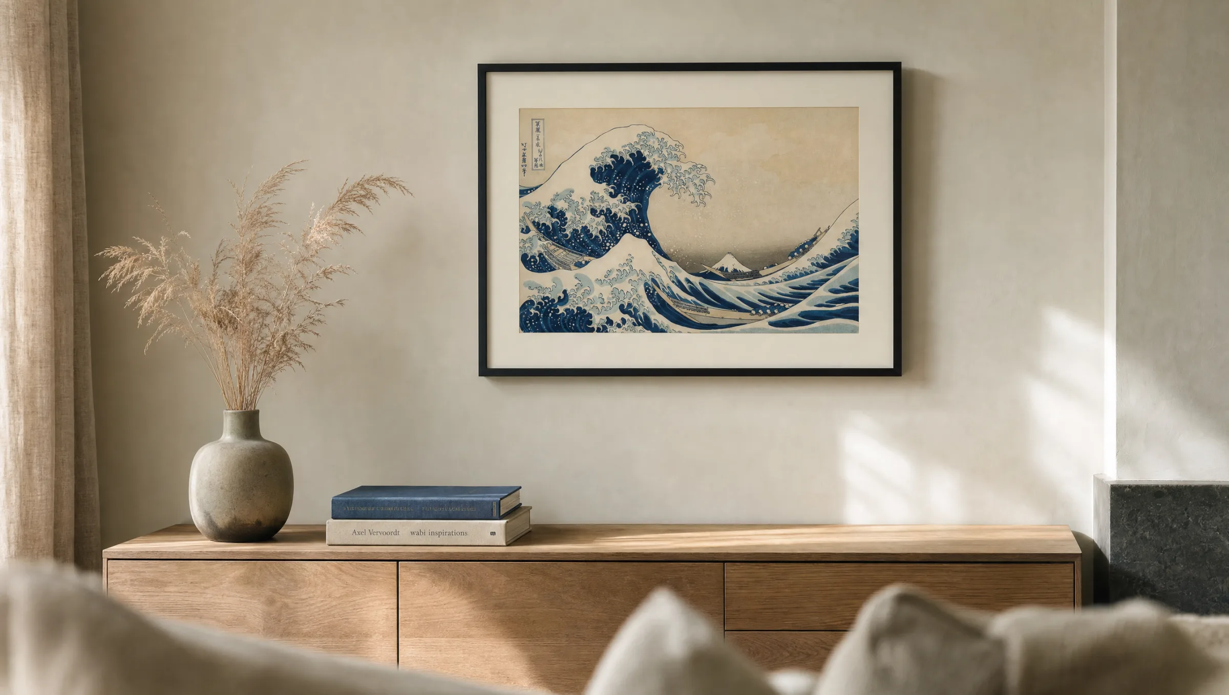
The sheet is not designed for portrait orientation – the original measures roughly 25 × 37 cm in landscape format. Proportional enlargements to 50 × 70 cm or 70 × 100 cm work well on the wall. A slim black or oak wooden frame with a wide passepartout emphasises the graphic character without competing with the motif.
As an alternative to a classic paper print, premium canvas suits living spaces with natural daylight; a hexagonal aluminium wall panel can render the blue with particular density, though it shifts the work into a more contemporary reading. All Reetro prints of classic Ukiyo-e motifs are made in Germany, and colour calibration is checked manually before any order ships.
Häufige Fragen
-
01
When was the Hokusai Great Wave created?
The Hokusai Great Wave was most likely made between 1830 and 1832 and first published around 1831. It is the opening and best-known sheet of the series 'Thirty-Six Views of Mount Fuji'. Hokusai was approximately 71 years old at the time. The precise dating varies between sources because Edo-period publishers did not systematically date their first editions.
-
02
What exactly does the image depict?
In the foreground, a large wave with fractally rendered foam tips rears up over three narrow transport boats whose rowers crouch low beneath it. In the background – smaller than the wave itself – stands the snow-covered Mount Fuji. The interplay between the dynamic wave in the foreground and the still volcano behind forms the core of the composition.
-
03
Is the Hokusai Great Wave a painting or a print?
It is not a painting but a colour woodblock print made using the Ukiyo-e technique. A separate wooden block was carved for each colour and printed onto washi paper in sequence. Hokusai supplied the preparatory drawing; the actual production was carried out by specialist woodblock carvers and printers in the workshop of publisher Nishimuraya Yohachi.
-
04
Why is the Hokusai Great Wave so well known?
The Hokusai Great Wave combines an unusually modern pictorial composition with a clearly legible subject. Its off-centre structure, fractal foam forms, and use of the then-new Prussian blue made the sheet an export success as early as the nineteenth century. Through Japonisme it influenced European artists including Monet, van Gogh, and Debussy, and today it appears on passports, emojis, and postage stamps worldwide.
-
05
Which format works best for a wall print?
Because the original is a landscape-format work, proportional enlargements to 50 × 70 cm or 70 × 100 cm tend to look most balanced in most rooms. Above sofas and sideboards, an XXL format also carries well. An aspect ratio close to 2:3 is important so that the image does not need to be cropped.
-
06
What should I look for in a reproduction?
Accurate rendering of Prussian blue in two tonal steps is essential, along with a clean, non-greyed white for the foam. Matte FSC-certified papers from 200 g/m² reproduce the flat colour areas calmly and avoid distracting reflections. Reetro prints classic Ukiyo-e motifs in Germany on papers meeting these standards, and colour accuracy is checked manually before each order is dispatched.