Food Wall Art: curated prints for kitchen and dining room
Food wall art can add character to a kitchen, frame a dining table, or give a breakfast nook a distinct personality. Rather than interchangeable decoration, the focus here is on motifs with editorial substance: food photography, still lifes, market scenes and graphic illustrations that open up rooms connected to cooking, eating and gathering in a narrative way.
Why food wall art is more than kitchen decoration
Rooms where people eat are rarely purely functional spaces. They are meeting points — at the counter in the morning, around a laid table in the evening. Food wall art can reinforce this atmosphere precisely because it picks up a motif already present in the room: ingredients, crockery, hands at work. The wall decoration gains a thematic anchor without feeling like a backdrop.
Editorially speaking, food motifs work best when they are not arbitrary. A plainly photographed still life of bread and olive oil, a quiet image of espresso cups, or a botanical print of herbs all tell stories about origin, craft and everyday life. They invite closer looking rather than simply filling a surface.
Motif categories for food wall art
Which motif fits depends on the room, the quality of light and the surrounding furniture. Four categories have proved themselves in practice.
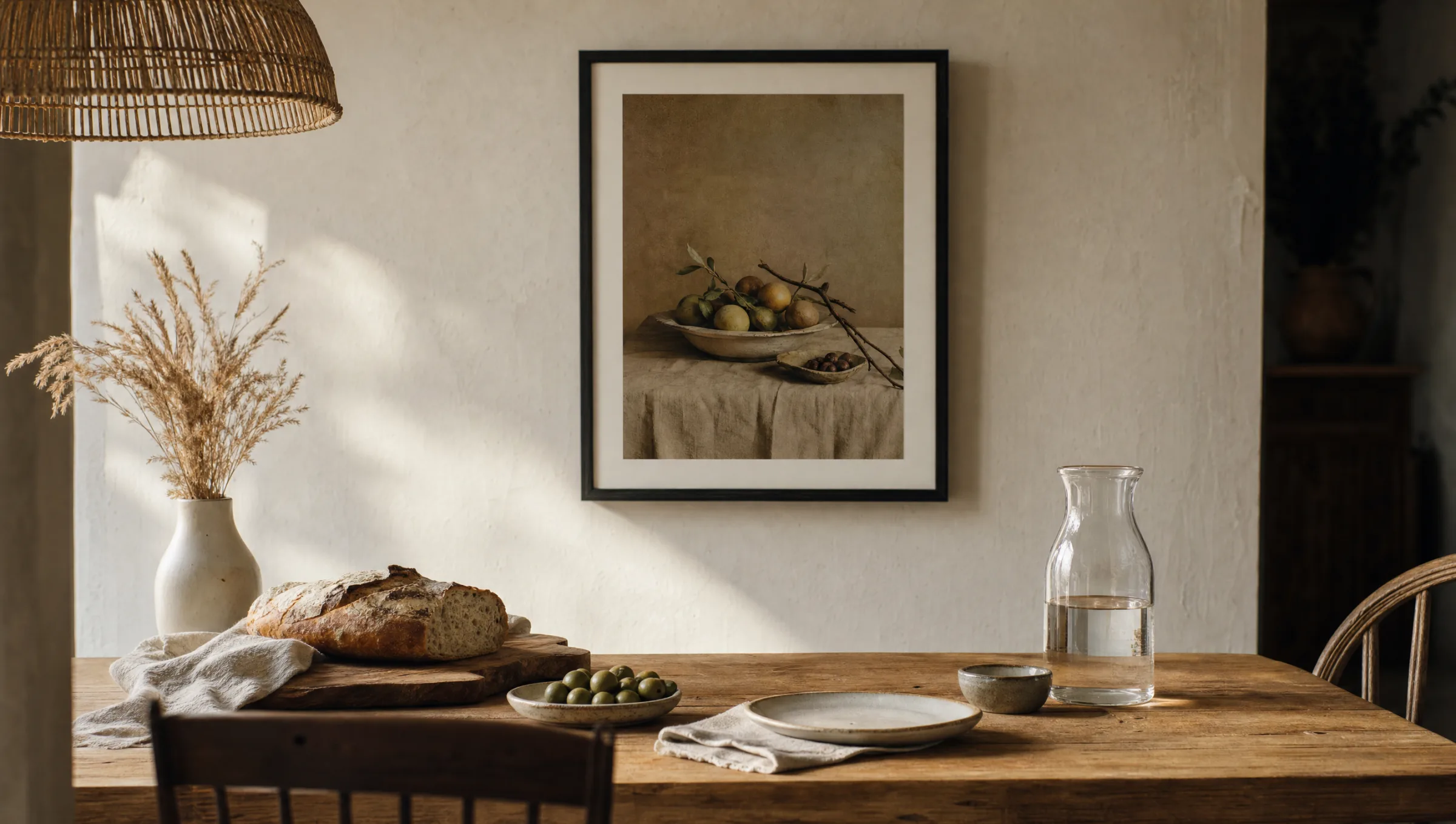
Food photography in the dark-ground tradition
Shots in the style of Flemish still lifes: dark background, directional light falling on fruit, wine or bread. These images feel concentrated and suit warm wood or clay tones in a dining room.
Bright, minimalist still lifes
Reduced compositions featuring ceramic tableware, lemons or eggs on a neutral ground. Well suited to Scandinavian-influenced kitchens with pale cabinetry and plenty of natural light.
Market scenes and documentary photography
Photographs of weekly markets, bakeries or olive groves. They speak of origin and craft, and work especially well in open-plan kitchen-diners as an understated focal point.
Botanical and graphic prints
Illustrations of herbs, mushrooms or citrus fruits, often in the style of old teaching charts. They read as matter-of-fact, hang well in sets and are restrained in their use of colour.
Format, placement and hanging
Food wall art makes its full impression when the format is right. Above a dining table, the width of the print should be roughly two thirds of the table's width so that the motif and the furniture remain in proportion. Along a long bench or banquette, a row of two or three smaller prints often works better than a single large piece.
In the kitchen itself, it is worth keeping a clear distance from the extractor hood, sink and hob. Grease vapour and steam will eventually damage both paper and frame. Anyone wishing to place a motif close to the action should opt for aluminium or coated substrates that can be wiped clean with a damp cloth.
Hanging height should be guided by seated eye level, not standing eye level: the centre of the print should sit approximately 145 to 150 centimetres above the floor, so that guests at the table have the motif comfortably in their line of sight.
A well-chosen piece of food wall art does not replace an open kitchen — but it extends what happens there out into the wall.
Reetro Editorial
Materials and print quality in detail
Food motifs depend on texture: crumbs on bread, droplets on glass, a dusting of flour on a worktop. These details need a material that reproduces fine contrast cleanly. FSC-certified fine-art papers of 200 gsm or above with a matte surface are the most reliable choice here, as they carry no reflections and allow the motif to sit quietly in the room.
Premium canvas is particularly suitable for large-format market scenes or dark still lifes, since its fine weave lends the image a painterly quality. Hexagonal aluminium panels, on the other hand, work well for graphic sets of herbs or spices, as several modules can be combined into a honeycomb arrangement.
Reetro prints all motifs in Germany. This allows tighter control over colour accuracy, paper selection and finishing — aspects that are especially critical with food photography, where the delicate reds, browns and greens are unforgiving.
Food wall art in the context of the wider interior
To keep food wall art from feeling thematically isolated, it helps to consider the other surfaces in the room. An oiled oak tabletop suits warm, earthy motifs; a pale lacquered kitchen gains depth from a single, darker still life. In open-plan layouts, the motif should connect tonally to the living area rather than creating a sharp division.
Anyone combining several prints should establish a shared thread: the same frame colour, the same paper stock or a consistent visual language such as analogue photography. The result is a small curated series that frames the dining area without overcrowding it.
Häufige Fragen
-
01
What motif works best as food wall art in a kitchen?
For kitchens, reduced motifs tend to work best: bright still lifes featuring fruit, bread or tableware, botanical prints of herbs, or quiet black-and-white photographs of bakeries and markets. It is important that the food wall art sits well with the colour of the kitchen cabinetry and avoids excessive detail, so that it remains legible from several metres away. In open-plan kitchen-diners, a single large-format motif usually works better than several small prints, because it organises the space rather than fragmenting it.
-
02
What size should food wall art above a dining table be?
A reliable rule of thumb is that the width of the print should be roughly 60 to 70 per cent of the table's length. For a 180 cm table, this means a motif of around 100 to 130 cm. If a set of two or three prints is used instead, the combined width including the gaps between them applies. The bottom edge of the frame should sit at least 25 to 30 centimetres above the tabletop so that chairs and tableware do not knock against the print.
-
03
Can food wall art handle the conditions found in a kitchen?
Directly above a hob, sink or extractor hood, paper is persistently at risk: grease particles and steam settle into the surface and cause yellowing over time. At a distance of at least two metres from the cooking area, high-quality paper prints behind glass are unproblematic. Closer to the action, coated aluminium panels are the more robust option, as residue can be removed with a damp cloth without damaging the material.
-
04
How do I combine several prints into a wall arrangement?
A composed combination works when all motifs share a common thread: the same frame colour, the same paper or a similar visual language. A set of two or three prints in an identical format, hung at regular intervals side by side, is a tried-and-tested approach. Those who want to experiment can pair a main print with two smaller detail shots. What matters is that the motifs retain a thematic connection and do not appear random.
-
05
What materials does Reetro use for food wall art prints?
For food motifs, Reetro primarily uses matte FSC-certified fine-art paper at 200 gsm or above, because it reproduces fine textures such as crumbs, droplets or flour accurately and without glare. For large-format still lifes and market scenes, premium canvas is also an option, as its fine weave adds painterly depth to the image. All printing is carried out in Germany, which allows closer control over the delicate reds, browns and greens that food photography demands.