Canvas Print Kitchen: Motifs and Formats for the Room Where Cooking Happens
The kitchen is rarely just a workspace today — it has become an open gathering point between dining table, kitchen island and living area. A canvas print can shape this transition: quietly, durably, with clear visual language. This guide takes an editorial look at motif choices, formats and material considerations for kitchen walls.
Why a Canvas Print Kitchen Works Better Than a Framed Glass Picture
Kitchens present conditions that are far from trivial for wall art: temporary moisture during cooking, fluctuating temperatures and occasional grease particles in the air. A canvas print holds up more robustly under these conditions than large glass-framed pieces. It does not reflect, does not mist over and creates no harsh glare on the wall when ceiling spots or pendant lights hang above the dining table.
At the same time, the textile character of a stretched canvas feels warmer than glass or metal. In kitchens with many smooth surfaces — high-gloss cabinet fronts, stainless steel, stone — this slightly textured picture plane introduces a visual counterbalance. The motif enters the room more quietly as a result, without becoming dominant.
Weight is another practical advantage: a canvas on a stretcher frame is considerably lighter than a comparable piece behind glass and can be hung securely with a single nail — even on walls in rented apartments that tend to change frequently.
Motif Directions for a Canvas Print Kitchen
Four motif directions have proved particularly well-suited for kitchen walls — each with its own visual logic and effect in the room.
Still Life with Fruit, Vegetables and Bread
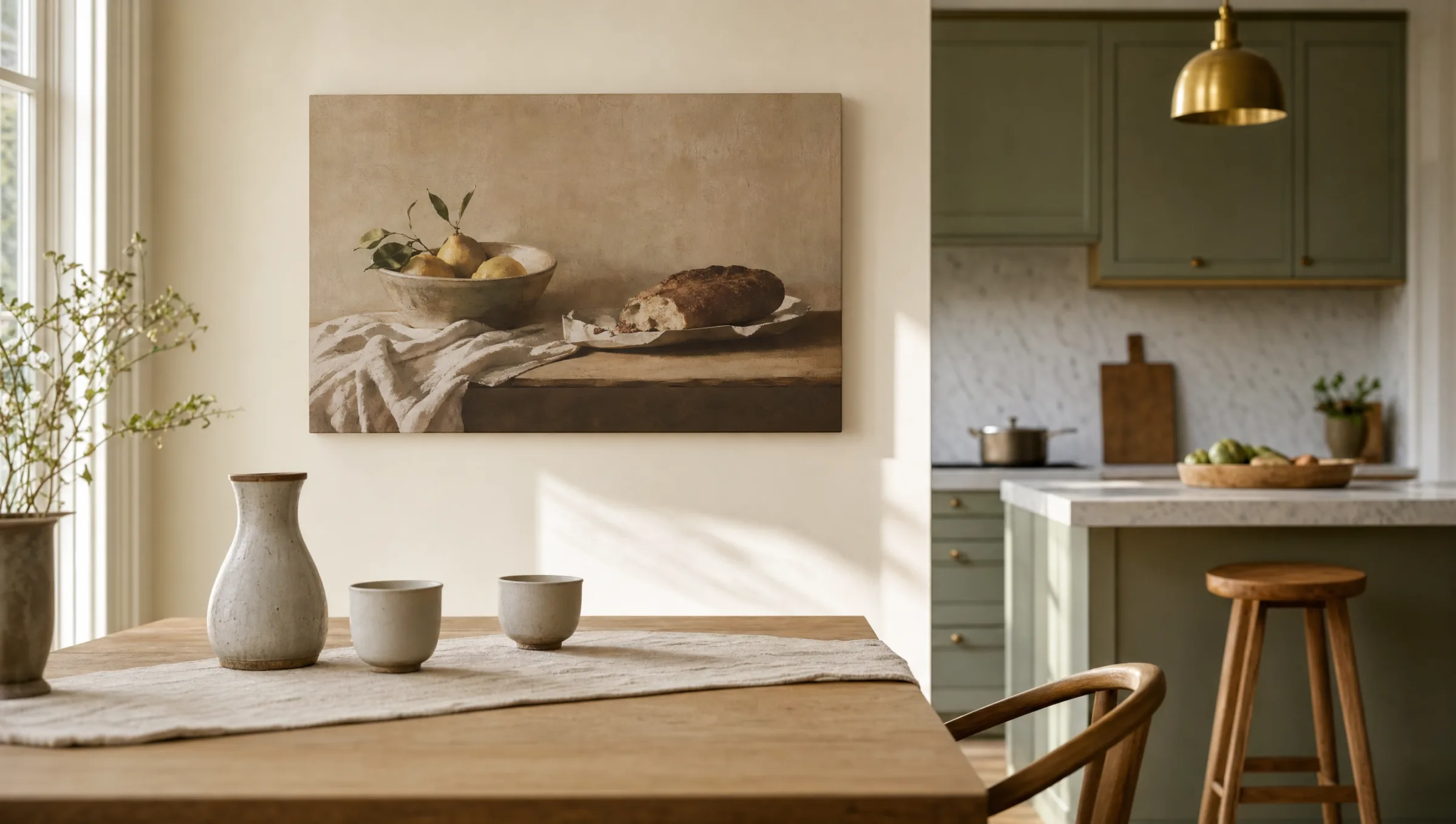
A classic pictorial tradition, freshly interpreted: calm compositions featuring lemons, artichokes or sourdough loaves. Works especially well in country-style and nature-inspired kitchens.
Coffee, Wine and Espresso
Graphic close-ups of cups, carafes or moka pots. A natural fit for urban kitchens with dark cabinet fronts and industrial accents.
Herbs and Botanicals
Basil, rosemary and olive branches as botanical illustration or photography. Brings a plant-like accent without requiring real herbs to live above the hob.
Mediterranean Landscapes
Olive groves, Italian coastal towns and French market scenes. Tells a story centred on food and cooking without reducing the motif to a direct image of ingredients.
Format and Placement: Where a Canvas Print Kitchen Finds Its Spot
The most important question before buying is not the motif but the wall. Kitchens typically offer only a handful of usable surfaces: the wall above the dining table, the end of a bench seating unit, a free strip between wall cabinet and ceiling, or the wall opposite the worktop.
Above the dining table, a landscape format between 80 × 60 cm and 120 × 80 cm is a reliable choice. It echoes the horizontal line of the tabletop and does not feel oppressive when guests are seated beneath it. On narrow wall sections, a portrait format of 50 × 70 cm can make more sense — for example next to a kitchenette or between two doors.
Distance from the work zone matters: leaving at least 60 cm between the canvas and the nearest source of splashing — hob, sink or kettle — is advisable. Directly above the cooking island, a canvas print kitchen is less suitable in the long run, as steam and grease vapour will gradually affect the material.
A good kitchen wall does not need a loud image — it needs a motif you still enjoy looking at after the hundredth breakfast.
Reetro Editorial
Material, Care and Longevity of a Canvas Print in the Kitchen
High-quality canvas prints are made from tightly woven cotton or blended fabric stretched over a dimensionally stable stretcher frame of FSC-certified wood — made in Germany to precise tolerances. What matters most is the ink layer: pigment inks with UV protection keep colours stable over years, even in well-lit kitchens. Matte coatings further reduce reflections from windows and ceiling lights.
Day-to-day care requires nothing more than a dry microfibre cloth used to dust the surface occasionally. Cleaning sprays, damp wipes and solvents should be avoided, as they can attack the pigment layer. For more stubborn marks, a very lightly dampened cloth drawn gently across the surface is sufficient — always followed by a dry wipe.
Anyone living in an open-plan kitchen with intensive cooking use should also position a canvas print kitchen at least three to four metres from the extractor hood. This keeps the material in good condition even after years of daily cooking.
Colour Coordination: How a Canvas Print Kitchen Fits Existing Interiors
Most kitchens already have a well-defined colour palette — set by cabinet fronts, worktops, tiles and flooring. A wall print should pick up this palette rather than override it. In pale, restrained kitchens finished in white, sand or sage, motifs with muted earth tones, olive green or warm ochre feel cohesive.
Dark kitchens with charcoal or deep-green cabinet fronts benefit from lighter picture fields with strong contrast — botanical illustrations on a cream ground, for instance, or black-and-white photographs with clear line structure.
In timber kitchens featuring oak or walnut, motifs that share a similar colour range work well: warm browns, terracotta, burnt red. The wall then reads not as an intrusion but as a natural continuation of the furniture material.
Häufige Fragen
-
01
Which motif works best for a canvas print kitchen?
Motifs that create a calm connection to the space tend to work best over time: still lifes with fruit and bread, botanical depictions of kitchen herbs, Mediterranean landscapes or graphic coffee and wine imagery. More important than the subject is colour temperature — it should complement the existing interior. Very bold or heavily saturated motifs can feel tiring in the kitchen, simply because you see them every day at mealtimes.
-
02
What size should a canvas print kitchen wall art be?
Above a dining table, landscape formats between 80 × 60 cm and 120 × 80 cm are typical. For narrow wall sections next to a kitchenette or between doors, portrait formats from 50 × 70 cm upwards are a sensible choice. A useful rule of thumb: the print should span roughly two-thirds of the width of the furniture piece below it — a dining table or bench seat, for example. Prints that are too small tend to look lost on a kitchen wall, caught between wall cabinets and appliances.
-
03
Can a canvas print handle the conditions in a kitchen?
In a normal residential kitchen with a functioning extractor hood, a high-quality canvas print is entirely suitable. Pigment inks with UV protection and matte coatings are resistant to ambient light and short-term humidity. What matters is sufficient distance from the hob, sink and extractor — ideally at least 60 cm from the nearest source of splashing. A canvas print kitchen should not be hung directly above the cooking island or near an open flame.
-
04
How do I clean a canvas print in the kitchen?
For routine maintenance, a dry microfibre cloth used once or twice a month to dust the surface gently is all that is needed. Glass cleaner, all-purpose spray and damp cleaning wipes should be avoided, as they can damage the print layer. For heavier soiling — such as a light grease film — a very slightly dampened cloth drawn across the surface in the direction of the weave is effective. Always follow with a dry wipe to remove any remaining moisture.
-
05
Single canvas print or a multi-piece series?
Both work, but they produce different effects. A single, larger canvas print brings calm and a clear focal point to a wall — ideal above a dining table. A series of two or three smaller formats feels more narrative and can add structure to a longer wall. In small kitchens, a single piece is usually the quieter solution; in open-plan living kitchens with a long free wall, a multi-piece arrangement can help organise the space.
-
06
What quality factors should I look for in a canvas print?
Three things are decisive: the weave density of the canvas, the inks used and the stretcher frame. High-quality canvas prints use tightly woven cotton or blended fabric from around 350 g/m², lightfast pigment inks and a dimensionally stable wooden frame from FSC-certified forestry. Reetro prints its canvas prints in Germany with a matte protective coating — this reduces reflections and protects the colours from yellowing over many years.