
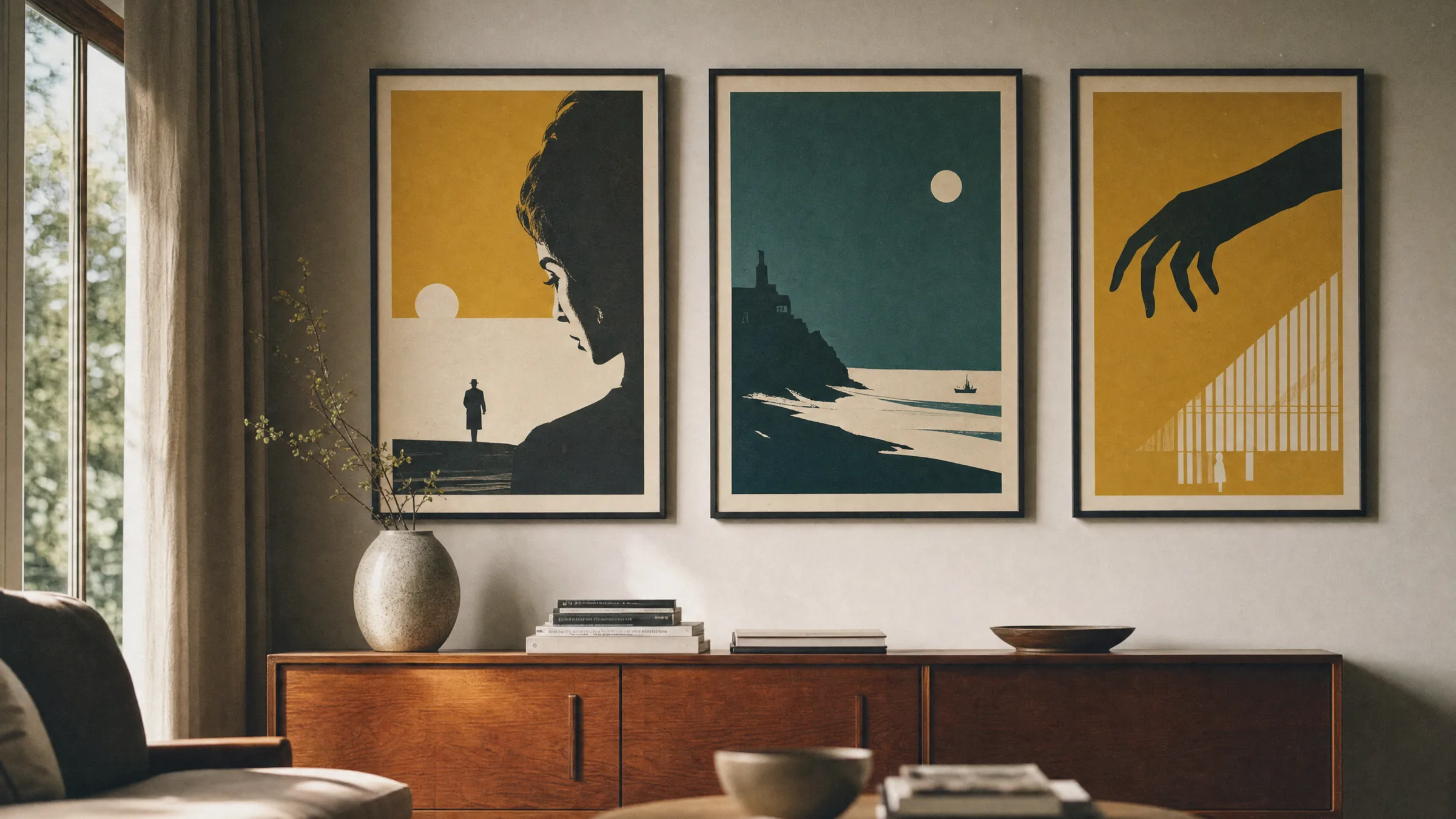
1960s Movie Posters: The Visual Language of a Defining Decade
The 1960s were a turning point for the cinema poster. Between Pop Art, illustration and photomontage, a visual language emerged that continues to shape interior spaces today. This overview covers motifs, techniques and collector questions, and offers guidance on choosing a reproduction that works in your home.
Why 1960s Movie Posters Still Hold Their Own
1960s movie posters occupy the space between traditional commercial graphic design and the emerging Pop Art movement. Illustrators such as Saul Bass, Robert McGinnis and the Polish school centred around Waldemar Świerzy shaped a decade that worked with reduced silhouettes, bold flat colours and typographic experimentation. Unlike the smooth photographic retouching of later decades, these works carry a visible authorial hand.
At the same time, subject matter and production conditions were changing rapidly: James Bond films, Spaghetti Westerns, the French Nouvelle Vague and British social dramas each called for their own visual world. Posters responded with collage, drawn portraits and a new appetite for empty space. It is precisely this contrast between motif and negative space that makes them so adaptable on contemporary walls.
Four Design Movements in 1960s Movie Posters
1960s movie posters can be broadly grouped into four directions. Knowing the differences makes it easier to find a motif that suits your own interior style.
Pop Art Influence
Clean flat fields, halftone dots and comic-like outlines define many US posters. Motifs are graphic, work with a limited colour range, and combine well with contemporary mid-century furniture.
Polish School
The Polish poster style interprets films symbolically rather than commercially. Painterly gestures, unusual colour gradients and hand-drawn typography produce independent artworks far removed from straightforward film advertising.
Italian Photo-Illustration
Italian poster painters such as Renato Casaro merged painted portraits with dynamic compositions. Warm colours, cinematic perspectives and large-scale faces dominate — well suited to walls that aim to tell a story.
French Graphic Design
French film posters combined photography with clean serif typography. They tend to read as quieter than their US counterparts today, and sit naturally in Scandinavian-influenced, pared-back interiors.
Motifs, Colours and Formats in 1960s Movie Posters
In terms of colour, 1960s movie posters are dominated by broken reds, mustard yellow, teal and deep black. Pure primary colours appear mainly in a Pop Art context, while European examples more often favour muted, almost painterly palettes. This colour world sits quietly alongside spaces featuring wood, linen or raw plaster.
Formats range from the French Grande (120 × 160 cm) and the Italian Due Fogli to the US One-Sheet (approx. 69 × 104 cm). For home walls, slender portrait formats are generally easier to hang than very wide landscape sheets. A large-format poster works particularly well as a solo piece above a sofa; smaller formats can be combined into a curated row.
Anyone planning several motifs side by side should look for a common thread — a shared colour family, decade or genre. Without one, the pieces compete rather than complement each other.
A good film poster from the sixties does not explain the film — it translates it into a single image. That is precisely why it works on a wall as an independent work of art.
Reetro Editorial
Original, Reprint or Reproduction: Placing 1960s Movie Posters in Context
Original theatrical posters from the 1960s are now sought-after collector's items. They carry fold marks, light yellowing and the printing screens of their era — characteristics that add appeal for collectors but demand careful handling in everyday settings. Prices vary considerably depending on the film, country of origin and condition.
Reprints from later print runs are less expensive but not always clearly labelled as such. Anyone who simply wants the visual world of 1960s movie posters in their home is usually better served by a cleanly licensed or public-domain reproduction printed to a solid technical standard. Paper weight, colour accuracy and a format suited to the room are the deciding factors.
A note on presentation: matte paper of 200 g/m² or heavier reads more calmly with these motifs than glossy surfaces, because it preserves the characteristic illustrative quality rather than pushing it in a photographic direction. Reetro's posters are printed to order by our production partner in the EU on FSC-certified papers with a matte coating for exactly this reason.
Häufige Fragen
-
01
What are the defining design qualities of 1960s movie posters?
1960s movie posters combine an illustrative hand with typographic experimentation. Characteristic features include reduced silhouettes, bold flat colours, collage and painted portraits. Styles vary noticeably by country: US examples often show Pop Art influences, Polish posters work symbolically and painterly, Italian releases favour painted film scenes, and French designs lean on calm photo-illustration. What unites them is a deliberate use of negative space and a visible authorial signature — qualities that subsequent decades rarely produced in quite the same way.
-
02
Which illustrators defined 1960s movie poster design?
Among the best-known names are Saul Bass, who distilled entire films into reduced symbols, and Robert McGinnis, whose elegant figure portraits defined the early Bond posters in particular. In Poland, Waldemar Świerzy, Jan Lenica and Roman Cieślewicz produced independent interpretations of both Western and Eastern European films. In Italy, Renato Casaro was highly influential. These artists typically worked by drawing rather than photography, treating the poster as an independent graphic task rather than a purely commercial vehicle.
-
03
Do 1960s movie posters work in modern interiors?
Yes — precisely because the colour palettes of 1960s movie posters tend to be muted and the compositions leave generous negative space, they integrate well into pared-back contemporary rooms. They work especially well against light walls and alongside materials such as wood, linen or natural stone. A single large format can carry an entire wall on its own; several smaller pieces can be hung as a curated series. A shared visual thread — colour family, genre or decade — is important so the motifs speak to each other rather than compete.
-
04
How can I tell whether a poster is a genuine original from the 1960s?
Originals show typical signs of age: a centre fold, slight yellowing, a visible offset printing screen and country-specific formats such as the French Grande or the US One-Sheet. The reverse often carries censor stamps or printer details. Without experience the attribution is difficult, since reprints from the 1970s and 1980s can display similar characteristics. Anyone wanting certainty should buy through a specialist auction house with provenance documentation. For everyday wall display, a clearly labelled reproduction is usually the more practical choice.
-
05
What format suits the wall above a sofa?
Above a standard sofa of around 200 cm in width, a single portrait-format piece between 70 × 100 cm and 100 × 140 cm generally looks well-proportioned. The lower edge of the frame should sit roughly 20 to 30 cm above the sofa back. Anyone combining several 1960s movie posters should plan with consistent frames and a defined gap between pieces. Landscape formats work when the motif width reaches at least two-thirds of the sofa width — otherwise the image can appear lost on the wall.
-
06
What should I look for in a printed reproduction?
For motifs with an illustrative character, matte paper from 200 g/m² upwards is recommended: it keeps flat colour areas calm and avoids reflections. Glossy surfaces alter the feel and can make drawn lines appear harsher than intended. Reetro prints its posters to order through its production partner in the EU on FSC-certified papers with a matte coating, with careful attention to colour-accurate reproduction of the original palette. This preserves the character of the source artwork — whether as a classic poster, a premium canvas print or a hexagon aluminium panel.