Vintage Movie Poster: Style Directions, Motifs and Wall Display
A vintage movie poster is more than nostalgic decoration. It draws on the visual language of classic cinema bills — from hand-drawn illustrations of the 1950s to stripped-back typographic layouts of the late 1970s — and brings that language into a contemporary living environment. This guide provides an editorial overview of style eras, print qualities and hanging options.
What defines a vintage movie poster stylistically
The term vintage movie poster covers poster designs that originated between the 1940s and the late 1980s, or that consciously quote the visual language of those decades. Characteristic features include hand-painted illustrations, grainy offset printing, muted colour palettes and the distinctive film typography of each era. Unlike today's digitally composed key visuals, these posters lived by draughtsmanship and a clear hierarchy of title, main image and credit block.
Within this category several distinct currents can be identified: film-noir posters with hard chiaroscuro contrasts, Polish and Czechoslovak film posters with a surreal visual language, Italian fotobusta prints, and the psychedelic layouts of the late 1960s. Each of these schools produces a different effect on the wall and suits different interiors.
Choosing a vintage movie poster is therefore less a decision about a particular film than about a graphic sensibility. A Saul Bass layout reads as graphically reduced and sits well alongside mid-century furniture, while an Italian poster from the 1960s is denser and more colourful, making it better suited to lively living spaces.
Four typical style directions in the vintage movie poster
The following four currents appear most frequently in collections and can be combined well according to room and furnishing style.
Film noir of the 1940s–50s
Monochrome to sepia-toned motifs, hard shadows, bold title lettering. Works with restraint in studies and libraries furnished with dark wood tones.
Mid-century graphic posters
Flat illustrations, clear geometry, a calm colour palette. Designers like Saul Bass defined this school. Pairs well with furniture from the 1950s and 60s.
Polish school
Surreal, often hand-painted motifs with a poetic visual language. A very distinctive presence; works well as a single statement piece above a sideboard.
1970s illustration
Warm earth and mustard tones, soft airbrush aesthetic, playful typography. Works in living rooms with natural materials and corduroy upholstery.
Format, paper and print quality
The impact of a vintage movie poster depends substantially on the substrate. Original cinema posters were typically printed by offset on relatively thin paper, which produced characteristic halftone dots and slightly washed-out tones. Modern reproductions aim to reference that quality in a controlled way without tipping into muddy print results.
For display in a domestic interior, a matte paper of at least 200 g/m² is recommended. Matte coatings reduce reflections — important for detailed poster motifs — and reinforce the quiet, almost chalky character of classic illustration prints. Glossy surfaces tend to feel out of place with these designs.
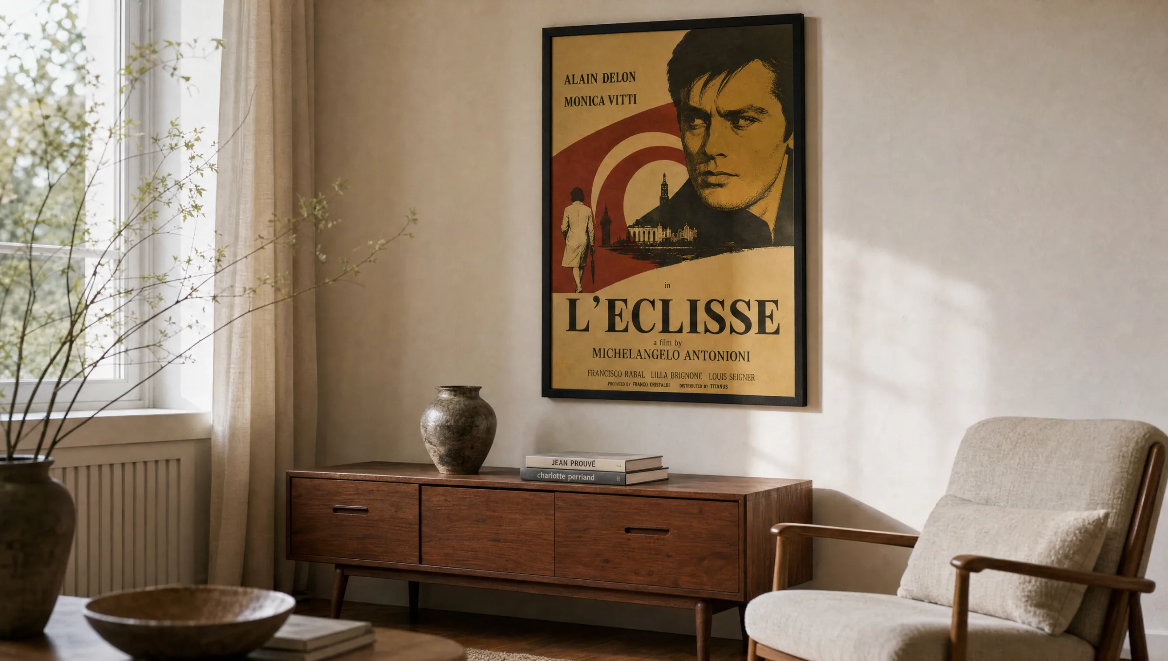
Typical formats range from the classic A2 for single-motif pieces to large-format prints around 70 × 100 cm, which reference the original dimensions of many cinema bills. Those planning a salon-style arrangement tend to work with smaller formats; a single piece above a sofa benefits from larger dimensions.
A good vintage movie poster does not show the film — it shows an attitude. Graphic, typographic, sometimes poetic. It works even if you have never seen the picture.
Reetro Editorial
Hanging and combining vintage movie posters
When hanging, bear in mind that film posters have a strong vertical reading direction because of their title block. They should therefore be positioned so that the typography sits at eye level — meaning the centre of the image roughly 145 to 150 cm from the floor. In home cinema rooms, a denser, gallery-style arrangement works well; in living rooms, single pieces read more calmly.
A vintage movie poster suits simple dark-wood or black aluminium frames. Off-white mounts emphasise the poster character, while frameless hanging reinforces the impression of an authentic cinema bill. When combining several posters, a common denominator helps — the same era, the same colour register or the same frame colour.
In rented homes, larger formats can be hung without drilling, using picture rails or wall-mounted ledges. Narrow portrait formats suit hallways by drawing the eye along the space; in open-plan kitchen-living areas, a single large-format piece reads more quietly than a dense grouping.
Care and longevity
The inks used in modern reproductions are considerably more lightfast than those of post-war originals. Even so, posters should not hang in direct sunlight, as magenta and yellow tones can fade over the years. A position on a side wall with indirect natural light noticeably extends colour fidelity.
Frames with anti-reflective glass or UV-protective acrylic are particularly worthwhile for large-format pieces that receive prolonged daylight exposure. Dust can be removed from matte paper surfaces with a dry, soft microfibre cloth; damp wiping should be avoided so as not to stress the coating.
Häufige Fragen
-
01
What sets a vintage movie poster apart from a modern cinema poster?
A vintage movie poster draws on the visual language of cinema bills from the 1940s through to the late 1980s. Typical features are hand-drawn illustrations rather than photographic composites, muted colour palettes, visible halftone dots and a clear typographic hierarchy of film title, main image and credit block. Modern cinema posters, by contrast, generally rely on retouched portrait photography and smooth digital gradients. The vintage character therefore comes less from the age of a print than from its graphic sensibility.
-
02
Which rooms suit a vintage movie poster?
In principle any living space where the typography can be read at eye level. Living rooms with mid-century furniture, studies, home cinema rooms and longer hallways all work particularly well. In kitchens and bathrooms, be mindful of moisture and temperature fluctuations. Prolonged direct sunlight should be avoided as printing inks can fade over time. A position on a side wall with indirect natural light is ideal.
-
03
What size makes sense for a vintage movie poster?
For hanging above a sofa or sideboard, formats from around 50 × 70 cm upwards are appropriate. Those wishing to reference the original dimensions of classic cinema bills should consider 70 × 100 cm. Smaller formats such as A3 or A2 work well in groups — for example in a salon-style arrangement of several posters from the same era. The key factor is the relationship to the furniture below: the poster should cover roughly two-thirds of the width of the piece of furniture beneath it.
-
04
How should a vintage movie poster be framed?
Simple frames in dark wood, black aluminium or natural oak emphasise the poster character without competing with the motif. An off-white mount pushes the image back slightly and gives a gallery feel; frameless hanging is closer to an authentic cinema bill. Anti-reflective glass reduces glare and is recommended for detailed illustrations. When combining several vintage movie posters, keeping at least the frame colour consistent helps unify the arrangement.
-
05
How do you care for a quality vintage movie poster over the long term?
Matte-coated paper prints can be dusted with a dry, soft microfibre cloth. Damp wiping or cleaning agents are unnecessary and can damage the surface. A stable indoor climate without strong humidity fluctuations and a position away from direct sunlight are the most important factors. Frames with UV-protective glass extend colour fidelity further. Reetro prints its posters in Germany on FSC-certified papers of at least 200 g/m² with a matte coating, which keeps everyday care straightforward.