
Movie Poster: Motifs, Formats and Wall Impact
A movie poster is more than a film memento. It carries graphic history, typography and the visual language of its era. This page offers editorial guidance on formats, motifs, papers and how to integrate a film poster thoughtfully into living rooms, hallways or a home cinema.
What Makes a Good Movie Poster
A movie poster lives by reduction. Where a film has two hours to tell its story, the poster must work in seconds. The classic hallmarks are a central motif, a clear typographic hierarchy of title and credits, and a colour palette that carries the mood of the film — from warm earth tones in a Western to cool blue in science fiction.
In editorial terms, three criteria matter most: the graphic independence of the motif, the quality of the typography, and the balance between illustration and photography. Historical posters from the 1950s through the 1970s were largely illustrative, while later decades were defined by the photo-montage look. Both traditions have their place — what counts is that the poster functions as a self-contained image, even without any prior knowledge of the film.
Popular Motif Groups for Movie Posters
Film posters can be grouped into several distinct design traditions. These categories help with selection when a poster needs to function not only as a film reference but also as a piece of wall art in its own right.
Classic Hollywood Posters
Illustrative compositions from the 1940s to 1960s with hand-drawn portraits, dramatic gradients and opulent typography. Work particularly well in rooms with dark wall colours or wood panelling.
European Art-House Cinema
Restrained graphic design from France, Italy and Poland. Often featuring collaged elements, unusual cropping and a typographic sensibility that suits minimalist interiors.
Genre and Cult Films
Science fiction, horror and neo-noir with expressive colour. These movie posters set deliberate accents and function well as a focal point in home cinemas, hallways or studies.
Modern Alternative Posters
Film posters reinterpreted by graphic designers, usually in limited editions. They combine illustration with typographic clarity and pair well with contemporary art.
Formats and Papers for a Movie Poster
Historic cinema formats such as the US One Sheet (69 × 104 cm) or the French Grande (120 × 160 cm) still carry collector value. For home use, however, standardised sizes such as 50 × 70 cm, 61 × 91.5 cm or 70 × 100 cm are more practical, since matching frames and mounts are easier to source. Those wanting to make a bolder statement with a large wall can consider XXL formats from 100 × 140 cm upwards.
When it comes to paper, it is worth paying attention to weight and surface finish. A movie poster on matte, uncoated paper of at least 200 g/m² appears particularly calm, since reflections under ceiling light are eliminated. Semi-matte coatings increase contrast for dark motifs without adding gloss. Gloss papers are better suited to small-format collector prints.
For rooms with high humidity or direct sunlight, an aluminium dibond panel or a mounted canvas is a more suitable alternative to paper. Both materials are dimensionally stable, do not warp and retain their colour depth over many years.
A good film poster works like a short story: it shows just enough to spark curiosity — and leaves just enough open to reward every glance anew.
Reetro Editorial
Framing and Hanging: Presenting a Movie Poster
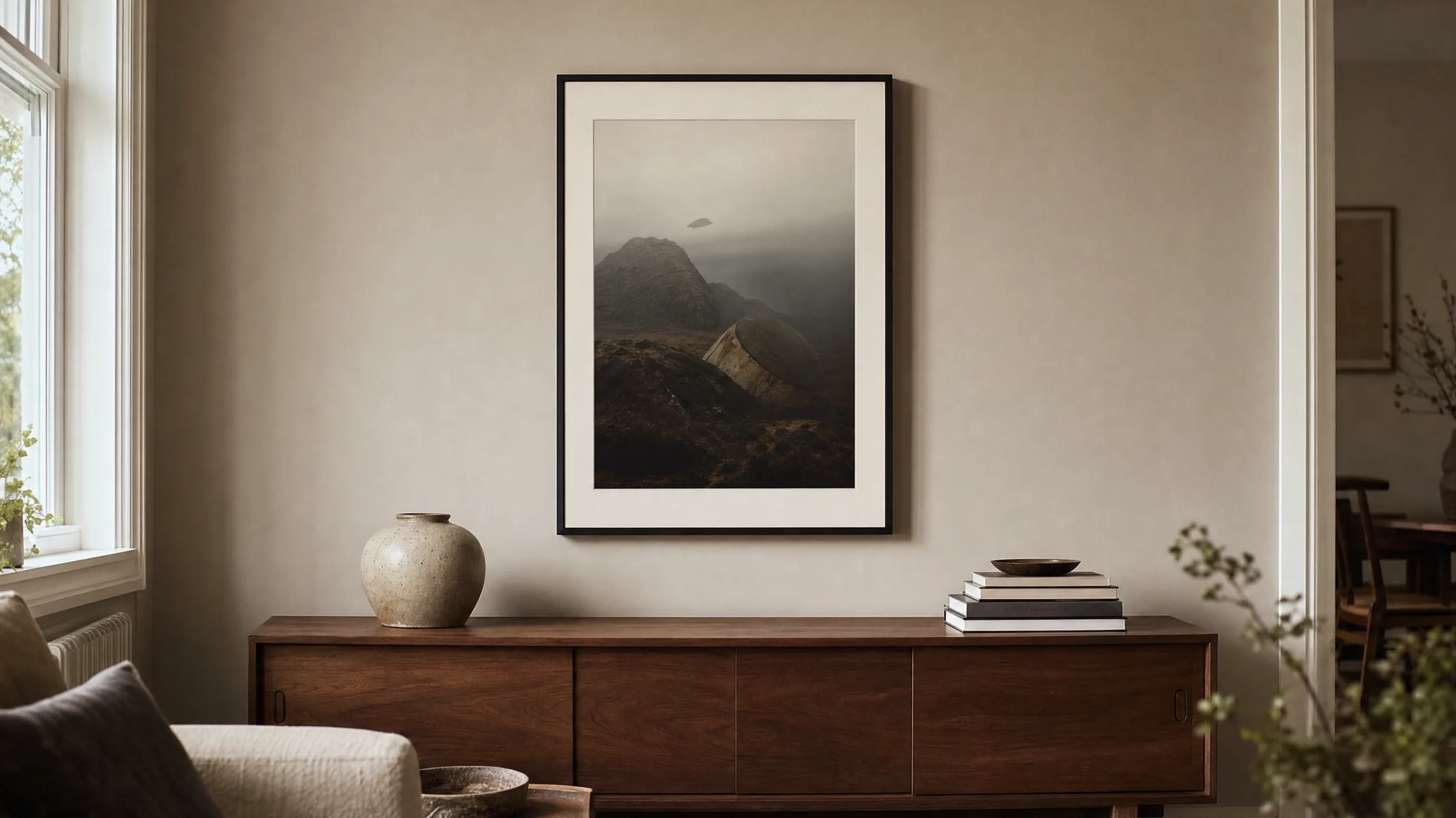
The choice of frame significantly affects the impact of a film poster. Narrow black aluminium mouldings are understated and draw the eye to the motif — ideal for graphically restrained posters. Oak or walnut frames bring illustrative posters from the 1960s into a domestic setting and harmonise well with warm wall colours.
A mount of three to five centimetres gives the poster breathing room and at the same time protects the paper from direct contact with the glass. For particularly colour-dense motifs, anti-reflective museum glass can be worthwhile, as it reduces reflections without distorting colours.
For hanging, the general rule is that the centre of the image should sit at eye level — typically around 145 to 150 cm from the floor. In hallways and stairwells a movie poster can hang slightly lower, as it is usually viewed in passing. In home cinemas, a salon-style arrangement of several smaller posters tends to work better than a single large format.
Combining a Movie Poster with Other Works
Film posters combine well with photography, typographic prints and abstract motifs. A shared visual language is important — for example a recurring colour, a consistent frame material or a similar graphic density. Anyone displaying several posters should aim for uniform frame widths to achieve a composed overall effect.
In minimalist rooms, a single large-format movie poster as a standalone piece is often enough. In more collection-style curated walls, five to nine motifs can be arranged in a grid. The spacing between frames should be consistent — four to six centimetres has proven reliable in practice.
Häufige Fragen
-
01
What format works best for a movie poster in a living room?
For living rooms, 50 × 70 cm and 70 × 100 cm have become established sizes, as they are compatible with standardised frames and mounts. A 61 × 91.5 cm poster corresponds to the classic US One Sheet format and works well above sofas or sideboards. Those wanting to make a stronger statement on a bare wall can also opt for XXL formats from 100 × 140 cm upwards. Smaller formats under 30 × 40 cm are better suited to grouped arrangements of several motifs, for example in hallways or stairwells.
-
02
How do I protect a movie poster from fading?
Fading is caused primarily by UV radiation — that is, direct sunlight. A movie poster should therefore not hang opposite large south-facing windows. A frame with UV-protective or museum glass reduces the exposure considerably. The printing method also matters: pigment-based inks on acid-free paper of at least 200 g/m² are significantly more lightfast than conventional offset prints on thin paper. For maximum longevity, an aluminium wall panel is a practical option — it requires no glass and reflects less light.
-
03
Does a movie poster work in a modern living room?
Yes, a movie poster integrates well into modern interiors when both the motif and the framing are chosen with restraint. Graphically reduced posters from European art-house cinema or contemporary alternative poster series sit comfortably alongside purist spaces, dark wall colours and furniture in natural wood or steel. A consistent visual language is key: if the room already features abstract or typographic works, the film poster should correspond to them in colour. A narrow black aluminium frame tends to feel more cohesive in such contexts than an ornate wooden moulding.
-
04
What paper is best for printing a movie poster?
For a high-quality movie poster, matte uncoated paper with a weight of at least 200 g/m² is recommended. It does not reflect ceiling light and allows colours to appear calm and even. Semi-matte papers increase contrast for dark motifs without adding gloss. Fully glossy paper is more appropriate for small-format collector prints, as it can appear restless at larger sizes. Acid-free composition and FSC-certified fibres are also important — both contribute to longevity and consistent colour reproduction over many years. Reetro has all posters printed to order by our production partner in the EU to these standards.
-
05
At what height should a film poster be hung?
As a rule of thumb, the centre of the image should sit at eye level — approximately 145 to 150 cm from the floor. Above sofas and sideboards, the lower edge of the frame should begin around 20 to 30 cm above the furniture, so the picture does not appear to float. In hallways and stairwells, a poster can hang a little lower, as it is typically viewed in passing. In grouped arrangements, it is the imagined central axis of the overall composition that defines eye level, not any individual motif.
-
06
What does Reetro consider when producing movie posters?
Reetro has posters printed to order by our production partner in the EU on FSC-certified paper of at least 200 g/m² with a matte surface and pigment-based inks. This combination produces a calm, low-reflection result and high lightfastness. For large-format motifs and rooms with higher humidity, we also offer premium canvases and aluminium wall panels that do not warp and require no glass. Every motif is editorially curated — we see ourselves less as a marketplace and more as the publisher of a carefully assembled collection of wall art.