The National Park Service’s Unigrid brochures are one of those everyday printed objects that are easy to underrate. They were not boutique editions, but visitor handouts for a large public system. That is precisely what makes them interesting. According to the National Park Service, Publications Chief Vincent Gleason sought a more efficient and cost-effective solution in 1977 for the many differently designed park brochures and brought in designer Massimo Vignelli. The core idea, then, was not decoration but order.
What makes Unigrid specific as a printed object
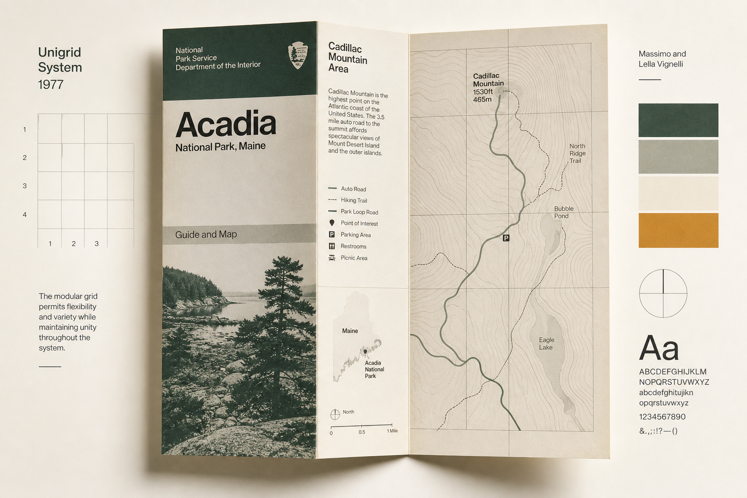
The NPS describes the system very precisely: its basic building blocks are 4 × 8¼ inch panels defined by the fold lines. Paper can be one or two panels wide and up to six panels long, calculated to make the most of a standard 25 × 38 inch press sheet and minimize waste. This is where graphic design becomes a production system. The sheet looks calm and clear because format, folding, and print economy were conceived together from the start.
More than a grid: a national visual language
The National Design Studio history page summarizes the achievement well: Massimo and Lella Vignelli’s Unigrid system brought coherence to National Park Service brochures by standardizing layout, type, grid, and format across hundreds of publications. That is the key point. Unigrid is not simply an attractive look for one brochure, but a print logic that ties many very different places together in readable form — from a small historic house to a vast landscape park.
Typography, repetition, recognition
The typographic base is documented too. The National Park Service lists Helvetica and Times Roman as the system’s original typefaces. Combined with the recurring fold modules, that helps explain why the brochures feel so factual without becoming dry. The underlying grid sets physical boundaries for elements while, according to the NPS, still allowing a great deal of flexibility. Two brochures of the same size can therefore look quite different and still read immediately as part of the same family.
A system that lasted
Several sources show that these printed materials worked not only administratively but also as design. The NPS notes that the 1978 brochure for Clara Barton National Historic Site was the first park brochure to use Unigrid. The RIT Vignelli Center adds that hundreds of NPS designers have used the system for more than four decades to provide maps and information to visitors. In 1985, the program also received an early Presidential Design Award. So the brochure was neither a one-off experiment nor mere bureaucracy, but an unusually durable piece of public print culture.
Why it fits Reetro
For Reetro, what is appealing about Unigrid is how modest and disciplined the brochures are at the same time. No pathos, no collector pose — just paper, folds, maps, images, and typography held in clean balance. If that attitude appeals to you, it often leads to large-format posters or more quietly staged canvas prints where clarity matters more than overload. Unigrid shows how beautiful a printed object can become when it does not hide function, but gives it form.