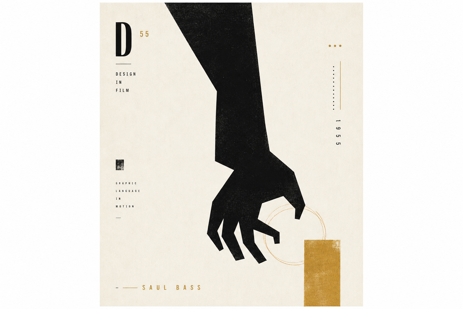
Some printed objects do more than refresh a motif; they change what a whole medium can look like. Saul Bass’s poster for The Man with the Golden Arm belongs in that category. AGI notes that the film poster and title sequence Bass created for Otto Preminger’s 1955 film made him widely known in the film industry. That already says a lot: the poster was not mere support material, but part of a visual approach that reorganized how cinema could communicate graphically.
A symbol instead of a star
What remains striking is how radically Bass reduced the sheet. The Denver Art Museum describes the image as part of the first full visual identity program created for a motion picture — posters, marketing materials, and other communications developed from one design logic. Denver also stresses that Bass was known for simple, powerful graphic images that conveyed the essence of a subject. Here, that essence is condensed into a single dominant sign: the jagged arm.
Why that arm works so well
The Movie Poster Art Gallery describes the arm as a jagged cut-out form used as the central image of the campaign. The same source underlines how unusual that move was in Hollywood: instead of putting the stars at the center, Bass placed a symbol first. That matters for a printed object. The poster does not narrate the plot in detail; it compresses mood and conflict into one shape that can be grasped at a glance and remembered long after.
Film graphics as a connected system
Today it feels normal when a film poster, title sequence, and marketing pieces belong to the same visual world. That is why the Denver Art Museum’s historical note matters: it presents The Man with the Golden Arm as an early, integrated identity program for a film. Read together with AGI’s emphasis on the poster and title sequence, the object becomes more than a successful one-sheet. It is evidence of Bass treating print, motion, and promotion as parts of one coherent graphic system.
Why it fits Reetro
What feels especially relevant for Reetro is how little the poster needs in order to stay powerful: one uneasy silhouette, hard contrast, generous emptiness, and a sign that sets a clear attitude immediately. If you respond to that kind of controlled graphic sharpness, it often leads to large-format posters or to crisply staged framed pieces that do not need to illustrate everything. Bass shows how a printed object lasts longest when it does not over-persuade, but lands precisely.