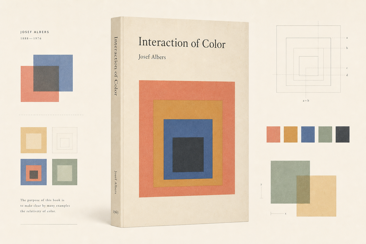
Interaction of Color matters to Reetro because a teaching book behaves here like a precisely composed print experiment in its own right. Yale University Press describes the work as a handbook and teaching aid for artists, instructors, and students. The same source also notes that the first edition appeared in 1963 as a limited silkscreen edition with 150 color plates. This is not incidental book production, but a printed object that materializes its own argument about color.
A handbook built as a color experiment
The Yale anniversary edition makes the starting point unusually clear: Interaction of Color was originally published in 1963 as a limited silkscreen edition with 150 color plates. That alone pushes the book away from being merely theoretical text. A book that explains color through sequences of printed plates turns print into demonstration. That is what makes it especially relevant for Reetro: print is not just the wrapper for an idea here, but the actual experimental setup.
The bibliographic trail of the first edition
Open Library lists Interaction of Color as a 1963 publication from Yale University Press, and the work page likewise gives 1963 as the first publication year. Together with the German National Library search record, that creates a clean bibliographic line for the object. For design books, that matters: format, process, and edition history are often part of the argument itself.
From limited set to long circulation
Yale also states that the book first appeared in paperback in 1971, then with ten color studies selected by Albers, and that it has remained in print ever since. The same page credits the various editions since 1963 with sales of more than a quarter of a million copies. That shifts Interaction of Color from an elaborate teaching edition into broader print circulation without losing its character as a working book. That movement between rare color plate object and widely read design manual is a large part of what still makes the title notable.
Why it fits Reetro
Interaction of Color fits Reetro because it shows how lightness and discipline can live on the same page. Squares, margins, white space, and calibrated color tension are enough to build a full visual world. If that kind of restraint appeals to you, it often leads to calm posters or graphically clear framed pieces where proportion and color carry more weight than illustration in the narrow sense. As a 1963 book, Interaction of Color remains a strong example of how printed design can bring thinking, seeing, and material into the same order.