Herbert Matter (1907–1984) revolutionized Swiss tourism posters from the 1930s onwards by being the first to consistently use photomontage as a design tool, thereby redefining the visual language of the modern travel poster. What Matter developed at the time on behalf of the Swiss National Tourist Office was no ordinary advertising job: he combined documentary photography with free image composition to create something that had never existed before. His posters hung not only in train stations, but also on the wall of Alexey Brodovitch, the most influential art director in America in the 1950s. That shows how far the influence of this work reached. For anyone who wants to understand how visual culture navigates between art and commerce, Matter’s story remains one of the most relevant case studies of the 20th century.
Herbert Matter and the Swiss Tourism Poster: Photomontage as a Design Revolution
Herbert Matter, born in 1907 in the Swiss mountain village of Engelberg, fundamentally transformed the tourism poster of the 1930s. Using the technique of photomontage, he reinvented the Swiss travel poster and created images that wove documentation and commercial intent so tightly together that it was nearly impossible to say where one ended and the other began.
The Key Fact: Photography as a Design Tool
Matter was not a pure poster illustrator. He was a photographer, graphic designer, and filmmaker all in one. According to his official biography, he experimented with the Rolleiflex camera as a design instrument and expressive means of communication. This dual role of the camera — as both a technical recording device and a creative tool — was extraordinary for the time.
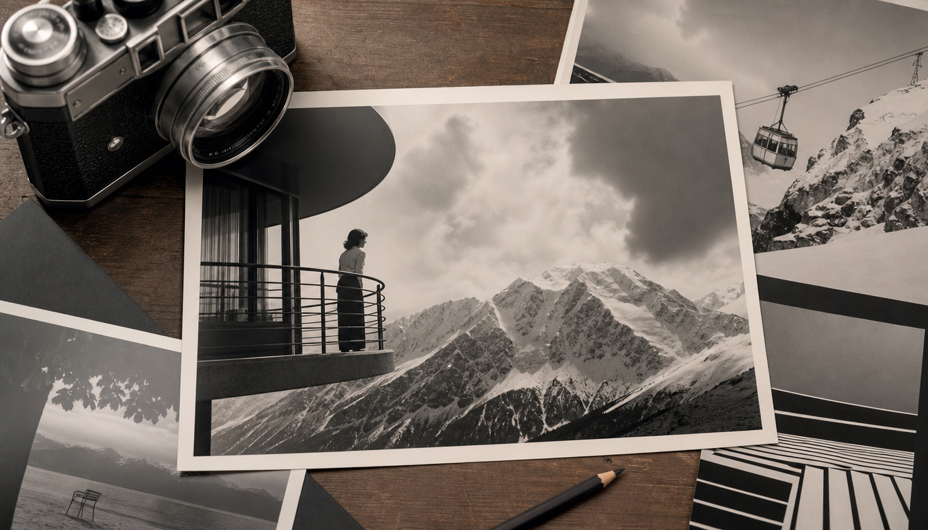
The posters he designed for the Swiss National Tourist Office combined photographic reality with graphic elevation. Mountains, skiers, and Alpine panoramas were not painted but photographed and then reassembled. The result had, as his biography puts it, “the beauty and intensity of Cassandre and the geometric perfection of Corbusier” combined with an unmistakably personal signature.
Alexey Brodovitch, one of the most influential art directors of the 20th century, collected these Swiss travel posters. Two of them hung in his studio. That says more about the quality of this work than any award ever could.
Between Document and Staging
What makes Matter’s work so fascinating is the tension it sustains. Photomontage was a radically new technique at the time. It promised authenticity because it was based on photographs, while simultaneously creating images that never existed in reality. A giant face set against an Alpine panorama, a hand appearing to hold a landscape, skiers leaping over road signs at oversized scale.
This was not documentation. It was commercially motivated image manipulation that exploited the public’s trust in photography. And it worked.
Galerie 1 2 3 describes him simply as: “He reinvented the Swiss tourism poster of the 1930s with the technique of photomontage.”
In 1952, Matter was appointed to Yale University as a professor of photography and graphic design. Academic recognition came late — but it came.
4 Practical Food for Thought for Vintage Poster Enthusiasts
1. Photomontage is not a flaw — it’s a method. Buying a vintage travel poster rarely means buying a documentary photograph. Matter’s work shows that the combination of photography and graphic design is a distinct artistic category in its own right. The way we look at classic travel posters changes once you know how much deliberate craft lies behind seemingly spontaneous images.
2. Tourism posters are historical documents. Matter’s Swiss posters from the 1930s reveal what a society wanted to project to the outside world. Not what was, but what should be. Anyone hanging a retro travel poster on their wall today is hanging a filtered view of an era — not a neutral representation.
3. Modernism and commerce are not mutually exclusive. Matter worked for state tourism offices and thereby shaped the visual identity of entire countries. His style was modern; his clients were conservative institutions. This shows that great design often emerges on commission — not in spite of it, but precisely because of it. Those who value design quality will find this same attitude reflected in Bauhaus posters or vintage advertising posters.
4. Format and impact go hand in hand. Matter’s posters were large, bold, and made for public spaces. Anyone seeking a similar effect in a living space should think carefully about format. A vintage-style canvas print or an XXL poster creates a very different energy than a small framed picture. Matter knew this. He used scale as a design tool.
Sources
- Biography – Herbert Matter® Official Site
- Herbert Matter posters – Selections – Galerie 1 2 3
- Anatomy of Logos | Herbert Matter (1907–1984) – Facebook
FAQ
Who was Herbert Matter and why is he considered a pioneer of the Swiss tourism poster?
Herbert Matter was born in 1907 in the Swiss mountain village of Engelberg, where he grew up surrounded by one of the two most significant medieval graphic collections in Europe. As a photographer, graphic designer, and filmmaker, he revolutionized the Swiss tourism poster in the 1930s by employing the technique of photomontage. His posters for the Swiss National Tourist Office combined the visual language of Cassandre with the geometric precision of Le Corbusier and an entirely unique, unmistakable personal signature.
What makes Herbert Matter's photomontage technique so distinctive?
Matter experimented with the Rolleiflex camera both as a pure design tool and as an expressive means of communication. He combined documentary, imaginative, and manipulative photography into a new type of image that was simply revolutionary for its time. The result were posters that simultaneously informed and emotionally engaged the viewer. Journalistic objectivity and free visual invention converged in one and the same image.
How did Herbert Matter come to the United States and what role did Alexey Brodovitch play?
A friend working at the Museum of Modern Art advised Matter to seek out Alexey Brodovitch. Brodovitch had already collected Matter’s Swiss travel posters — two of them hung on the wall of his studio. This encounter opened the door for Matter into the American design and photography scene. Brodovitch was at the time one of the most influential art directors working, and his interest in Matter’s work was no coincidental stroke of luck, but a clear signal of quality.
When did Herbert Matter begin teaching at a university and where?
In 1952, Matter was invited by Eisenman to join Yale University as a professor of photography and graphic design. Yale was at the time a central hub for design education in the United States. Matter contributed to shaping a generation of designers who went on to advance American Modernism.
Does Matter's work stand more for documentation or for commercial communication?
The answer is: both at once — and that is precisely the point. Matter deliberately explored the space between objective photographic documentation and targeted commercial image manipulation. His tourism posters depicted the Swiss Alpine world and its people, but always through the lens of a designer who knew exactly what message needed to land. This tension between authenticity and staging is what makes his work relevant to this day.