Fact feels relevant for Reetro because the magazine pairs the sharpness of its content with an equally sharp printed attitude. The Online Books Page at the University of Pennsylvania lists Fact as a full online archive covering 1964 to 1967 and names Ralph Ginzburg as editor. Even that concise bibliographic frame matters: this was not a stray issue, but a clearly bounded editorial project of the mid-1960s.
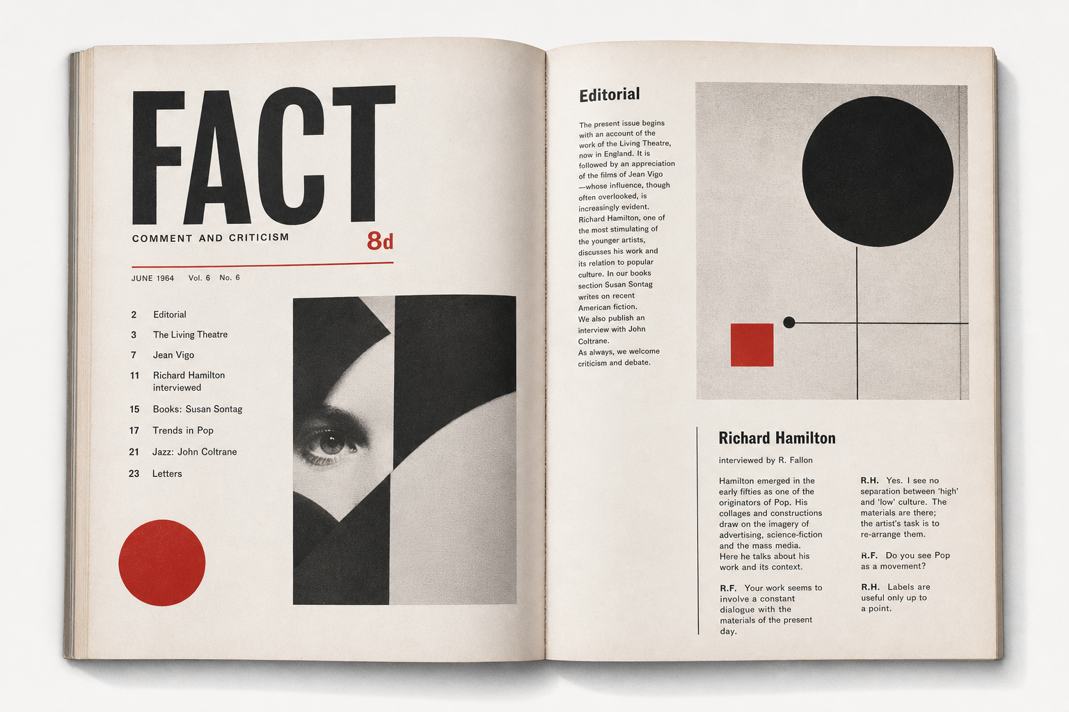
A magazine built on the Ginzburg-Lubalin axis
Design Is History places Fact within the collaboration of Ralph Ginzburg and Herb Lubalin alongside Eros and Avant Garde. That matters for Reetro because the magazine can be read not only politically but graphically: as a printed object in which editorial design, typography, and argumentative force work closely together. In that sense, Fact feels less like neutral reporting than like a deliberately shaped magazine with a visible point of view.
1964 to 1967, cleanly documented
The Penn listing fixes the run succinctly at 1964 to 1967. Design Is History adds the editorial frame, describing Fact as a shift away from the sexuality and intimacy of Eros toward culture and politics. Taken together, the sources produce a surprisingly precise picture: not a sprawling mass-market illustrated title, but a relatively short-lived and tightly focused magazine that compressed its themes into a distinct editorial surface.
The Goldwater issue as a concrete print object
Fact becomes especially tangible through the Internet Archive copy titled 322479204 Fact Magazine Goldwater 1964. The archive describes it as a controversial 1964 issue in which psychiatrists offered opinions on presidential candidate Barry Goldwater’s psychological fitness. Design Is History connects that editorial move to the later legal case and notes that punitive damages in the Goldwater suit contributed to the end of the magazine. For Reetro, what matters is not just the controversy but the material force of an issue that pressed debate into print form.
Why it fits Reetro
Fact fits Reetro because it shows how strong a printed surface can become when it is not decorative but exact. If you respond to that mix of black-and-white calm, typographic precision, and taut editorial tension, it often leads to crisp posters or restrained framed art where contrast, white space, and point of view matter more than noise. As a 1960s print object, Fact is a reminder that a magazine can carry information and still read as a graphic position in its own right.