Jazz Poster: Motifs, Materials and Editorial Context
A jazz poster is more than simple wall decoration — it carries the history of a musical tradition that has shaped rooms, clubs and record sleeves for over a century. This overview outlines which motifs have stood the test of time, what matters when it comes to print quality, and how jazz imagery can be thoughtfully placed within a living space.
What defines a jazz poster
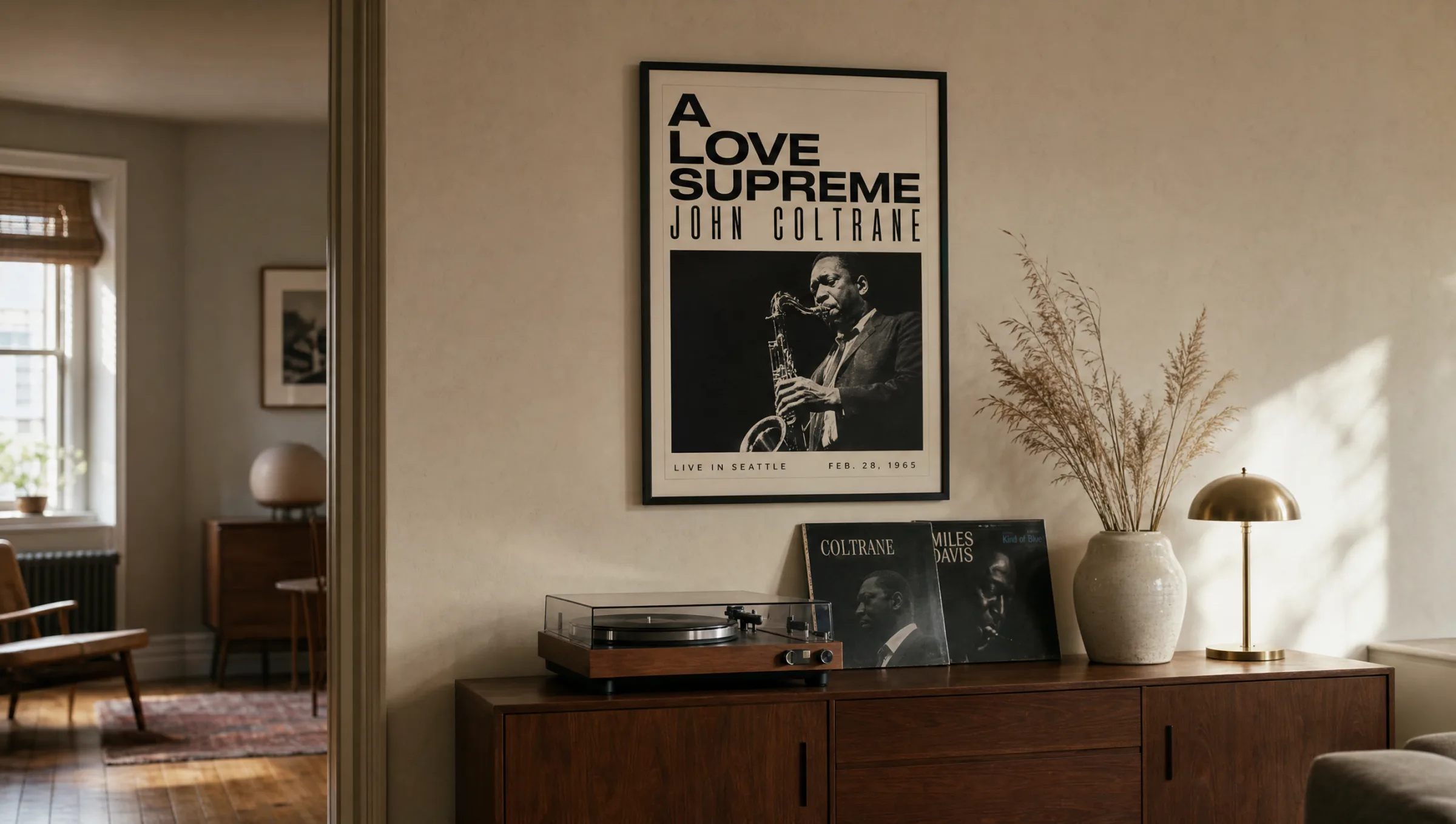
A jazz poster draws its strength from the tension between graphic restraint and musical depth. The iconic posters of the 1950s and 1960s — above all the work of Reid Miles for Blue Note Records — established a visual language that still resonates today: high contrast, black-and-white photographic portraits, selectively used accent colours, and a typographic rigour that calls to mind Bauhaus and the Swiss Style.
In terms of content, the genre spans concert and festival posters, album cover reproductions, abstract instrument illustrations, and portrait-like depictions of defining musicians. This breadth allows for very different effects: a reduced saxophone motif reads as minimalist, while a concert poster from New Orleans feels narrative and colour-rich.
Choosing a jazz poster is therefore not only a musical decision but also a design one. It is worth deciding in advance whether the motif should serve as a quiet accent or as the central focal point on the wall.
Typical motif groups for a jazz poster
The main motif families can be divided into four groups. Each has its own visual character and suits different interior situations.
Portraits of musicians
Black-and-white photographs of Miles Davis, John Coltrane or Ella Fitzgerald are among the most sought-after motifs. They feel classic and timeless, and work equally well in period apartments and pared-back, minimalist rooms.
Concert and festival posters
Reproductions of historic posters — from the Newport Jazz Festival or Montreux, for instance — bring typographic variety and bold colour into the picture. They work well as a standalone piece above a sideboard or sofa.
Instruments and abstract forms
Reduced depictions of a saxophone, double bass or trumpet function as graphic elements. These motifs integrate quietly into existing gallery walls without overloading the room.
Album covers in the Blue Note style
Cover reproductions with clear typography and a photographic visual language connect music history with graphic design. They are particularly effective in multi-print arrangements or as part of a gallery wall.
Formats and materials for a jazz poster
The choice of format has a significant influence on the overall effect. Classic concert posters were historically printed at 50 × 70 cm or 70 × 100 cm — these proportions still feel the most authentic today. For portrait motifs, square formats also work well, as they draw the eye more centrally.
When it comes to materials, it is worth paying attention to paper weight and surface finish. Matte paper from 200 g/m² upward softens the harshness of a black-and-white photograph and lets typographic elements sit with precision. Semi-matte coatings are a good compromise when the motif is colour-rich and can carry a little more depth.
A high-gloss finish tends to be too reflective for jazz motifs and strips the composition of the calm, matter-of-fact quality that defines the genre. Anyone hanging a jazz poster in a living space should also consider lightfastness, so that black tones remain deep over the years. Reetro prints on FSC-certified papers in Germany, with matte coatings that meet these standards.
A good jazz poster works like a solo instrument: restrained in gesture, but precise in every detail.
Reetro Editorial
Framing and placement in the room
A narrow black wooden frame is the most common choice and reinforces the typographic rigour of many jazz poster motifs. Natural wood feels warmer and suits concert posters with earthy colour tones better. For album cover reproductions, a white frame with a mount can strengthen the gallery character of the piece.
On placement: above sideboards, record players or in a hallway, jazz imagery tends to have the most impact because it is encountered incidentally rather than deliberately. In a study, reduced instrument illustrations work well; in a living room, narrative concert posters can be hung at a larger scale.
When displaying several prints together, a consistent frame family and a clear grid are advisable. This turns a collection of individual motifs into a curated wall arrangement that is more than the sum of its parts.
Combining a jazz poster in a gallery wall
Anyone combining a jazz poster with other works should look for a shared tonality. Black-and-white photographs from architecture or street life often harmonise better than colourful illustrations, because they pick up the calm visual language common to many jazz motifs.
A reliable approach: one dominant main motif in a large format, complemented by two or three smaller works in a related colour palette. This keeps the jazz poster as the narrative anchor without it being lost in an overcrowded wall.
Häufige Fragen
-
01
What format works best for a jazz poster?
Historically authentic formats are 50 × 70 cm and 70 × 100 cm, as concert and festival posters were traditionally printed in these sizes. For portrait and album cover motifs, 30 × 40 cm or square formats also work well, especially in multi-print arrangements. Large formats from 70 × 100 cm upward make a strong impression when the jazz poster is intended as the central wall accent — above a sofa or sideboard, for example. A practical rule of thumb is that the print should span roughly two thirds of the width of any furniture placed beneath it.
-
02
Which motifs are most popular for a jazz poster?
The most in-demand motifs are portraits of iconic musicians such as Miles Davis, John Coltrane, Billie Holiday and Ella Fitzgerald, typically in black-and-white. Reproductions of historic concert posters — from festivals in Montreux, Newport or Montreal — are also widely chosen, as are album covers in the Blue Note style with strong typography. Reduced illustrations of instruments such as the saxophone, double bass or trumpet are a popular option when the motif needs to sit discreetly within an existing interior.
-
03
What frame suits a jazz poster?
A narrow black wooden frame is the classic and usually the safest choice, as it supports the typographic rigour of many jazz poster designs. Natural wood — oak or ash, for instance — feels warmer and suits posters with earthy or warm colour tones. For album cover reproductions, a white frame with an additional mount can reinforce the gallery quality of the piece. Ornate or gold-finished frames are best avoided, as they work against the reduced character typical of jazz graphic design.
-
04
How do I care for a printed jazz poster over time?
Direct sunlight should be avoided, as UV light can gradually reduce the depth of black tones over the years. A position opposite a window rather than directly in front of one is often preferable. The surface of a framed print can be cleaned with a dry microfibre cloth; for more stubborn marks on the glass, a slightly damp cloth works well. Unframed prints should be stored flat rather than rolled for extended periods, so the paper retains its flatness.
-
05
What print quality should a high-quality jazz poster have?
Matte or semi-matte paper with a weight of at least 200 g/m², ideally FSC-certified, is the recommended standard. This quality gives fine typographic lines and the tonal values of classic black-and-white photography sufficient depth without any surface reflection. Reetro prints its jazz posters in Germany on FSC-certified papers with a matte coating, producing high-contrast, lightfast prints that do justice to the graphic clarity of historic jazz imagery and retain their colour depth over many years.