
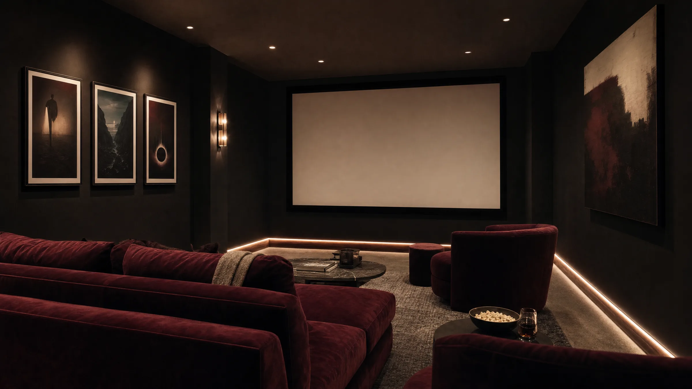
Home Cinema Decor: Wall Art, Posters and Materials for Your Private Movie Room
A private movie room lives not only from technology but from atmosphere. The right home cinema decor absorbs light, structures the walls and gives the space a narrative layer. This overview covers which motifs, formats and materials have proved their worth — and what to keep in mind when it comes to arrangement and lighting.
What Makes Good Home Cinema Decor
A home cinema is a room with a particular lighting situation: dimmed, often with dark wall colours, attention directed at the screen. Decor must respect this context. Images that are too bright or highly reflective create distraction; formats that are too small look lost. Matte surfaces, calm motifs and formats suited to the wall space beside and behind the seating are the sensible choices.
Classic motifs for home cinema decor include film posters, abstract colour studies, minimalist typography and atmospheric black-and-white photography. Graphic reductions of well-known scenes or film quotes have also established themselves. A considered selection matters: three to five carefully curated works almost always read more strongly than a wall densely packed with posters.
Motif Categories for Home Cinema Decor
Four directions that have proved themselves in private movie rooms and combine well with one another.
Reduced Film Posters
Graphically restrained interpretations of well-known films rather than loud original advertising artwork. Quiet colour palettes and clear typography sit naturally in dark rooms without pulling the eye away from the screen.
Abstract Colour Fields
Large-format gradients in bordeaux, anthracite, deep green or muted blue pick up on classic cinema colours and read as calm wall surfaces beside speakers and seating.
Analogue Photography
Black-and-white or sepia photographs of old picture houses, projectors and set details strike a quietly nostalgic tone without tipping into kitsch.
Typography and Quotes
Understated film quotes or chapter numbers work well as graphic anchor points — in an entrance area, beside a bar, or next to the seating arrangement.
Formats, Materials and Surfaces
In dimmed rooms, freedom from glare is essential. Matte surfaces are therefore almost always the better choice over glossy finishes. FSC-certified papers from 200 g/m² upwards with a matte coating give colours depth without producing reflections. Premium canvas prints likewise read as calm and unobtrusive thanks to their lightly textured surface, and can be hung without frames.
Formats depend on wall length and seating distance. Narrow portrait formats have proved their worth beside the projection wall; on the side walls, generous landscape formats from 100 × 70 cm work well. Anyone wishing to accent the wall behind the seating can opt for XXL posters or a grouping of three equal-sized works. Hexagon aluminium prints suit loose clusters in peripheral areas such as a bar or hallway. All Reetro prints are made in Germany on FSC-certified premium papers.
Home cinema decor should carry the room, not compete with it: what happens on the screen remains the main event — the walls are simply the stage.
Reetro Editorial
Arrangement, Lighting and Acoustics
Prints hung behind or beside the screen should be positioned so that they are not illuminated during playback. Indirect LED strips with warm-white light gently highlight frames and edges without disturbing the projection contrast. For intervals and entrance areas, dimmable wall sconces that accent individual pieces are a sensible option.
An often overlooked point: posters and canvas prints also have an acoustic effect. Textile surfaces and large-format canvas pieces can lightly dampen high frequencies and settle walls prone to flutter echo. They do not replace professional acoustic treatment, but they support its effect — especially in smaller rooms with many hard, smooth surfaces.
For hanging height, a reliable rule is to align the centre of the image with eye level in the seated position — meaning considerably lower than in a standing living room. This keeps the gaze relaxed on entering the room and allows the decor to fall naturally into the sightline.
Common Mistakes in Home Cinema Decor
The most frequent mistake is overcrowding: too many posters, too many motifs, too many themes. A home cinema gains in calm when a clear visual language dominates — for example, exclusively black-and-white, or a limited colour palette. Equally problematic are glossy glass frames placed directly beside the screen: they catch stray light and produce visible reflections during projection.
Formats that are too small on large, dark walls also look out of place. If in doubt, hold paper cut-outs in the intended size against the wall and assess the proportions from the seating position before ordering or drilling.
Häufige Fragen
-
01
What motifs work well for home cinema decor?
Reduced film posters, abstract colour fields in dark tones, analogue black-and-white photography and understated typography have all proved their worth. A consistent visual language is key: choose a colour palette or a single stylistic direction and stick with it. Three to five carefully selected works almost always read more strongly in a movie room than many colourful posters side by side. Original advertising artwork with loud colours can distract from the viewing experience and tends to suit an entrance area or bar better.
-
02
Which materials are suitable for home cinema decor?
In dimmed rooms, matte surfaces are almost always the better choice. FSC-certified papers from 200 g/m² with a matte coating, premium canvas prints or matte aluminium prints reflect very little stray light and do not interfere with the projection. Avoid glossy glass frames in close proximity to the screen, as they can produce visible reflections. Textile surfaces such as canvas also have a light dampening effect on high frequencies, which is a useful side benefit in rooms with hard walls.
-
03
How large should prints be in a home cinema?
This depends on wall space and seating distance. For side walls beside the seating group, landscape formats from 100 × 70 cm are appropriate; for an accented wall behind the sofa, XXL posters from 120 cm along the longest edge work well. Narrow portrait formats are effective beside speaker columns. A reliable rule of thumb: the print should occupy roughly two-thirds of the free wall width above a piece of furniture. When uncertain, a paper cut-out in the target size held against the wall makes for a useful test before committing.
-
04
How should wall art be hung in a movie room?
In a home cinema, the centre of the image should be aligned with eye level in the seated position, not the standing position — typically around 110 to 120 cm from the floor. Keep spacing between frames consistent: 5 to 8 cm reads as calm and considered. Prints placed directly beside the screen should be positioned so they are not lit during playback. Indirect warm-white light can then highlight them subtly during intervals.
-
05
Does home cinema decor affect projection quality?
Only if chosen poorly. Bright, glossy or reflective surfaces near the screen can bounce stray light and reduce the contrast of the projected image. Matte, dark motifs do not have this effect. Where possible, the walls immediately beside the screen should be left clear or dressed with particularly dark, matte works. Decor on the side walls behind the field of view is entirely unproblematic.
-
06
How do you recognise quality prints for a movie room?
Look for a paper weight of at least 200 g/m², matte or satin-matte coatings, colour-accurate printing and clean cut edges. Certifications such as FSC indicate responsible paper sourcing. At Reetro, printing takes place in Germany on FSC-certified premium papers with a matte surface; canvas prints and hexagon aluminium panels are also available, and these can be combined to create a cohesive home cinema decor scheme across different zones of the room.