Hilma af Klint Poster for Living Spaces and Studios
A Hilma af Klint poster brings the Swedish painter's spiritual-abstract world into everyday surroundings. This guide maps her most important series, explains the differences between formats and paper qualities, and offers practical advice on choosing the right motif for living rooms, workspaces and gallery-style interiors.
Why Hilma af Klint Is in Demand Again
Hilma af Klint (1862–1944) was producing large-scale abstract compositions as early as 1906 — years before Kandinsky, Malevich or Mondrian made the same leap. It was not until the Guggenheim retrospective of 2018/19 that her work reached a broad public. Since then, demand for reproductions has grown steadily.
Her visual language combines botanical studies, geometric diagrams and symbols drawn from Theosophy and Anthroposophy. This mixture explains why a Hilma af Klint poster works equally well in a spare, minimally furnished period apartment, a yoga studio, a clinic or a creative workspace: the motifs read as both graphically clear and open to interpretation.
Key Series Available as a Hilma af Klint Poster
The selection below focuses on four series that are visually particularly distinctive and have proven themselves in a range of interior contexts.
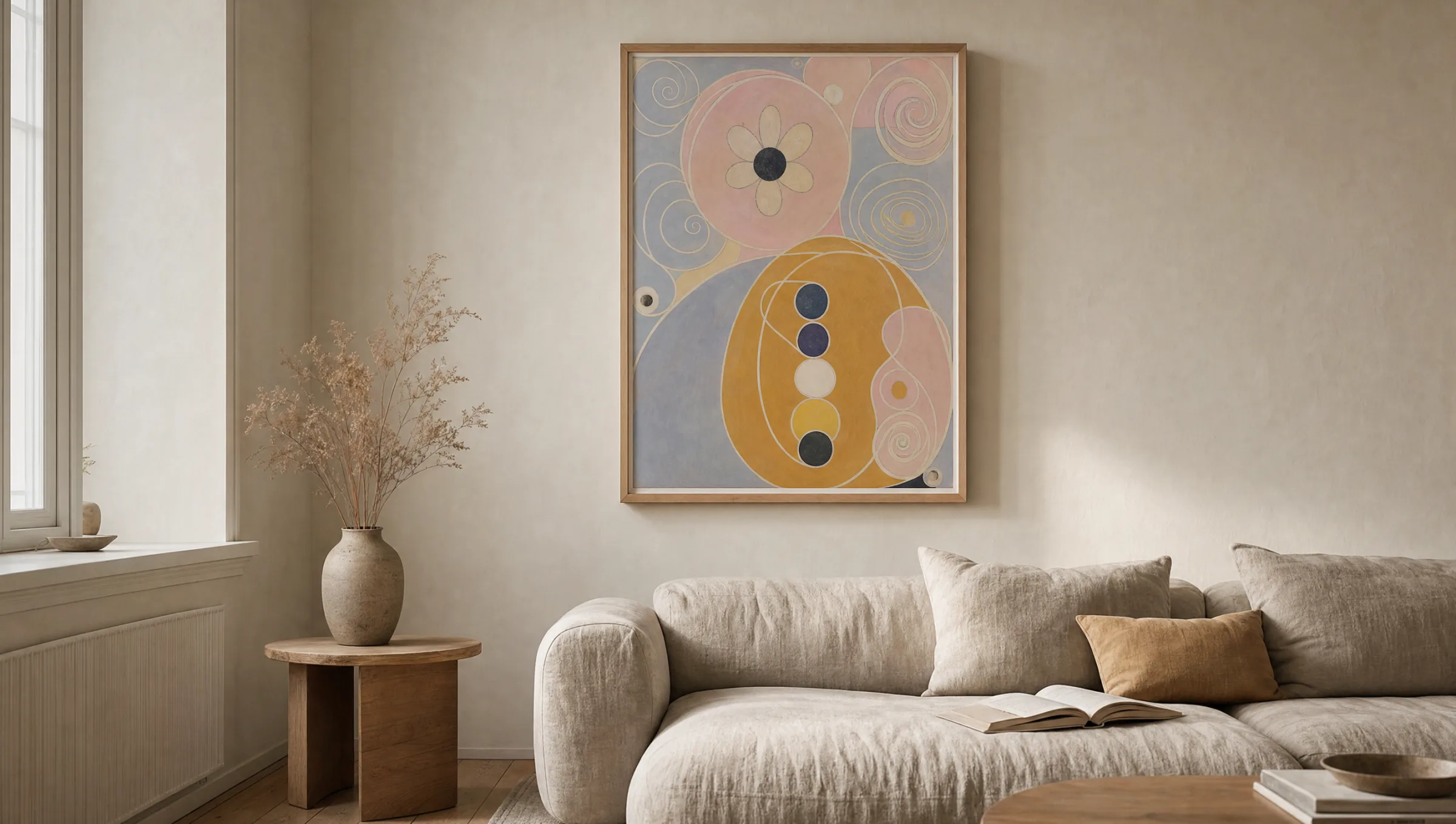
The Ten Largest (1907)
Monumental panels representing the four stages of life. Soft pinks, blues and ochre tones, organic spirals and letter fragments. Ideal as a single large-format piece above a sofa or bed.
The Swan Series (1914–15)
17 paintings that move from figurative swans toward pure geometry. No. 17 in particular, with its bisected circle in black and white, is widely chosen as a minimalist poster.
The Altar Paintings (1915)
Three panels featuring a triangle, circle and concentric rings in gold, red and blue. Work well as a triptych or as a single centrally placed motif.
Evolution / WUS Series
Smaller formats with floral and symbolic elements. Well suited to grouped arrangements, hallways and areas where several motifs are to be combined.
Formats and Paper: What Matters for a Hilma af Klint Poster
Some of the originals stand over three metres tall. A reproduction should at least hint at the generosity of scale inherent in the compositions. For works from The Ten Largest, formats from 70 × 100 cm upwards are recommended; XXL prints up to 100 × 140 cm restore something closer to the paintings' true presence.
Because many motifs rely on delicate pastel areas, the choice of paper is critical. A matte FSC-certified paper of at least 200 g/m² absorbs subtle gradations softly and avoids reflections. Gloss papers can make geometric works like the Swan Series appear more technical and become distracting under raking light.
Anyone hanging a Hilma af Klint poster in a bright room should look for pigment-based printing. The characteristic pink and lilac tones are sensitive to UV light and fade faster with standard dye inks than stronger primary colours do. Reetro prints its posters in Germany on 250 g/m² certified matte paper with pigment inks, which improves both colour fidelity and longevity.
The pictures were painted directly through me, without any preliminary drawings and with great force. I had no idea what the paintings were supposed to depict; nevertheless I worked swiftly and surely, without changing a single brushstroke.
Hilma af Klint, Notebooks
Hanging and Combining Hilma af Klint Posters in a Room
A single large Hilma af Klint poster benefits from generous wall space around it. At least 30 cm of clearance from furniture edges and neighbouring works allows the composition to breathe. The centre of the motif ideally sits at eye level, roughly 145–150 cm from the floor.
For grouped arrangements, works from the Swan or Altar series work particularly well because they share a recognisable formal kinship. Three motifs in the same format, spaced 5–8 cm apart, form a calm row. Mixing with photography or contemporary graphic prints is possible, but the colours should echo the pastel palette of the source works.
In offices and consulting rooms, the geometric phase tends to be the better choice — the later Swan paintings or the Parsifal Series, for instance. They read as more focused and do not compete visually with desks, bookshelves or treatment furniture.
Framing: Simple and Understated
Narrow wooden frames in natural oak, black or white are the standard choice. Oak frames complement the warm earth tones of the early panels; black profiles sharpen the geometric motifs. A mount board is not essential if the print is set up with no white border — with af Klint, the image edges are part of the composition.
Anti-reflective glass is worth considering for positions opposite windows. With aluminium-mounted prints or directly laminated canvases the question of glass does not arise; here, a matte surface coating should be specified instead.
Häufige Fragen
-
01
What format works best for a Hilma af Klint poster?
It depends on the motif. Works from The Ten Largest need room to breathe and only become fully convincing from 70 × 100 cm upwards; XXL prints up to 100 × 140 cm come closest to the original proportions. The geometric Swan or Altar paintings also work well at 50 × 70 cm, especially in a row or as a triptych. For hallways and secondary rooms, smaller formats around 30 × 40 cm are a sensible option when several motifs are combined.
-
02
Are Hilma af Klint posters in the public domain?
Hilma af Klint died in 1944, and her work has been in the public domain in most countries since 2015. Reproductions of her paintings may therefore be legally printed and sold as posters. The foundation that manages her archive in Stockholm holds no remaining copyright over individual motifs. That said, print quality is still worth checking when buying: high-resolution source files produce far better results than the low-resolution images widely circulated online.
-
03
Which rooms suit which motifs?
The large-format pastel works are well suited to living rooms and bedrooms where they can function as the main piece. The geometric works from the Swan and Parsifal series are a better fit for home offices, clinics, studios and libraries. In very small or irregular rooms, the compositions can feel crowded — here a single smaller motif from the Evolution series is often the more considered choice.
-
04
How do I combine multiple Hilma af Klint posters?
The quietest result comes from a row of three motifs from the same series, in the same format and with identical frames — for example three Altar paintings or three works from the Swan Series. The gap between prints should be 5–8 cm. A salon-style hanging can accommodate works from different series, but the colours should be coordinated — either all pastel motifs or all works from the geometric phase, not both together.
-
05
What framing is recommended for a Hilma af Klint poster?
Simple, narrow wooden frames in oak, black or white work best. Oak supports the warm tones of the early panels; black sharpens the geometric motifs. A mount board is not strictly necessary when the print runs to the edge, since the borders are part of the composition. Anti-reflective glass is worthwhile if the piece hangs opposite a window. For those who prefer to avoid glass, premium canvas or matte aluminium mounting are good alternatives.
-
06
What should I look for in print quality?
The key factors are paper weight, coating and ink type. A matte FSC-certified paper of at least 200 g/m² renders the delicate colour gradations softly and eliminates reflections. Pigment-based inks are significantly more UV-resistant than standard dye inks — an important point because the pink and lilac areas in af Klint's work are prone to fading. Reetro prints its Hilma af Klint poster range in Germany on certified 250 g/m² matte paper with pigment inks, which markedly improves colour accuracy and durability.