Hilma af Klint Poster: Symbolism, Series and How to Hang Them
Hilma af Klint is now recognised as one of the earliest pioneers of abstract painting. Her visual worlds of spirals, plant forms and symbolic colour fields were created as early as 1906 — years before Kandinsky. This page maps her series of works and explains what matters when choosing a reproduction-worthy wall print.
Why a Hilma af Klint Poster Feels So Present Today
For a long time, Hilma af Klint was rarely shown in public. It was the exhibitions at Moderna Museet Stockholm (2013) and the Guggenheim New York (2018/19) that made her work accessible to a wider audience. Since then, a Hilma af Klint poster has become a fixture in contemporary wall arrangements — not as a nostalgic reference, but as a visual counterweight to purely decorative wall art.
Her visual language combines geometric clarity with organic forms. Circles, spirals and floral motifs are arranged in a distinctive, often pastel colour range. This combination reads as calm in a modern interior without feeling decoratively empty. Rooms with restrained wall colours — greige, off-white or sage — particularly benefit from the pictorial density of her compositions.
Key Series for a Hilma af Klint Poster
The artist worked in clearly structured series. When choosing a reproduction, it pays to select the series deliberately — it determines the format, the colour character and the effect in the room.
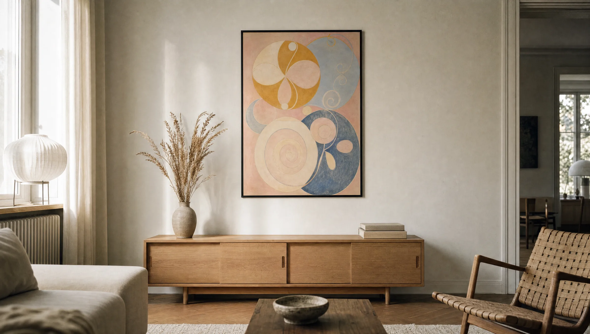
The Ten Largest (1907)
Monumental panels devoted to the stages of life. Sweeping plant forms, strong orange and deep blue — rich in content and colour presence, ideal as an XXL-format print.
The Swan Series (1914–15)
Reduced, almost geometric compositions of two figures in black and white and complementary colours. Works particularly well as a paired hanging.
The Altarpiece (1915)
Triangle and circle forms with colour gradients, gold and light symbolism. Concentrated in content, rigorous in form — best placed as a single, centrally positioned work.
Primordial Chaos & Evolution
Earlier series with dense symbolism, lettering and biological forms. Detail-rich — a larger format with high print resolution is well worth it here.
Format and Material: What Matters in Print
Hilma af Klint's originals are in some cases over three metres tall. A small A4 print feels almost inadequate to the scale of her ideas. Anyone wanting to capture the impact of the panel paintings should choose formats from 50 × 70 cm upwards — for The Ten Largest, 70 × 100 cm or larger is very much worth considering. Portrait format suits most series, as many compositions are vertically oriented.
The subtle colour gradients — transitions from rose to violet, or from pale blue to ochre — place real demands on paper and print quality. Matte FSC-certified paper from 200 g/m² upwards absorbs these gradients without distracting reflections. Glossy surfaces feel restless against af Klint's imagery; a subdued, paper-like impression is far closer to the original watercolour and tempera character of her work. Reetro prints are made in Germany on certified matte-coated stock for this reason.
The pictures were painted directly through me, without preliminary sketches, and with great force.
Hilma af Klint, Notebook 1906
Placing a Hilma af Klint Poster in a Room
In a living space, her works function particularly well above a clearly defined piece of furniture — a sideboard, sofa back or dining table. Spacing matters: the symbolism needs wall area around it, otherwise the composition becomes crowded. A practical rule of thumb is to leave at least half the picture width free on each side.
A salon-style grouping is also possible, but should stay within a single series. Two Swan pictures hung symmetrically create a calm axis; mixing an Altarpiece with a Primordial Chaos panel quickly feels like a list rather than a considered hanging. When in doubt, start with one centrally placed work and add to it later.
Framing is optional. A slim natural wood or black aluminium frame supports the geometric rigour of the works without giving them a historical costume. Mounts should be used sparingly with af Klint — they tend to detach the large panel paintings from their connection to the wall.
Häufige Fragen
-
01
Which motif is best for a first Hilma af Klint poster?
For a first purchase, a work from The Ten Largest series is a reliable starting point — typically No. 3 (Youth) or No. 7 (Adulthood). These pieces are tonally balanced, formally legible and work across many interior styles. The Swan Series is a strong second option, particularly when the room is restrained and a graphic, almost placard-like accent is wanted. Altarpiece works with gold elements carry a stronger sacred quality and are better suited once you are already familiar with her visual world.
-
02
What is the minimum size for a Hilma af Klint poster?
Her originals are often very large — The Ten Largest panels each measure approximately 328 × 240 cm. For a reproduction in a living space, 50 × 70 cm is the sensible minimum, as smaller formats compress the symbolism and fine linework too much. 70 × 100 cm or 100 × 140 cm give the compositions the room they need. For detail-rich works like the Primordial Chaos series, a larger format is especially worthwhile, keeping lettering and small forms legible.
-
03
Are af Klint's works in the public domain and free to reproduce?
Hilma af Klint died in 1944. In most European countries copyright expires 70 years after an artist's death, meaning her work has been in the public domain since 2015. Reproducing it as a poster is therefore legally unproblematic. The Hilma af Klint Foundation does, however, manage high-resolution original photographs and certain trademark rights, which is why reputable suppliers work with their own royalty-free image sources or museum digitisations.
-
04
Which paper suits af Klint's visual language?
Hilma af Klint worked primarily with watercolour and tempera on paper or canvas. A matte, lightly textured FSC fine-art paper from 200 g/m² upwards replicates this character most faithfully. Glossy photo papers feel too technical and reflect linework unfavourably. Reetro prints its art prints in Germany on certified paper with a matte surface coating — consistent with the original character of her work and ensuring stable colour reproduction over many years.
-
05
How do I combine several Hilma af Klint posters?
Staying within one series is usually the calmer solution. Two or three works from the Swan Series form a coherent row, as do two panels from The Ten Largest. Consistency in frame colour, spacing between works (8–10 cm) and format keeps the arrangement unified. Mixing very different series — an Altarpiece alongside a Primordial Chaos panel, for instance — tends to read as an inventory rather than a considered hanging.