
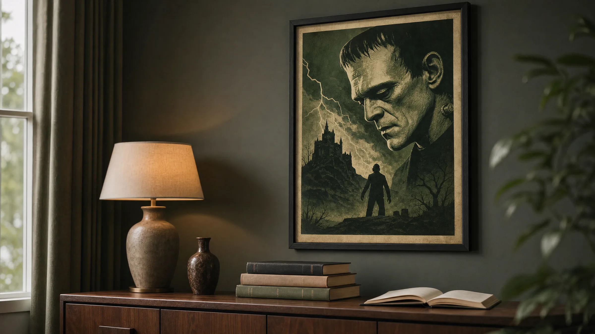
Frankenstein Poster: Motifs, Styles and Editorial Context
A frankenstein poster reaches back to one of modernity's most formative stories — somewhere between Mary Shelley's 1818 novel, Universal's 1930s cinema and the graphic legacy of classic film posters. This editorial overview maps the main motif families, print variants and contexts to help you place the subject clearly.
Why the Frankenstein Poster Still Resonates
Few figures from Gothic literature have left as long a visual trail as the creature from Mary Shelley's novel. More than a hundred years separate the first edition of 1818 from Boris Karloff's iconic portrayal in Universal's 1931 film — and yet both layers merge in the visual language we encounter today. The frankenstein poster is therefore less a pure film artefact than a cultural condensate: literary motif, cinema bill and graphic icon all at once.
Its visual power rests on a handful of very clear elements: the angular profile, the scarred brow, the grave stare. Combined with the typographic conventions of early sound cinema — curved or block titling, muted colour ranges, high contrast — the result is an image type that remains immediately readable even outside its original context.
Motif Directions for a Frankenstein Poster
Four motif families can be distinguished — each with its own graphic logic and appropriate wall contexts.
Classic Film Poster
Reproduced or reworked posters in the style of the 1930s: reduced colour palette, dramatic typography, often in sepia or green tones. Works well alongside dark wood furniture and warm ambient lighting.
Illustrative Portrait Study
Graphic head or half-length portraits of the creature, frequently rendered in ink lines, cross-hatching or a woodcut aesthetic. Calm, almost book-illustration in feel, and easy to combine with a reading corner.
Minimal Typographic Motif
Quotes from Shelley's novel or the title 'Frankenstein' as a pure type composition. Restrained, compatible with modern interiors and less explicit than figurative renderings.
Vintage Horror Collage
Several motifs — laboratory, lightning, silhouette — compressed into a single poster surface. Narrative, image-dense, suited to collector walls alongside other Universal Monsters prints.
Formats and Paper for a Frankenstein Poster
For a frankenstein poster, formats that follow the vertical logic of classic film posters work best. 50 × 70 cm is a reliable standard for living spaces; 70 × 100 cm brings the motif closer to the historical cinema format and reads well in hallways or above sideboards without dominating the room. XXL sizes from 100 × 140 cm upward suit open living areas where there is enough viewing distance.
On the paper side, matte FSC-certified fine-art paper from 200 g/m² upward has proved its worth, printed to order by our production partner in the EU to precise colour specifications. It holds the colour range of classic posters accurately without becoming reflective — a decisive point with dark image areas. Those looking for a slightly more graphic effect can choose papers with a subtle texture, which reinforces the printmaking quality of older film posters.
No other motif from Gothic Romanticism has translated as seamlessly from novel to cinema poster and onward into everyday aesthetics as Frankenstein's creature.
Reetro Editorial
Framing and Placement of a Frankenstein Poster
When it comes to framing, less tends to produce a cleaner result. Slim wooden frames in black, walnut or stained oak complement the historical character without overlaying the image. Mounts of two to four centimetres give particularly illustrative motifs room to breathe; classic film poster designs can also be framed edge to edge to preserve the original poster feel.
In terms of placement, the motif benefits from indirect, warm light. Direct ceiling spotlights tend to create hard reflections on dark greens and sepia tones. Above console tables, in reading corners or in library areas, a frankenstein poster develops its narrative quality without sliding into seasonal Halloween decoration — the subject carries through the whole year.
Häufige Fragen
-
01
What makes a good frankenstein poster?
A well-considered frankenstein poster balances recognisability with graphic restraint. It draws on iconic elements — the angular profile, the scarred brow, classic poster typography — without tipping into the overtly decorative. A coherent, muted colour palette, typically in sepia, green or grey tones, is important, as is a clean print resolution that holds fine lines and cross-hatching. Motifs that combine literary and cinematic references tend to age better than designs tied closely to seasonal Halloween graphics.
-
02
Which format works best for a frankenstein poster in a living room?
For living spaces, 50 × 70 cm and 70 × 100 cm are the most reliable choices. 50 × 70 cm works well in a gallery wall alongside other film prints or above a reading chair. 70 × 100 cm echoes the proportions of historical cinema posters and holds its own as a standalone piece above a sideboard or fireplace mantel. From 100 × 140 cm upward, allow at least two and a half metres of viewing distance so the motif does not feel overwhelming.
-
03
How do I frame a frankenstein poster appropriately?
Slim frames in black, dark-stained or walnut wood are recommended. They echo the colour world of classic posters without competing with the motif. For illustrative portrait studies, a mount of two to four centimetres creates a calm, gallery-like result; classic film poster formats can also be framed without a mount to retain the original poster feel. Anti-reflective glazing is worth considering for dark motifs, as it significantly reduces glare in the deeper image areas.
-
04
Does a frankenstein poster work outside of Halloween?
Yes. The subject belongs to Gothic Romanticism and has literary roots in the early nineteenth century, which carries year-round. Anyone wanting to avoid a direct association with Halloween décor should look to illustrative portrait studies, minimal typographic motifs featuring novel quotes, or posters with a restrained colour palette. Paired with bookshelves, dark wall colours and warm lighting, a frankenstein poster reads as a considered, narrative wall piece rather than seasonal decoration.
-
05
Which motifs combine well with a frankenstein poster?
Natural companions are other Universal Monsters prints such as Dracula or The Wolf Man, as well as graphic film posters from the film noir and Hitchcock sphere. For a more literary setting, portraits of Romantic-era authors, botanical studies from the nineteenth century or anatomical illustrations work well. A shared colour anchor — muted greens, sepia or grey tones — is important so the wall reads as a curated collection rather than a loose gathering of unrelated prints.
-
06
What does Reetro pay attention to when printing a frankenstein poster?
Our prints are printed to order by our production partner in the EU on FSC-certified fine-art papers from 200 g/m² with a matte coating. For dark, high-contrast motifs in particular, a low-reflection surface is essential so that cross-hatching, ink lines and deep blacks remain cleanly legible. Colour-accurate calibration ensures that sepia, green and grey tones stay close to the historical poster reference without artificial boosting. We offer formats from 30 × 40 cm through to the XXL range.