Rock Poster: Style Directions, Motifs and Hanging
Rock motifs on the wall are more than memorabilia — they condense a cultural attitude. This page offers an editorial overview of the rock poster: from typographic concert bills and photographic portraits through to abstract album-cover adaptations, with guidance on format, paper and framing.
What Defines the Rock Poster Today
The term rock poster spans a broad visual tradition that grew out of the concert bills of the late 1960s and extends into contemporary design language. Strong typography, clear colour contrasts and a graphic economy that turns the motif into an iconographic statement are the defining characteristics.
Older posters frequently relied on psychedelic distortions and hand-lettered typefaces, whereas contemporary designers take a quieter approach: monochrome portraits, precisely set band names and a layout that holds its own as an independent wall piece outside of any concert context. It is precisely this shift that makes the style interesting for living spaces.
Four Style Directions in Rock Poster Art
The following categories help narrow down a suitable motif for a given interior style. They differ in visual language, colour palette and the balance between typography and image.
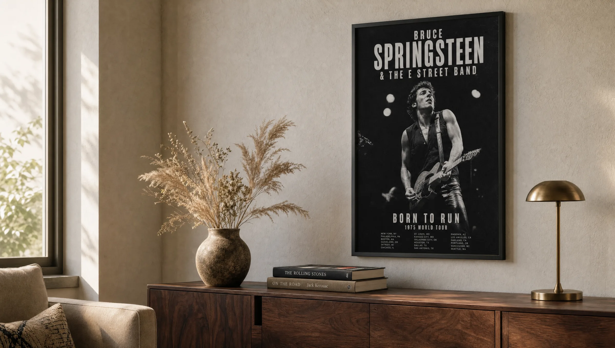
Classic Concert Bill
Tour dates, band logo and a central image — the classic gig poster lives through typography and the charm of specific details. It works particularly well in gallery walls alongside other printed graphics.
Photographic Portrait
Black-and-white shots of individual musicians or stage moments. This approach reads more quietly and pairs well with minimalist interiors and wooden frames.
Cover Adaptation
Graphic reinterpretations of iconic album covers, often reduced to a single symbol or colour field. Well suited to large-format hanging above a sofa or sideboard.
Typographic Lyrics
Song lyrics as typeset wall pieces. Typeface choice is key: serif antiqua fonts feel literary; geometric grotesks read as more contemporary.
Format and Paper for Rock Posters
For a rock poster motif, a format that supports the visual language without overwhelming it is worth choosing. 50 × 70 cm is a reliable standard size for single hangings above a desk or sideboard; 70 × 100 cm holds its own over sofas and in hallways. XXL formats from 100 × 140 cm make a clear visual statement and suit high walls in period-conversion apartments or lofts.
With paper, it is worth considering both weight and surface. FSC-certified sheets from 200 g/m² upwards with a matte coating reduce reflections and allow deep blacks to appear three-dimensional — an advantage with high-contrast concert photography. Gloss surfaces only make sense when the motif relies on bold, saturated colour fields.
Anyone wanting to hang poster prints without glass can opt for premium canvas or hexagonal aluminium. Both substrates reduce glare and give the motif an object-like presence on the wall without losing its graphic character. Reetro prints are made in Germany on FSC-certified paper to ensure lasting quality.
A good rock poster does not tell the whole story — it leaves room for your own memory of a song, an evening, a particular chapter.
Reetro Editorial
Framing and Hanging: Rock Posters in the Room
The choice of frame determines whether a rock poster reads as a collector's piece or as a furnishing object. Slim black aluminium mouldings emphasise the graphic character and suit typographically led posters. Natural oak frames, on the other hand, soften the harder edges of black-and-white photography and create a warm transition towards wooden furniture.
When arranging several posters, a consistent frame size or a clear central axis helps. A composed gallery wall emerges when all motifs share the same mount border — around 4 to 5 cm — and the midline of the arrangement sits at roughly 145 cm from the floor.
Above sofas, a useful rule of thumb is that the image width should be approximately two thirds of the sofa width. This anchors the poster visually without overwhelming the seating group.
Combining Rock Posters with Other Image Worlds
Rock poster motifs sit well alongside black-and-white photography, abstract print graphics and selected vintage reproductions. The combination with floral watercolours or pastel illustrations tends to be less successful — the different tonal registers compete rather than complement one another.
In home offices and studios, rock posters serve as an atmospheric anchor; in bedrooms, the quieter portrait or lyrics variants are generally preferable, since tour bills packed with dates can feel visually restless in a sleeping space.
Häufige Fragen
-
01
What size rock poster works best above a sofa?
Above a standard sofa between 200 and 220 cm wide, a single rock poster in the 70 × 100 cm format works very well. For a stronger presence, 100 × 140 cm is a natural step up. As a guide, the image width should not exceed roughly two thirds of the sofa width, so the wall does not feel overloaded. For a gallery wall of several smaller posters, 50 × 70 cm is easy to handle and leaves room to vary the arrangement.
-
02
Gloss or matte paper for a rock poster?
For rock posters, matte or satin-matte paper is the better choice in most cases. Concert photography and typographic motifs rely on deep blacks, which appear more three-dimensional on matte surfaces and produce no distracting reflections. Gloss paper is only a meaningful option when the motif is strongly colour-saturated and the added brilliance is a deliberate effect — for example with psychedelic concert bills from the late 1960s.
-
03
How do I hang several rock posters as a gallery wall?
Start by laying all framed posters on the floor and experimenting with the arrangement. A composed result comes from using frames of the same width with consistent gaps of 4 to 6 cm between each piece. The midline of the full composition should sit at around 145 cm from the floor, corresponding to average eye level. Ideally, avoid mixing portrait and landscape formats at random; instead, align them along a clear central axis for a cohesive look.
-
04
Do rock posters suit light, minimalist rooms?
Yes — often particularly well. In a light, pared-back interior, a single rock poster acts as a deliberate point of contrast. In that context, choose quieter motifs: monochrome portraits, typographic lyrics or graphic cover adaptations in no more than two colours. Slim oak or black aluminium frames maintain the minimalist character of the room without competing with the overall scheme.
-
05
How do I care for framed posters over the long term?
Hang posters away from direct sunlight, as UV exposure can fade colours over the years. Rooms with a stable relative humidity between 40 and 60 per cent are ideal. Dust frames regularly with a dry microfibre cloth; clean glass surfaces with a lightly dampened cloth and never use harsh cleaning agents. At Reetro, prints are produced in Germany on FSC-certified paper from 200 g/m² upwards with a matte coating, which supports both the light-fastness and the tactile quality of the motif.