The Most Beautiful Wall Art Selection for Considered Living Spaces
What truly makes a wall print work is rarely decided by the motif alone. Format, paper, frame and the wall itself all play a part. This page explores what distinguishes the most beautiful wall art selection — looking at style directions, materials and calm compositions suited to living rooms, hallways and work areas.
What Makes the Most Beautiful Wall Art Selection
A good wall print holds up to being seen every day. It does not impose itself, but unfolds its effect over weeks and months. The most beautiful wall art selection therefore does not begin with trends, but with the question of how a motif behaves in daylight, in the evening and in relation to furniture and textiles.
Three factors carry the most weight: the clarity of the composition, the depth of the colours and the quality of the materials. A restrained still life on matte fine-art paper can define a wall more strongly than a large, colour-saturated format — provided the proportions and hanging position are right.
At Reetro, every motif is reviewed editorially before being added to the range. This includes the print file, the colour profiles and its suitability across different formats. That way a consistent standard is maintained even as the catalogue grows.
Style Directions for the Most Beautiful Wall Art Collection
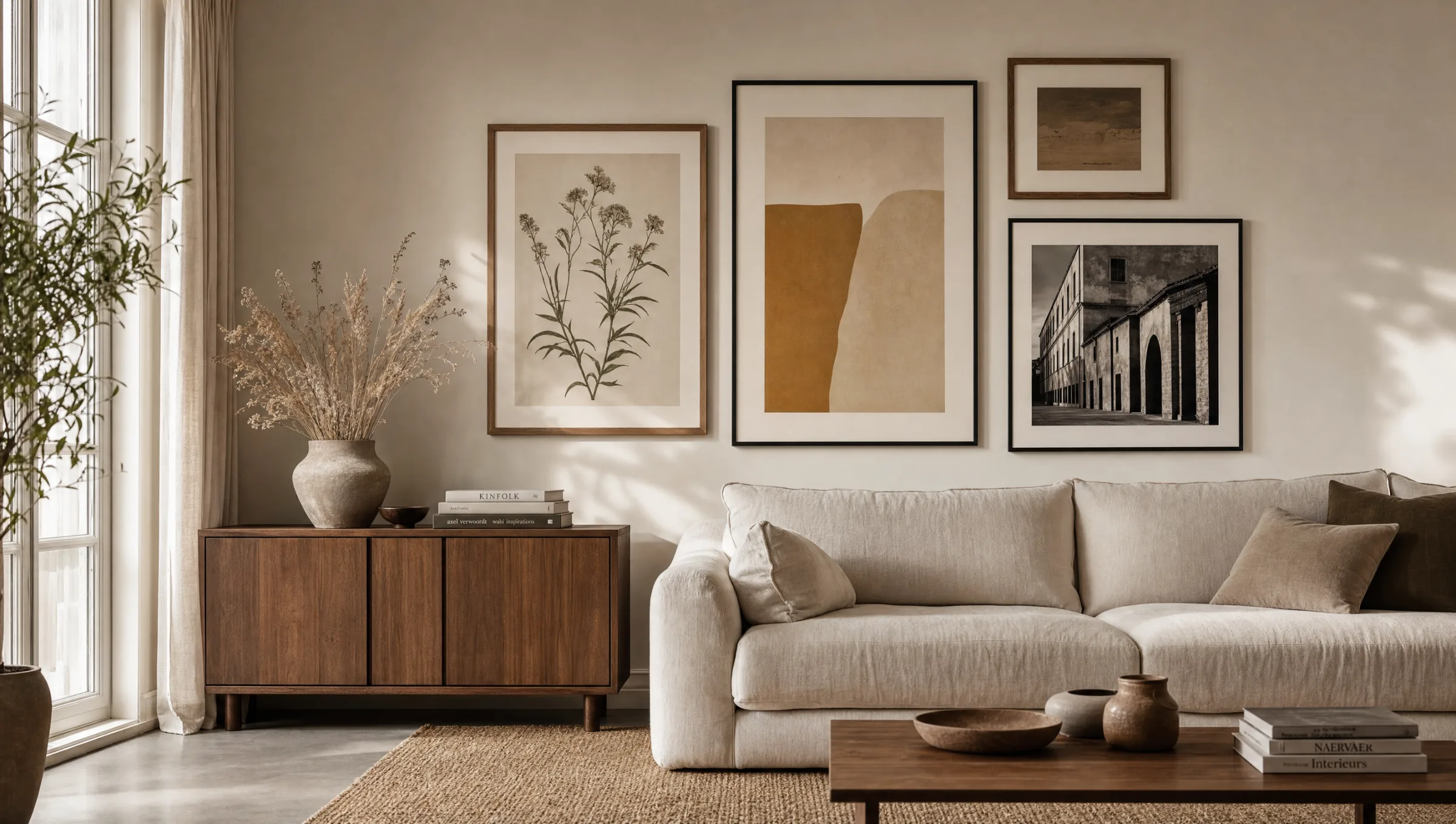
Four motif worlds form the core of many living spaces. They can be combined or deliberately placed as a single quiet accent.
Botanical Studies and Nature Prints
Pressed leaves, watercolour ferns, photographic grasses: fine lines, muted greens, often on a light ground. Particularly balancing in dining rooms and bedrooms.
Abstract Colour Fields
Reduced compositions in two to four colours. Well suited to modern interiors with clean furniture lines, they give rooms lacking architectural detail a sense of grounding.
Black-and-White Photography
Architecture, coastlines, portraits in fine greyscale gradation. Works well in hallways and above sideboards, as the absence of colour lets other materials come forward.
Classic Art Prints
Reproductions of historical paintings on textured paper. They bring narrative depth and suit older apartments with cornicing and dark wood tones.
Formats and Hanging: Letting the Most Beautiful Wall Art Work
The choice of format depends less on the motif than on the wall. A useful rule of thumb: the print should occupy roughly two thirds of the width of the furniture beneath it. Above a 220 cm sofa, image widths of around 140 to 150 cm work well — either as a single piece or as a grouping.
XXL posters from 70 × 100 cm read most calmly on large, uninterrupted wall surfaces. For gallery arrangements of several prints, a consistent frame or at least a consistent paper type helps the eye read the group as a single unit.
Eye level as the centre of the image is a reliable guide — in living rooms typically between 145 and 152 cm from the floor. In dining areas the centre can sit slightly lower, since people are usually seated there.
A wall print is not a decorative object you swap out. It is a small decision about the atmosphere of a room — and should be chosen accordingly.
Reetro Editorial
Materials That Carry the Most Beautiful Wall Art Quality
Paper is not simply paper. FSC-certified fine-art papers from 200 g/m² with a matte coating give motifs depth without reflecting glare. They suit classic prints as much as photographs with fine tonal gradations.
Premium canvases carry oil-based or pigment-based prints with a subtle texture. They have a physical presence and pair well with painterly motifs. Hexagonal aluminium panels, by contrast, suit graphic work because the smooth surface keeps lines crisp.
Reetro prints in Germany and works exclusively with materials that remain colour-stable over the long term. This is less a promise than a precondition for a wall print to look in five years exactly as it did on the first day.
Care and Longevity
Wall prints need little attention, but benefit from two habits: regular, dry dusting with a soft cloth and a position away from direct sunlight. UV light is the main reason prints lose brilliance over the years.
For framed works behind glass, a lightly dampened microfibre cloth is sufficient for the pane. Canvases should not be cleaned with moisture — a dust-free brush or a hairdryer on a cold setting removes deposits gently.
Anyone with several prints in a room can rotate them slightly every year or two. This not only protects the wall from localised light fading but makes familiar motifs feel new again.
Häufige Fragen
-
01
How do I identify the most beautiful wall art selection for my living room?
Start not with the motif but with the room. Note the wall width, the light conditions and the dominant colours of your furniture and textiles. Wall prints tend to look most settled when they pick up two or three tones already present in the space and add one quiet accent of their own. On large, open walls, a single print from 70 × 100 cm usually reads better than a fragmented group. In rooms with strong architectural detail — cornicing, wood panelling, exposed beams — the motif itself can afford to be more restrained.
-
02
Which formats work best for most beautiful wall art displayed above a sofa?
The sofa width is the reference point: the print or print group should occupy roughly two thirds of it. For a 220 cm sofa that means around 140 to 150 cm of image width. This could be a single XXL poster, a diptych of two 60 × 90 cm prints, or a gallery of three to five smaller works. The lower edge of the frame sits comfortably at around 20 to 30 cm above the sofa back.
-
03
Which material looks more refined — paper, canvas or aluminium?
It depends on the motif. Fine-art paper with a matte coating suits photographs and classic art prints because it renders tonal values precisely and does not reflect light. Canvas works well for painterly subjects because its texture supports the feel of an original. Aluminium with a smooth surface brings out graphic motifs and line work with particular clarity. Any material looks refined when the print and the substrate are well matched to each other.
-
04
How do I hang several wall art prints as a group?
Lay the arrangement out on the floor first and photograph it from above. This lets you check spacing and proportions before making any holes in the wall. Consistent gaps of 4 to 6 cm between frames tend to work well. With mixed formats, align along a shared central axis or a continuous top or bottom edge. A consistent frame style or a consistent paper type helps the group read as a coherent unit.
-
05
Do wall art prints fade over time?
High-quality prints on age-resistant papers retain their colour depth for many years, provided they are not hung in direct sunlight. UV light is the primary cause of fading, particularly in magenta and yellow tones. Placing a print on a side wall rather than opposite a south-facing window considerably extends its lifespan. Reetro prints in Germany on FSC-certified papers from 200 g/m² using pigment-based inks formulated for high colour stability, so the most beautiful wall art you choose today should still look the same years from now.