
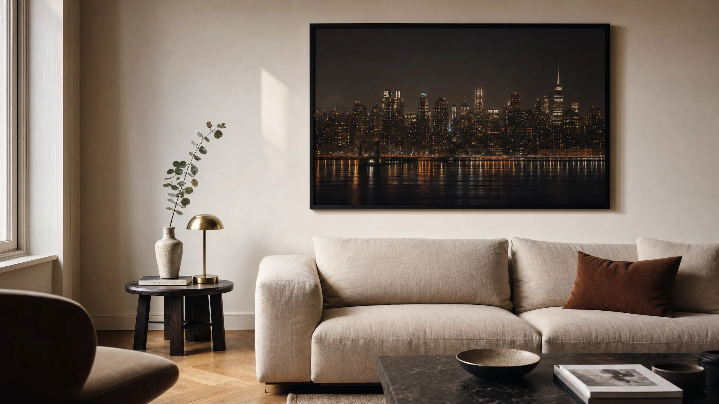
Metropolis Poster: urban motifs for the wall
A metropolis poster distils the atmosphere of great cities onto a single sheet of paper – between architectural lines, qualities of light and the rhythm of the street. This overview organises the key motif groups, formats and materials, and shows what to look for when selecting art for living spaces and workrooms.
What defines a metropolis poster
The word metropolis means far more than the sheer size of a city. It points to density, complexity and the constant change of urban space. A well-chosen motif captures exactly these qualities: the layering of high-rise buildings, reflections in glass, the diagonals of bridges and street grids.
Two broad directions can be identified in the visual language. Documentary-style photographs show real skylines – New York, Tokyo, Berlin or Chicago – and work with clear, deliberate perspective. Graphically reduced compositions, on the other hand, abstract the city into lines, silhouettes and flat areas of colour, often in the style of classic travel posters from the 1930s.
For wall impact, what matters most is how the motif creates depth. Long-exposure night photographs produce dense, warm colour worlds, while daytime shots and black-and-white compositions tend to emphasise a more sober, architectural reading.
Motif groups in the metropolis poster
Four recurring motif groups define this segment. Each conveys a different mood and suits different rooms and interior styles.
Skyline at night
Panoramas of illuminated high-rises reflected in rivers or bays. These motifs bring warm tones into the picture and work particularly well in living rooms or above a sofa.
Architectural detail
Close crops of individual facades, Art Deco towers or modern glass structures. The restrained visual language suits hallways, offices and minimalist interiors.
Street perspective
Views from pavement level: pedestrian crossings, traffic lights, neon signs. These motifs tell the story of everyday city life and sit well in lively, eclectic interiors.
Graphic retro illustration
Bold imagery in the style of classic travel posters, with clear areas of flat colour. Ideal for kitchens, dining rooms and spaces with plenty of wood or vintage furniture.
Format and placement: the right metropolis poster for the room
The choice of format depends more on the motif than is often assumed. Panoramic skyline shots benefit from landscape-format prints from 70 × 50 cm upwards, because only then does the layering of buildings become legible. Anyone looking to fill an entire wall above a sofa will lean towards XXL formats from 100 × 70 cm.
Portrait formats work well for single skyscrapers, narrow street canyons or detail shots. They are suited to slim wall spaces between doors, in hallways, or as part of a group of two or three motifs from the same city.
A useful rule of thumb: the print should occupy roughly two thirds of the width of the furniture beneath it. For a 220 cm wide sofa, the sweet spot sits at around 140–150 cm image width – achievable with a single XXL poster or a three-part arrangement of 50 × 70 cm prints.
A metropolis poster does not function as a postcard on the wall, but as a pictorial space that shifts the viewer's perspective, if only for a moment.
Reetro Editorial
Material, framing and care
For urban motifs, the choice of paper is decisive. Matte FSC-certified papers at 200 g/m² or above render contrast deeply without producing glare – especially important for night shots with many points of light. Glossy surfaces amplify luminosity but create reflections in brightly lit rooms.
For framing, a slim black or natural wood frame is a reliable choice. It picks up the clean lines of urban architecture without competing with the motif. A white or off-white mount adds further calm and makes the image appear larger. For large-format prints from 100 cm upwards, a frameless aluminium composite is a practical alternative, as it remains dimensionally stable even at higher humidity – all Reetro prints are printed to order by our production partner in the EU to these standards.
For maintenance, a dry microfibre cloth is all that is needed. Direct sunlight should be avoided, as UV exposure can cause colour shifts over the years – particularly in the blue and cyan tones that dominate city photography.
Hanging metropolis posters as a group
Individual motifs can be combined with photographs of other cities, typographic prints or abstract graphics. What matters is a shared thread – usually established through a common colour palette or matching frame material.
One proven layout is a row of three hung at the same height: three skylines of different cities, all in the same format and frame. Alternatively, a salon-style arrangement works well with a large metropolis poster as the anchor image and several smaller pieces grouped around it.
Häufige Fragen
-
01
What format suits a metropolis poster above a sofa?
Above a standard sofa 200 to 220 cm wide, a landscape format between 100 × 70 cm and 140 × 100 cm tends to look most balanced. A useful rule of thumb is that the print should cover roughly two thirds of the width of the furniture beneath it. If you prefer grouping several smaller prints, three motifs in 50 × 70 cm placed side by side produce a comparable overall effect. With particularly high walls it is worth going slightly oversized so the motif does not appear to float and lose presence.
-
02
Is a metropolis poster better in colour or black and white?
Both have genuine merit. Colour shots – especially of night scenes – convey atmosphere and warmth and work well in living rooms with textile furnishings. Black-and-white motifs emphasise architectural structure and integrate more easily into existing interiors because they introduce no colour conflicts. For home offices and minimalist settings, monochrome is often the quieter solution; for living rooms with muted earthy tones, warm colour shots tend to be the more engaging choice.
-
03
Which cities are most popular as metropolis poster motifs?
Among the most sought-after subjects are New York with its iconic skyline, Tokyo with the illuminated streets of Shibuya, London with the Thames and Tower Bridge, and Chicago with its architecture of classical modernism. European cities such as Berlin, Paris and Barcelona are also strongly represented. Alongside these, less familiar subjects are growing in popularity – Hong Kong, Singapore and São Paulo among them – because they offer a more distinctive visual language and unexpected colour worlds.
-
04
Which frame works best with a metropolis poster?
Slim frames in black or natural wood are the safest choice. They echo the clean lines of urban architecture without competing with the image. A white or off-white mount adds further calm and makes the print appear larger. For very large formats from 100 cm on the longest edge, a frameless aluminium composite is practical: it is easier to hang, remains flat under varying humidity, and avoids visible moulding edges that can distract from the motif itself.
-
05
How do I care for a city-motif poster over the long term?
Direct sunlight should be avoided wherever possible, as UV exposure gradually shifts the blue and cyan tones that dominate city photography. For cleaning, a dry microfibre cloth is sufficient – used on the frame and, for unframed posters, very gently on the surface itself. Reetro's metropolis posters are printed to order by our production partner in the EU on matte FSC-certified papers at 200 g/m² or above; this combination minimises reflections and ensures stable colour reproduction over many years.