Japanese Poster: Woodblock Prints, Minimalism and Modern Graphics
A Japanese poster combines the clear visual language of the classical woodblock print with the calm of modern graphic design. This overview covers styles, formats and materials, and shows how Japan-inspired wall art works in an interior — from Hokusai reproductions to contemporary typography.
What a Japanese Poster Does for an Interior
Japan's pictorial tradition is visually distinctive: flat areas of colour, clear contours, asymmetric compositions and an assured relationship with empty space. These qualities make a Japanese poster a rewarding element in rooms where images should structure rather than dominate. Unlike many Western motifs, Japanese visual language often works well in smaller formats, because the composition itself is built on reduction.
Stylistically, three broad currents can be distinguished: the classical ukiyo-e woodblock prints of the 18th and 19th centuries, sumi-e ink painting with its restrained tones of black, and contemporary Japanese graphic design that frequently works with typography and geometric patterns. All three directions can be combined, provided a consistent colour palette is maintained — typically anchored in indigo, beige, ochre and a muted red.
Styles for a Japanese Poster
Three main currents define the market for Japan-inspired wall art. Each has its own compositional rules, colour palette and format preferences.
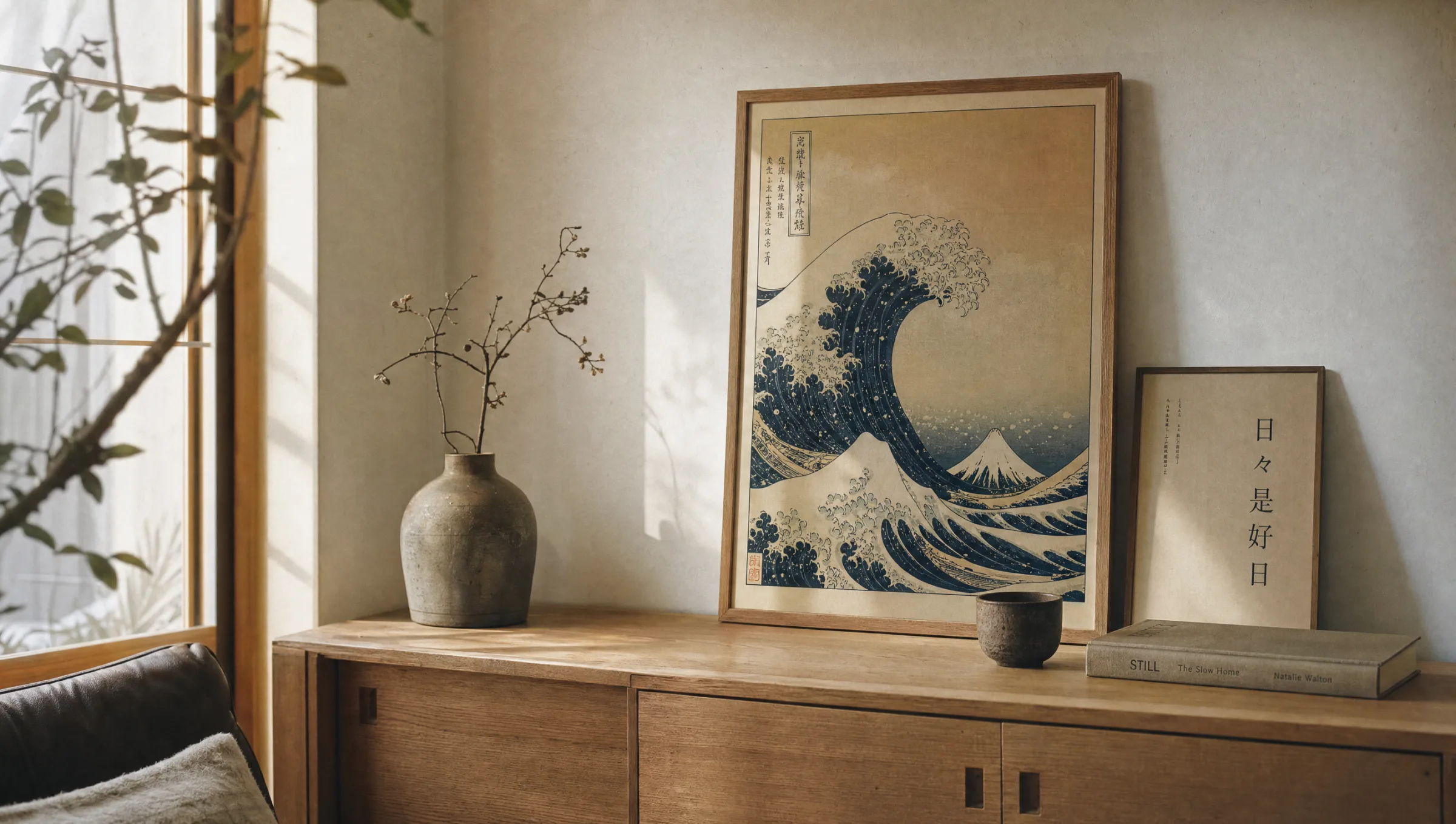
Ukiyo-e Woodblock Print
Reproductions of classical masters such as Hokusai, Hiroshige or Utagawa Kuniyoshi. Hallmarks are flat colour gradients, clear contours and landscape or everyday scenes. Works well alongside warm wood furniture and natural materials.
Sumi-e Ink Painting
Restrained black-and-white compositions featuring botanical or landscape motifs. Particularly calm in effect, and well suited to minimalist rooms with light wall colours and spare furnishings.
Modern Graphics & Typography
Contemporary Japanese designs, often featuring kanji characters, geometric patterns or pop influences. They set clear accents in home offices, hallways or hospitality settings.
Wabi-Sabi Photography
Quiet images of architecture, ceramics or natural details that reflect the aesthetic principle of imperfect beauty. Works in combination with linen, stone and unfinished wood.
Formats and Hanging for a Japanese Poster
Format choice for a Japanese poster follows the logic of the image rather than the size of the wall. Portrait-format woodblock prints with vertical landscapes — waterfalls or bamboo groves, for instance — need height and read best at 50×70 cm or 70×100 cm. Landscape-format scenes, such as Hokusai's well-known wave, demand width and only unfold convincingly from 70×100 cm upward.
Three hanging approaches have proven effective: a single image as a quiet focal point above a sideboard or sofa, a paired arrangement of two related motifs in the same format, and a curated gallery of three to five prints aligned along a shared horizontal centreline. Restrained frame choices matter — narrow profiles in oak, black or aluminium support graphic clarity without overshadowing it.
Mats are optional for woodblock motifs but give the image breathing room and a considered, editorial quality. A mat width of 5 to 8 cm reads as balanced in most domestic settings.
The Japanese pictorial tradition teaches that empty space is not an absence but part of the composition. A good Japanese poster needs wall around it, not additional decoration.
Reetro Curation Team
Material and Print Quality
Paper choice is significant for Japan-inspired motifs because the visual language depends strongly on line quality and the effect of flat colour areas. A matte FSC-certified premium paper at 200 g/m² or above renders fine contours cleanly and avoids the reflections that on glossy surfaces would disturb the meditative character of the motifs. At Reetro, all prints are made in Germany using pigment-based inks, which deliver high colour stability and a neutral black point.
For large-format wall art with Japanese motifs, premium canvas and hexagonal aluminium formats are worth considering alongside poster prints. Aluminium suits modern graphic designs with clean flat colour areas, while canvas gives classical woodblock prints a textile depth reminiscent of hanging scroll paintings — without their fragility.
Combinations and Room Context
A Japanese poster works particularly well in rooms with reduced furnishings and natural materials. Light oak, linen, unbleached cotton, earth-toned ceramics and stone provide a calm background against which the graphic clarity of the motifs can register. In combination with Scandinavian furniture design, this produces the much-cited Japandi look, where Japanese and Northern European restraint come together.
Heavily patterned wallpaper, bold wall colours or busy picture arrangements mixing many different styles are less suitable. Anyone integrating Japanese motifs into an existing collection should maintain a consistent colour axis — as a rule, choosing indigo or a warm beige as a connecting element is sufficient.
Häufige Fragen
-
01
Which motifs work best for a Japanese poster in the living room?
Calm motifs with clear compositional order are the best choice for a living room: ukiyo-e reproductions such as Hokusai's wave and mountain scenes, woodblock prints featuring cherry blossom, or graphic ink drawings. Contemporary Japanese graphic design with restrained typography also works well above a sofa. The key is that the Japanese poster suits the room in both format and colour — large wall surfaces carry a 70×100 cm print well, while narrow alcoves often suit a portrait-format 50×70 cm better.
-
02
Which paper is most suitable for Japanese motifs?
Classical ukiyo-e prints look most natural on a matte, lightly textured FSC-certified paper from 200 g/m² upward, because the surface recalls traditional washi without its fragility. Glossy paper should be avoided, as reflections overlay the fine lines of the woodblock aesthetic. For modern graphics with bold flat colour areas, a semi-matte premium paper is a sensible choice — it renders depth cleanly while remaining glare-free.
-
03
How should a Japanese poster be hung correctly?
A single Japanese poster should be centred at eye level, meaning roughly 145 to 150 cm from the floor to the centre of the image. When hanging multiple prints, a clear alignment helps — either flush bottom edges or a shared centre line. For woodblock motifs, narrow frames in natural oak, black or aluminium work well. Generous mats of 5 to 8 cm reinforce the editorial quality and give the motif a sense of calm.
-
04
What is the difference between ukiyo-e and modern Japanese posters?
Ukiyo-e refers to the classical Japanese woodblock print tradition of the 17th to 19th centuries, with artists such as Hokusai, Hiroshige and Utamaro. Hallmarks include flat colouring, clear contours and scenes from everyday life. Modern Japanese posters frequently draw on this visual language but combine it with minimalist typography, geometric reduction or influences from Bauhaus and mid-century graphic design. Both styles work well together in a gallery arrangement, provided the colour palette and frame choices are consistent.
-
05
Do Japanese posters fade over time?
High-quality pigment prints on acid-free paper are UV-stable and retain their colours for many years. Direct sunlight should still be avoided, particularly for motifs with strong indigo or vermilion, which are historically among the more sensitive pigments. At Reetro, all prints are made in Germany using lightfast inks on FSC-certified premium paper from 200 g/m² upward, ensuring colour stability even under normal daylight conditions.