Floral Acrylic Prints: an editorial guide to botanical wall motifs
Floral motifs rank among the oldest pictorial traditions in art history — and remain a steady presence in contemporary interiors. This overview places floral acrylic prints in editorial context: from style and substrate to hanging. The focus is on clarity of motif, material quality, and the quiet impression a piece makes in a room.
Why floral acrylic prints hold a particular place in interior design
Flowers are among the most reproduced motifs in the history of images. From the Dutch still lifes of the 17th century through Georgia O'Keeffe's large-scale close-ups to contemporary botanical photography, they run as a continuous thread through visual culture. Printed in modern form — as floral acrylic prints, for instance — they combine this tradition with a clear, often reduced pictorial language that fits naturally into today's living spaces.
The visual appeal lies in contrast: organic forms meet sober materials such as acrylic, aluminium or matte paper. The result is a quiet tension that keeps the motif present without dominating the room. In Scandinavian or Japandi-influenced interiors in particular, botanical prints work better than many expect — provided the choice of motif and format are carefully considered.
Four style directions for floral acrylic prints
Floral motifs can be grouped broadly into four editorial lines. Each suits a different room character and a different visual effect — from documentary to abstract.
Botanical illustration
Detailed, often historically-inflected drawings of individual plants on a light ground. Well suited to quiet studies, reading corners, or classically furnished rooms with wood accents.
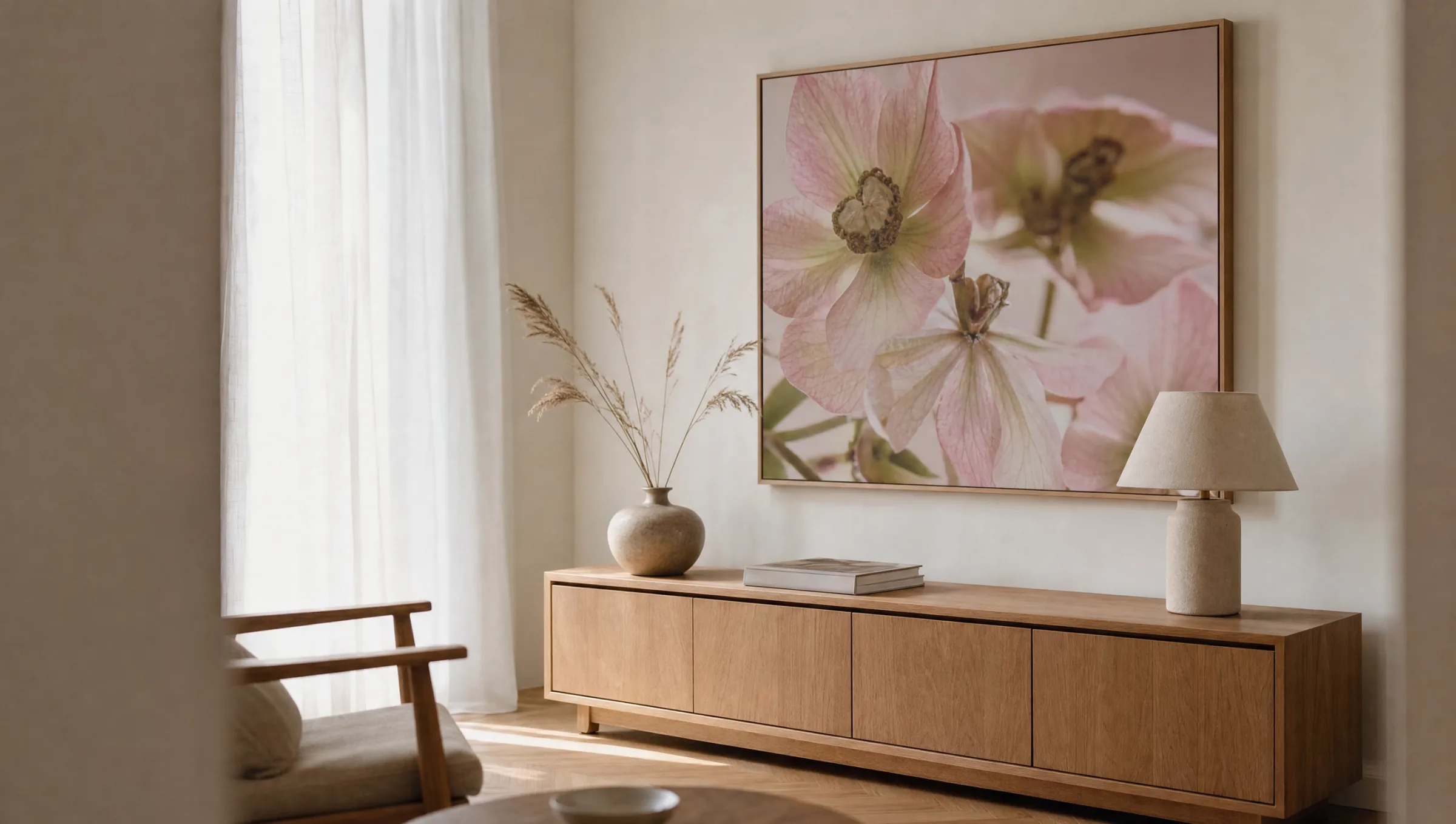
Macro photography
Close-up shots of single blooms with a shallow depth of field. The effect is graphic and reduced. Works especially well on acrylic or aluminium substrates that make the fine detail visible.
Watercolour and painterly floral
Soft gradients, a restrained colour palette, a visible painterly touch. Suits bedrooms and living areas where a more painted, less photographic impression is desired.
Abstract florality
Strongly reduced or graphically transformed plant forms, often in monochrome or two-colour arrangements. An option for modern interiors with a clear, linear aesthetic.
Material and print: what matters in floral acrylic prints
In print production, the term acrylic print usually refers to a motif mounted behind or printed onto a sheet of acrylic glass. The material reads as clear, lightly reflective, and accentuates fine colour nuances — an advantage with floral motifs, whose appeal often lies in subtle transitions. The sense of depth comes from the interplay between the print layer and the transparent substrate.
Aluminium composite panels are a common alternative, giving the image a more matte, quieter appearance. For floral still lifes with pronounced light direction, this option is often the less conspicuous choice. Those who prefer a paper feel should consider poster prints on 200 g/m² or heavier stock, ideally with a matte coating to avoid reflections across petal surfaces.
In every case, colour accuracy and UV-stable pigments are important. Floral tones — particularly rose, peach and pale yellow — are sensitive to direct sunlight. A position facing directly south is therefore rarely ideal. Pieces made in Germany, such as those produced by Reetro on FSC-certified substrates, are printed with pigment inks tested for long-term stability.
A floral print gains nothing from size alone. It is the empty wall around it that allows the bloom to do its work.
Editorial note, Reetro curation
Hanging and format: how floral acrylic prints read in a room
Large single pieces — around 70×100 cm or bigger — work well on free-standing walls above sideboards, sofas or dressers. They function as a calm visual anchor and benefit from adequate breathing space around them. Any bench or armchair placed in front should ideally not exceed roughly two-thirds of the picture's width.
Smaller formats can be combined into gallery-style or clean grid arrangements. With botanical motifs it is worth establishing a common thread within a group — the same colour palette, the same print technique or the same botanical family. This produces a curated series rather than a decorative assortment.
As a general rule, the centre of the picture should sit at around 145 to 150 cm from the floor. Above furniture, leave 15 to 25 cm between the top of the piece and the bottom of the frame. Floral acrylic prints respond better to soft, indirect light than to hard spotlights, which can overemphasise individual areas of the image.
Care and longevity
Acrylic glass surfaces are more scratch-sensitive than glass, but can be cleaned easily with a soft microfibre cloth and a small amount of water. Glass cleaners containing alcohol or ammonia should be avoided, as they can dull the surface over time. Aluminium substrates are more robust but show fingerprints more readily.
For paper prints behind glass or framed posters, hanging in humid rooms such as bathrooms is generally not recommended. Floral motifs are in any case better suited to dry living spaces with a stable room temperature.
Häufige Fragen
-
01
What is the difference between floral acrylic prints and framed posters?
Floral acrylic prints are produced with the motif mounted on or behind a sheet of acrylic glass. They read as clear and lightly reflective, which emphasises fine colour gradients — a genuine advantage with botanical motifs that rely on subtle transitions. Framed posters, by contrast, offer a warmer, more paper-like appearance and are often less expensive and easier to transport. Which option suits best depends on the room: acrylic works well in modern, pared-back interiors, while framed paper prints settle more quietly into spaces with wood, textiles and matte surfaces.
-
02
Which floral motifs work well in calm living spaces?
For bedrooms and reading corners, restrained motifs tend to work best: single blooms in close-up, botanical illustrations on a light ground, or watercolour-style depictions with a muted palette. Densely composed still lifes with many plants can feel busy in smaller rooms. A reliable rule of thumb: the fewer elements in the picture, the longer it remains comfortable to live with. The colour temperature should also align with the surrounding interior — warm tones alongside wood, cooler ones alongside concrete and steel.
-
03
What format suits floral acrylic prints hung above a sofa?
As a guide, the picture should occupy roughly two-thirds of the sofa's width. For a sofa 220 cm wide, that points to a single piece around 140 to 150 cm wide, or a two- or three-part grouping of equivalent total width. The bottom edge ideally sits 15 to 25 cm above the sofa back. Portrait formats work for narrow wall sections between furniture; landscape formats calm wider walls. Floral single-bloom motifs in close-up are particularly effective in landscape orientation.
-
04
Do floral acrylic prints fade over time?
With high-quality pigment inks, colour stability is designed to last many years. That said, floral tones in the rose, peach and pale yellow range are more sensitive to direct sunlight than deep blues or greens. A position in indirect daylight is therefore preferable. Colour-sensitive motifs placed directly opposite large south-facing windows should use UV-filtering acrylic or UV-protective glass. Rotating prints between rooms every few years also distributes light exposure more evenly.
-
05
How should acrylic glass surfaces be cleaned?
Acrylic glass is more prone to scratching than standard glass. For cleaning, a soft, lint-free microfibre cloth lightly dampened with plain water is sufficient. Cleaning products containing alcohol, ammonia or abrasive particles are unsuitable, as they can dull the surface or encourage fine cracks. Dust is best removed first with a dry brush or cool compressed air before the cloth is used. This keeps the clear, lightly reflective finish intact over time.
-
06
How does Reetro select its floral acrylic prints?
Reetro curates floral motifs according to pictorial calm, composition and colour accuracy in print. Production is based in Germany on FSC-certified papers from 200 g/m² upward with matte coating, or as premium canvas, hexagonal aluminium wall art, or classic formats behind acrylic glass. Pigment inks are tested for long-term stability. Rather than a broad mass assortment, the focus is an editorially selected range of floral acrylic prints that integrates into varied interior styles without tipping into the merely decorative.