
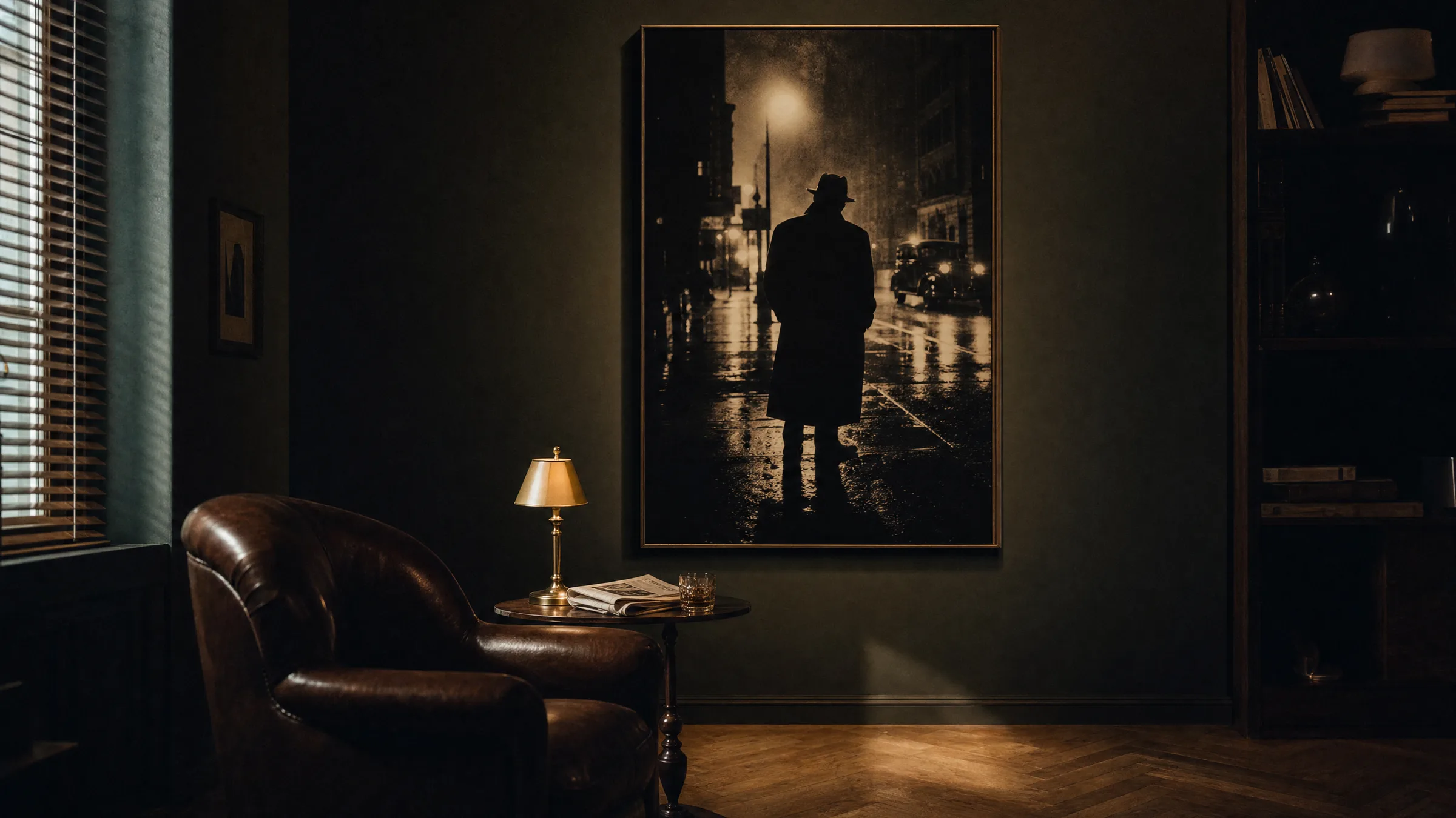
Film Noir Poster: The Visual Language of Shadows for Your Wall
A film noir poster condenses the visual codes of an entire genre into a single image: hard contrasts, smoky interiors, faces cropped at the edge of the frame. This overview unpacks that visual language and considers which rooms and formats allow noir motifs to make a genuinely considered statement on the wall.
What Defines a Film Noir Poster
The term film noir was coined by French critics in the late 1940s to describe a current in American cinema that reached its peak between 1941 and the early 1950s. Its hallmarks are grim urban backdrops, morally ambiguous characters and a cinematographic approach that treats light and shadow as primary storytelling tools.
A film noir poster translates these qualities into a single still image: narrow bands of light filtering through venetian blinds, a trench coat half-dissolved in shadow, the faint glow of a cigarette. The composition is often asymmetric, the typography restrained and the colour palette deliberately limited — black, off-white, warm sepia and a deep red accent.
Editorially, it is worth noting that many original cinema posters of the era were hand-illustrated, while contemporary interpretations tend towards photographic reconstruction or graphic reduction. Both approaches work on the wall, but they speak to different visual sensibilities.
Motif Groups in the Film Noir Poster
Within the genre, recurring families of motifs can be distinguished. Understanding them helps with selection, since each carries a different mood into a room.
Rain-Slicked Street
Reflections on wet asphalt, a single pool of lamplight, a silhouette at the edge of the frame. Works well on narrow wall surfaces in hallways or beside doorways, where the vertical image axis draws the eye upward and the space feels longer.
Detective's Office
Desk lamp, venetian blinds, a hand resting on a surface. This motif group suits home offices and reading corners, where the concentrated, inward-looking atmosphere of the source material feels at home.
Femme Fatale
Close-cropped portrait compositions with strong side lighting. These motifs need enough viewing distance to register fully and work well above a console table or in a dressing area.
Graphic Reduction
Typography, silhouettes and geometric shadow shapes without a literal figure. This variant fits comfortably into modern, minimalist interiors without dominating the room thematically.
Format and Placement of a Film Noir Poster
Because the genre works heavily with verticals — doorframes, stairwells, tall shuttered windows — portrait formats suit the visual language well. Sizes between 50 × 70 cm and 70 × 100 cm are well-proportioned for living spaces; XXL formats from 100 × 140 cm upward only fully reveal their depth when there is enough viewing distance in the room.
For grouped arrangements, combining one dominant noir motif with two or three smaller graphic or typographic works tends to read well. The key is that the black levels across the group remain consistent; otherwise the arrangement feels restless rather than composed.
A hanging height with the centre of the image between 145 and 152 cm from the floor has become standard — even when the poster is positioned above a piece of furniture. The gap between the top of the furniture and the bottom edge of the image should be at least 15 cm.
Noir is less a genre than a way of lighting. Those who understand that don't hang a film noir poster decoratively — they stage it like a small theatre set.
Reetro Editorial
Materials and Print Quality for Noir Motifs
Few image genres place as much demand on print quality as noir. The appeal lives entirely in the depth of the blacks and the finely graded grey values between them. Glossy surfaces create reflections that wash out precisely these areas, leaving the image looking flat.
Matte fine-art papers of at least 200 g/m² with a high white point are the recommended choice, or alternatively a slightly warm natural paper for a subtly aged quality. A colour profile that retains shadow detail even at a density of 1.8 and above is essential — printed to order by our production partner in the EU on FSC-certified stock, as with Reetro's production process.
For large-format works, a matte canvas can also be a considered option, as the texture breaks up the photographic screen appearance. Aluminium wall prints, by contrast, produce a very clean, cool character that suits graphically reduced interpretations of the genre.
Matching the Colour Climate of the Room
A film noir poster shifts the perceived colour temperature of a room. In warmly furnished living spaces with wood, brass and muted textiles, the motif reads as warmer and more narrative. In cooler, white-dominated rooms it remains more graphic and detached.
Both effects are valid; the choice should be deliberate. As a general rule: the more warm materials are present in the room, the more readily the motif can carry a deep, unbroken black. In cooler spaces, a slightly softened black with a sepia undertone can feel more integrated.
Häufige Fragen
-
01
Which motifs work best as a film noir poster?
Classic choices are night street scenes, detective offices with venetian-blind light and portraits with strong side lighting. If you are placing a film noir poster in your home for the first time, a graphically reduced interpretation is a reliable starting point: silhouettes, typography or a single light element work in modern interiors without overloading the room thematically. More complex, figure-rich compositions need enough wall space around them and a calm background to avoid feeling cluttered.
-
02
What format should a film noir poster be printed in?
Because noir works with verticals and narrow bands of light, portrait formats between 50 × 70 cm and 70 × 100 cm are well-proportioned for most living spaces. For generous walls in hallways, stairwells or open-plan living areas, formats from 100 × 140 cm upward become interesting, as the depth of the image becomes genuinely tangible at that scale. Landscape formats work primarily for street panoramas or skyline motifs.
-
03
Does a noir motif work in a bright, contemporary interior?
Yes, with two qualifications. First, the motif should lean towards graphic reduction and work with clear black areas, so that it does not read as an incongruous element. Second, framing matters: a narrow black or dark-oak frame anchors the image in a light room. A mount or passepartout optically enlarges the surrounding wall space and gives the motif room to breathe.
-
04
Which surface is best for printing a film noir poster?
Matte fine-art papers from 200 g/m² upward are the first choice for noir motifs, because they preserve shadow detail and produce no reflections. Glossy surfaces can increase colour saturation but tend to wash out the crucial transitions between grey and black. For large-format works, a matte canvas is a thoughtful alternative that gives the image a lightly cinematic quality.
-
05
How do I combine several prints with a film noir poster?
The calmest result comes from groupings in which the film noir poster acts as the visual anchor and accompanying works remain more understated — for example black-and-white photography, typography or minimalist graphics. Make sure the black levels of the prints involved are similarly deep; otherwise the group will fragment visually. A consistent framing concept in black or dark wood helps hold the arrangement together.
-
06
What does Reetro pay attention to when printing these motifs?
At Reetro, film noir poster prints are printed to order by our production partner in the EU on FSC-certified fine-art papers from 200 g/m² with a matte finish. Colour management is calibrated to ensure that even dense shadow areas retain visible detail and grey gradients do not band. For large-format interpretations, premium canvas and hexagon aluminium wall prints are also available, allowing the material character to be matched to the specific mood of the room.