Horror Film Posters – Iconic Motifs as Wall Art
Horror film posters rank among the most expressive artefacts in cinema history. Their interplay of dark typography, cool colour palettes and symbol-laden imagery gives them a life of their own as collectible objects — well beyond the cinema visit that inspired them.
What Makes Horror Film Posters Such Distinctive Wall Art?
Posters from the horror genre follow their own visual grammar. Deep crimson gradients, hard contrasts, distorted silhouettes and an often deliberately minimal pictorial language generate an atmosphere that survives intact as a framed wall piece. Unlike decorative art prints with no narrative, these images carry a story — and it is precisely that quality which gives them an unusual depth in a living space.
The history of horror film posters stretches back to the earliest days of cinema. From the 1920s through the 1940s, posters were hand-illustrated, frequently in an expressionist manner that captured the character of the film with remarkable accuracy. With the rise of the B-movie in the 1950s and 1960s, a loud, sensationalist aesthetic emerged that became a cult phenomenon in its own right. The slasher decade of the 1980s introduced yet another distinct visual signature: stark symbolism, cool colours and maximally reduced compositions.
Many of those original cinema posters are now sought-after collector's pieces. High-quality print reproductions make it possible to experience these visual worlds in everyday life, without the constraints of museum conditions.
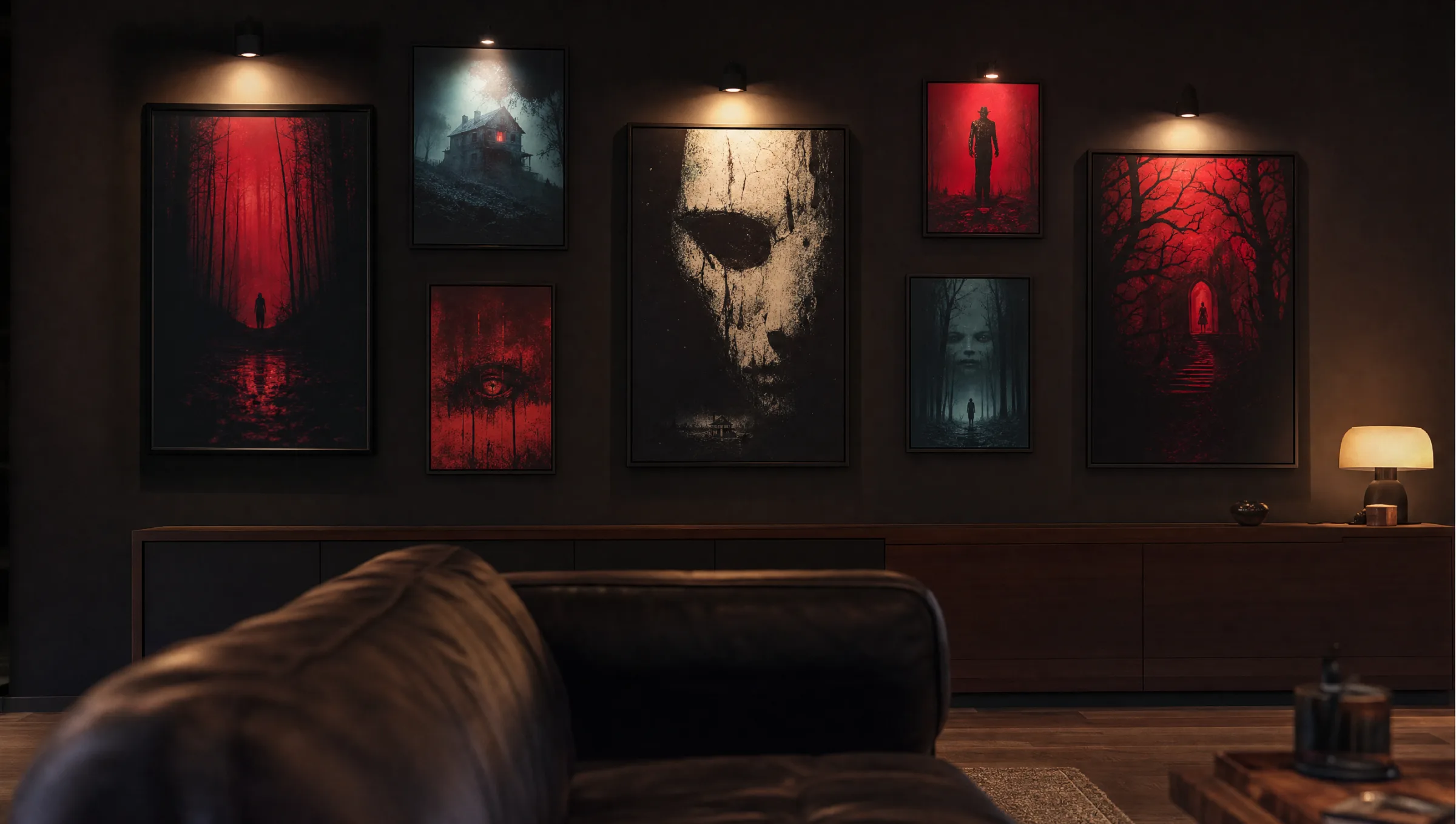
Visual Styles in Horror Film Posters at a Glance
The genre spans a broad visual range. From classic black-and-white illustration to digital neon aesthetics, horror film posters encompass several distinct styles that suit different spaces and tastes.
Classic & Silent-Film Era
Expressionist-inspired illustrations, heavy shadow work and hand-drawn figures. This style sits well in rooms with natural materials and warm artificial lighting.
Retro B-Movie (1950–1970)
Bold primary colours, exaggerated proportions and sensationalist typography. These posters carry an ironic, nostalgic quality and make deliberate statements in contemporary interiors.
Minimalist Slasher Look
Reduced imagery, a single central symbol and a cool or monochromatic palette. Works well alongside contemporary furniture and clean gallery walls.
Contemporary Fan-Art Design
Modern reinterpretations of well-known horror movie motifs, often created digitally. The reimagining produces independent works of art that still maintain their connection to the source material.
Formats and Materials for Horror Film Posters
Format has a significant influence on how a horror film poster reads on the wall. The classic cinema format of 68 × 98 cm or the American one-sheet format of 69 × 104 cm consciously reference the historical original. For a more dynamic spatial impact, XXL formats from 100 × 140 cm upwards work especially well in stairwells, long hallways or large gallery walls.
On the question of materials: matte paper at 200 g/m² or above reduces unwanted light reflections and brings out the dark tones typical of the horror genre. Glossy surfaces make lighter image elements appear more brilliant, but can produce distracting glare under poor lighting. Canvas prints offer a textured surface that lends illustrated motifs from the classic era a crafted, handmade quality.
Aluminium Dibond panels suit particularly high-contrast subjects: the surface reproduces deep blacks and sharp tonal transitions with precision, which the genre demands. For cool rooms, damp basement bars or home cinema spaces, a moisture-resistant material is also advisable.
A good horror film poster needs no text to make its point — the image alone tells the audience what to expect. That visual density is precisely what makes it a self-contained work of art on the wall.
Reetro Editorial
Placement and Room Design: Hanging Horror Film Posters Well
Horror film posters have the greatest impact when they are staged with some deliberation. A single large-format piece as a focal point works just as well as a gallery wall of thematically related motifs — for instance, works by one director, from one decade, or from a specific subgenre such as giallo, J-horror or creature features.
Lighting plays a decisive role. Directed, warm light from a picture rail fitting or a single spot accentuates dark horror imagery and prevents it from losing depth in a bright room. Alternatively, indirect ambient light with a low colour temperature (2700–3000 K) creates a coherent atmosphere.
For framing: slim black or dark grey frames support the image without competing with it visually. Dark grey or deep blue mounts add breathing space around smaller formats and reinforce the overall impression.
Care and Long-Term Preservation of Horror Film Posters
Paper-based prints are sensitive to direct sunlight, as UV radiation fades colour pigments over time. For rooms with a high proportion of natural light, UV-protective glazing or laminate coatings are recommended. Matte prints on FSC-certified paper are generally low-maintenance without any additional treatment — dust can be removed with a soft, dry microfibre cloth.
Canvas prints are somewhat more resilient and can be gently wiped with a lightly damp cloth if needed. Aluminium wall pieces are particularly robust and suited to rooms with fluctuating temperatures.
Häufige Fragen
-
01
What are the most common formats for horror film posters?
The historically established standard cinema poster sizes — around 68 × 98 cm or 70 × 100 cm — remain the most common formats for horror film posters today. They reflect the classic one-sheet format that has been used in cinemas worldwide for decades. Anyone looking for a stronger spatial presence can opt for XXL formats from 100 × 140 cm upwards. Square formats work well for minimalist motifs or as part of a gallery wall arrangement.
-
02
What material should I choose for horror film posters?
For horror film posters with dark colour palettes and hard contrast, matte paper at 200 g/m² or above is the recommended choice, as it minimises reflections and renders deep blacks with full saturation. Canvas offers a textured surface that gives classically illustrated motifs a handcrafted feel. Aluminium Dibond is ideal for particularly high-contrast, detail-rich images, since the surface ensures precise reproduction even of fine lines.
-
03
How do I combine several horror film posters into a gallery wall?
Thematic coherence is the most important principle: a gallery wall looks most considered when the posters share a common thread — whether that is the director, an era (for example, 1970s horror classics), a subgenre, or a consistent colour palette. Using the same frame colour throughout — all black or all dark grey — ties different motifs together visually. Spacing between pieces should be kept even, typically 5–10 cm.
-
04
Do horror film posters fade over time?
Paper-based prints can lose colour intensity over the years when exposed to UV radiation. To prevent this, horror film posters should not be placed in direct sunlight. UV-protective glazing or a matte laminate coating meaningfully extends their lifespan. Canvas and aluminium prints are somewhat more resistant. As a general rule: the higher the print quality and paper weight, the more durable the result.
-
05
Which rooms suit horror film posters best?
Horror film posters are a natural fit for home cinema rooms, media rooms or basement spaces with controlled lighting. But they can also work in bedrooms, hallways or studies — placed and lit thoughtfully, they create a composed, characterful atmosphere. Context matters most: in a modern, darkly furnished room the motifs read more as works of art; in a more playful setting they function as a deliberate statement.
-
06
Where can I buy high-quality horror film posters in the UK or Europe?
At Reetro, horror film posters are printed in Germany on FSC-certified papers at 200 g/m² or above with a matte finish. The range covers a variety of formats — from classic cinema dimensions to XXL posters — as well as canvas and aluminium wall pieces. Every motif is editorially curated and checked for print quality before it is added to the catalogue.