
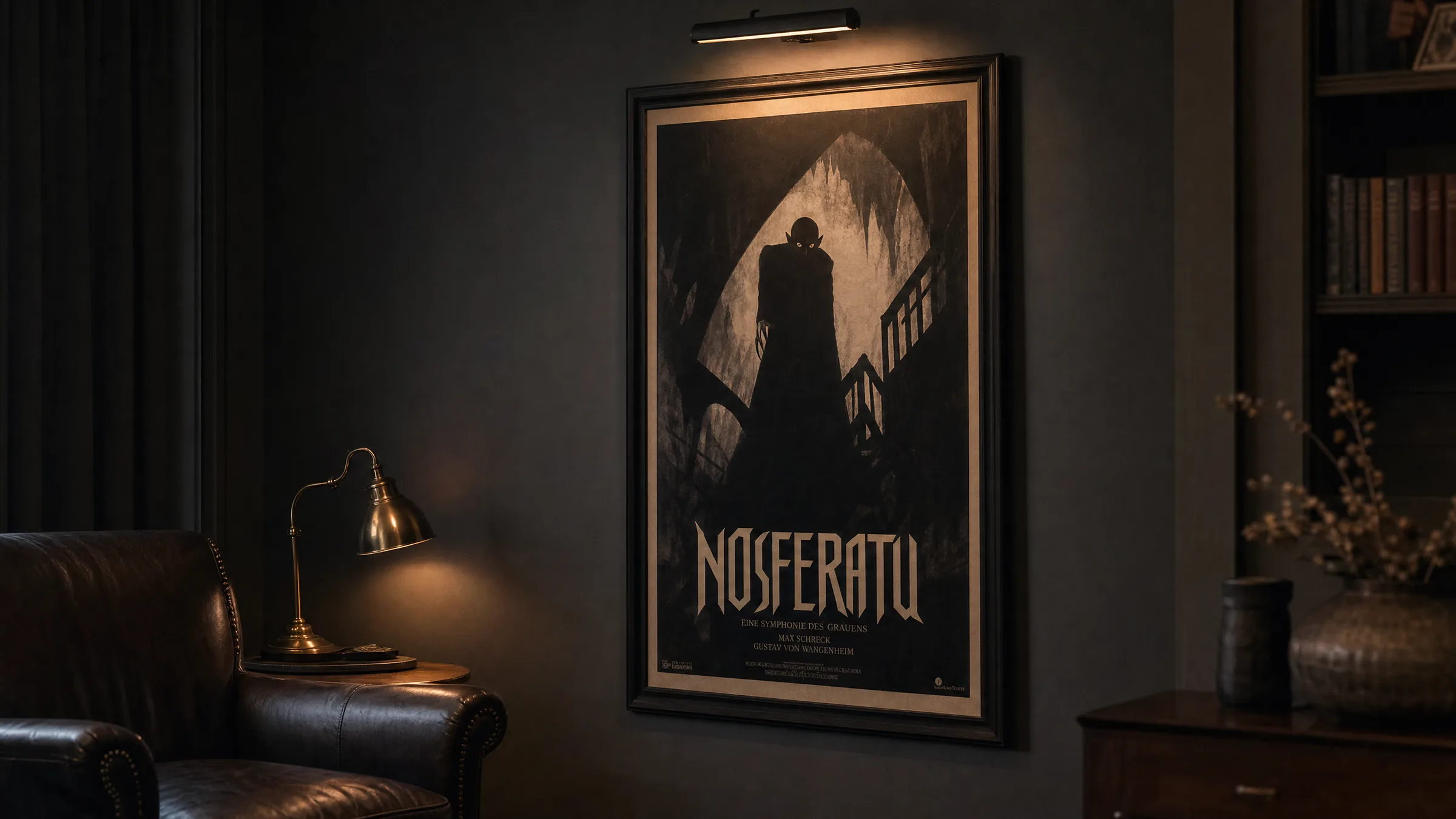
Dracula Poster – Gothic Horror Art for Your Walls
Few figures in horror history carry the visual weight of Dracula. A dracula poster translates that iconic imagery into a tangible piece of wall art — whether you favour the expressionist shadows of the 1922 Nosferatu, the theatrical glamour of classic Hammer films, or a more contemporary graphic interpretation.
The Visual History Behind the Dracula Poster
The iconography of Dracula has evolved across more than a century of cinema, literature, and illustration. The earliest visual representations draw from Max Schreck's gaunt silhouette in F. W. Murnau's Nosferatu (1922), where sharp angular shadows and high-contrast black-and-white photography defined the vampire aesthetic for decades. A dracula poster rooted in this era tends to feature stark negative space, elongated figures, and German Expressionist composition.
By the 1950s and 1960s, Hammer Horror studios introduced a more saturated, theatrical palette — crimson capes, candlelit stone corridors, and Christopher Lee's imposing presence. Posters from this period use hand-painted illustration techniques that carry a distinctly mid-century warmth, even while depicting darkness. These designs function well as statement pieces in living rooms or home cinema spaces.
Contemporary interpretations have broadened the range further. Graphic designers now produce minimalist typographic versions, detailed pen-and-ink portraits, and even retro-vaporwave takes on the count. Each stylistic tradition speaks to a different interior context and collector preference.
Dracula Poster Styles at a Glance
The dracula poster market spans a wide range of artistic traditions. Here are four of the most distinctive categories worth considering before you decide on a format or placement.
German Expressionist
High-contrast black-and-white compositions inspired by silent-film-era cinematography. Angular shadows and sparse detail create a sense of dread without relying on colour. Works well in narrow corridors or dark-painted rooms.
Hammer Horror Illustration
Hand-painted style artwork referencing mid-century British horror cinema. Rich reds, deep burgundies, and warm candlelight tones give these prints a theatrical quality that suits eclectic or maximalist interiors.
Minimalist Graphic
Reduced to silhouette, symbol, or single typographic element. These designs integrate quietly into modern or Scandinavian-influenced spaces without overwhelming surrounding décor. Often printed in two-colour or monochrome.
Vintage Movie Lobby Card
Reproductions or re-imaginings of original promotional artwork from classic horror films. Aged textures, bordered layouts, and serif lettering evoke a collector's sensibility and work particularly well in home library or study settings.
Choosing the Right Format for a Dracula Poster
Format decisions matter as much as the image itself. A narrow vertical poster — typical of the classic movie-poster ratio — suits tall walls between windows or beside doorframes. The proportions echo the compositional logic of original cinema promotion material, lending authenticity to the display.
For a more commanding installation, an XXL format printed on heavyweight matte paper (200 g/m² or above) transforms a dracula poster into a proper focal point. Matte surfaces suppress glare, which is especially relevant for darker artwork where shadow detail would otherwise be lost under direct lighting. Glossy coatings tend to compete with the intended mood of gothic imagery.
Canvas prints add a painterly texture that complements illustration-style designs, while aluminium Dibond or HD-metal surfaces suit high-contrast photographic or graphic interpretations, giving deep blacks a particular density and sharpness.
Gothic horror art works in a room the way a well-placed shadow works in a photograph — it defines the space around it more than it occupies it.
Reetro Editorial
Placement and Framing Tips for Horror Wall Art
Dark-palette prints like a dracula poster generally benefit from neutral or deep-toned surroundings. Against a white wall, high-contrast black imagery can feel stark in a way that works for some rooms and clashes in others. Against a dark grey, deep green, or charcoal wall, the same print integrates into the room's atmosphere more naturally.
Framing in black timber or raw metal profiles is the most consistent choice for gothic or horror-themed artwork. Avoid ornate gold or silver frames unless the poster's own visual language explicitly calls for that contrast — as some vintage Hammer-era illustrations do. Unframed prints mounted flush on aluminium composite panels offer a cleaner, gallery-adjacent result with no additional framing cost.
Lighting deserves particular attention. A single directional spotlight or picture light positioned above the print will cast subtle shadows across the artwork's surface, deepening the mood considerably. Avoid fluorescent ambient lighting, which flattens dark tones and reduces perceived contrast.
Caring for Your Print Over Time
Paper-based prints should be kept away from direct sunlight, as UV exposure will fade dark inks over months and years. If a window-adjacent placement is unavoidable, UV-filtering glass in the frame significantly slows this process. Reetro prints on FSC-certified papers use pigment-based inks with higher UV resistance than standard dye-based alternatives, but basic precautions remain worthwhile regardless of print quality.
Canvas prints can be gently dusted with a dry microfibre cloth. Avoid moisture near canvas edges, where the fabric meets the stretcher frame, as this can cause warping over time. Aluminium-surface prints require the least maintenance — a dry or very lightly damp cloth is sufficient for cleaning, and the surface is unaffected by humidity fluctuations.
Häufige Fragen
-
01
What styles of dracula poster are most common?
The most established categories are German Expressionist designs derived from silent film imagery, mid-century illustrated Hammer Horror styles, minimalist graphic interpretations, and vintage lobby card reproductions. Each suits a different interior context. Expressionist prints work well in narrower spaces with neutral or dark walls, while illustrated vintage designs tend to suit more eclectic or maximalist rooms where warmer tones are already present.
-
02
What paper weight and finish suits a dracula poster best?
Heavyweight matte paper — typically 200 g/m² or above — is the most practical choice for dark-toned gothic prints. Matte coatings eliminate surface glare, which matters especially for artwork where shadow gradients and deep blacks carry most of the visual information. Glossy finishes can create distracting reflections under standard room lighting and may wash out the darker areas of the composition.
-
03
Can I hang a dracula poster in a brightly lit room?
Yes, though the effect will differ from a dimly lit or directionally lit space. In a bright room, choose a print with strong composition and clear silhouette, since the atmospheric shadow detail that reads well in low light may appear flatter under uniform ambient illumination. Placing the print away from direct window light reduces UV exposure and preserves ink quality over time. A picture light or adjustable spotlight above the frame gives you more control over how the print is perceived regardless of ambient conditions.
-
04
How large should a dracula poster be for a feature wall?
For a genuine focal point, 70 × 100 cm is a reliable minimum on a standard ceiling-height wall. XXL formats from 100 × 140 cm upward command more presence and suit larger rooms where the viewing distance is greater. As a rule, the poster should occupy roughly one third to one half of the wall width it is centred on. Below that proportion, even strong imagery risks appearing incidental rather than intentional in the overall composition of the room.
-
05
Is a dracula poster suitable for rooms other than a home cinema or bedroom?
Entirely. Minimalist or typographic dracula poster designs integrate comfortably into home offices, reading rooms, or eclectic living spaces. The gothic horror aesthetic has a long relationship with collector and bibliophile culture — bookshelves, dark wood furniture, and library-style lighting are natural companions for this type of artwork. The key is matching the poster's stylistic register to the room's existing mood rather than treating it as a purely thematic object.
-
06
Where can I find a quality dracula poster?
Reetro produces horror and gothic wall art on FSC-certified papers from 200 g/m² using pigment-based inks, printed to order by our production partner in the EU. The range includes classic vertical poster formats as well as XXL sizes and canvas options. All prints are shipped flat or rolled in protective packaging to preserve print quality during transit. The focus is on durable, gallery-quality results suited for long-term display.