Decorative Poster: Motifs, Materials and Placement in the Home
A decorative poster is more than a way to fill an empty wall: it organises a room, introduces colour accents and gives an interior a coherent visual thread. This overview covers what to look for in motif selection, paper quality and format – and how posters actually perform in different living situations.
What makes a decorative poster
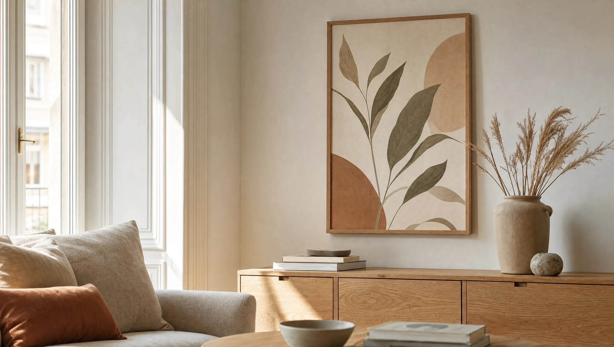
A decorative poster differs from a classic advertising poster in purpose: it is not meant to inform, but to shape a room. Typical motifs range from botanical illustrations and abstract colour fields to photographic cityscapes and landscapes. The key is that the motif enters a quiet dialogue with the furniture, the available light and the wall colour.
The overall effect depends heavily on print depth and paper surface. Matte coatings absorb reflections and make colours appear more consistent, while semi-matte surfaces allow slightly more depth in darker areas. A high-quality decorative poster is recognisable less by any sheen than by the cleanliness of its mid-tones and contours.
Unlike large-format canvases or aluminium wall art, a poster stays flexible: it can be framed, clamped or simply hung from a rail, and swapped out seasonally without locking the wall arrangement into place.
Style directions for a decorative poster
The following categories cover the majority of motif worlds that work well in living spaces over the long term. They are intended as an orientation before selecting specific images.
Botanical and floral
Leaf studies, dried flowers and stylised plants read as understated and suit light wood furniture, linen textiles and off-white wall colours. They age slowly in visual terms.
Abstract and colour-field
Geometric compositions or colour gradients set accents without prescribing a concrete subject. Ideal in minimalist rooms with few, clearly defined materials.
Photography and architecture
Black-and-white shots, coastal motifs or urban details create narrative depth. They work particularly well in larger formats and with restrained framing.
Typography and line art
Reduced lettering and line-work illustrations act as graphic anchors – for instance above sideboards or in hallways with limited wall space.
Formats and placement in a room
The choice of format should follow the available wall area and the viewing distance. Above a two-metre sofa, a single decorative poster in 70×100 cm typically reads as more balanced than several smaller prints. In a hallway or kitchen, 30×40 cm or 50×70 cm is usually sufficient because the distance to the wall is shorter.
For a decorative poster, a hanging height where the centre of the image sits roughly at eye level for a standing person is a reliable guide – around 145 to 155 cm from the floor. When hanging above furniture, the lower edge of the frame should sit 20 to 30 cm above the top of the piece, so the image does not appear to rest on it.
Anyone combining several posters should aim for consistent framing: the same wood type, the same tone or at least a recurring frame width. The motifs themselves can vary, as long as colour temperature and visual language are compatible.
A good poster does not need to be loud. It is enough if it keeps a room in view a little longer than it might otherwise deserve.
Reetro editorial
Paper, printing and longevity
The durability of a decorative poster depends on three factors: paper weight, printing method and the light conditions at the hanging spot. FSC-certified papers from 200 g/m² upward barely warp and take pigments evenly. Lighter poster papers, by contrast, often begin to curl within a few weeks, especially in rooms with dry heating air during winter.
For printing method, giclée or pigment printing delivers the most stable results, because the colours fade far more slowly under UV exposure than standard toner prints. Direct sunlight should still be avoided – even lightfast prints change gradually over the years.
A decorative poster can be further protected behind glass or acrylic in the frame. Anyone opting out of framing should at least raise the paper slightly away from the wall – for example using magnetic rails – so that moisture cannot work into the back of the sheet.
A decorative poster in rented accommodation
In rented flats in particular, it is worth looking at flexible hanging solutions. Wooden clip rails, picture ledges and non-permanent adhesive hooks make it possible to place posters without drilling. This is especially relevant in older buildings with delicate plaster or cornicing.
Anyone who moves frequently benefits from standard formats such as 50×70 cm or 70×100 cm, because matching frames can be easily sourced again. This saves effort and preserves the resale value of quality frames over the years.
Häufige Fragen
-
01
What format works best for a decorative poster above a sofa?
Above a standard sofa between 180 and 220 cm wide, a single decorative poster in 70×100 cm is usually the most balanced option. It fills the wall without dominating it and leaves breathing room on either side. Anyone who prefers to combine several smaller prints should opt for two or three pieces in 50×70 cm and maintain a consistent gap of roughly five to eight centimetres between frames. As a general rule, the total width of the arrangement should not exceed around two-thirds of the sofa width.
-
02
How high should a decorative poster be hung?
A reliable benchmark is to hang the poster so that the centre of the image sits approximately 145 to 155 cm above the floor – roughly the eye level of a standing adult. Above furniture the reference shifts: the lower edge of the frame should sit 20 to 30 cm above the top of the piece. In rooms used mainly while seated, such as dining rooms, the hanging height can be adjusted five to ten centimetres lower.
-
03
Which paper is recommended for a decorative poster?
For long-lasting results, papers from 200 g/m² upward are the right choice. This weight is stable enough to resist warping and takes pigments evenly. Matte surfaces reduce distracting reflections; semi-matte papers make dark image areas appear slightly deeper. FSC-certified papers also guarantee a verifiable chain of custody for the wood fibre. Plain high-gloss surfaces are generally less suitable for living spaces, as they show fingerprints and light reflections readily.
-
04
How can a poster be hung without drilling?
For rented flats or delicate walls, wooden magnetic and clip rails that hold the poster top and bottom and hang from a single hook are a practical option. Residue-free adhesive hooks or picture ledges on which framed prints can simply rest are another alternative. Both approaches keep posters interchangeable without damaging the wall – a real advantage when motifs are swapped out seasonally.
-
05
How do I care for a framed poster day to day?
As a rule, wiping the frame with a dry microfibre cloth once a quarter is sufficient. Glass cleaner should be avoided if the frame's surface coating is unknown – use a lightly dampened cloth instead. Posters themselves should not hang in direct sunlight and ideally not directly above radiators, as rising warm air gradually dries out the paper over time.
-
06
What sets a Reetro decorative poster apart?
Reetro positions itself as an editorial curator rather than an anonymous marketplace. Motifs are hand-selected, not algorithmically listed. All printing is done in Germany on FSC-certified papers from 200 g/m² with a matte coating, complemented by premium canvases, hexagonal aluminium wall art and designer cushions for cohesive room schemes. Anyone looking for a decorative poster that does not read as mass-produced will find at Reetro a deliberately focused range backed by transparent material and production standards, made in Germany.