Concert Poster: Styles, Materials and Hanging – An Editorial Overview
A concert poster is more than a souvenir – it marks evenings worth remembering. This overview maps out styles, formats and paper qualities, and shows how music prints can be hung calmly and cohesively on the wall without making a room feel like a backstage corridor.
What Makes a Good Concert Poster
A well-made concert poster brings together typographic clarity and a distinct visual idea. Historically, the tradition spans from the lithographic posters of the late 19th century through the psychedelic designs of the 1960s to the stripped-back tour posters of today's indie bands. What matters is that typeface, date and image form a legible hierarchy.
Unlike pure decoration, a concert poster always carries cultural information: artist, venue, date. This factual layer gives the image substance and sets it apart from generic wall art. Collectors therefore pay attention not only to the motif but also to the printing process, edition size and paper weight.
Styles of Concert Poster
The main design movements can be broadly grouped into four categories. Understanding them helps you build a collection with intention rather than hanging prints at random.
Psychedelic & Sixties
Flowing lettering, high-contrast colour fields, echoes of Art Nouveau. Fillmore posters from San Francisco are the benchmark. These motifs need sufficient wall space around them so the pattern can breathe and be read properly.
Punk & Xerox
Black-and-white photocopier aesthetic, collage, hand-written typography. Raw, direct and often in A2 format. Works best in simple black frames with no mount board, preserving the rough, immediate character of the original.
Gig Poster & Screenprint
Limited-edition screen prints with a restrained colour palette, frequently signed and numbered. The tactile impression left by the ink is part of the appeal – a premium matte paper supports and enhances that quality.
Minimal & Editorial
Clean grids, a single grotesque typeface, one central image. This variant fits comfortably into understated interiors without dominating the character of a room or competing with the furniture.
Formats and Papers for the Concert Poster
Classic concert posters appear in A2 (42 × 59.4 cm) or A1 (59.4 × 84.1 cm). For living spaces, A2 works well as a quiet standalone piece; A1 sets a clear focal point above a sofa or sideboard. Anyone grouping several prints together should stick to one base format so the wall does not become restless.
With paper, the weight makes the difference. From 200 g/m² upwards, a print feels substantial without warping. Matte surfaces reduce reflections and allow blacks to appear deeper – a particular advantage with high-contrast prints. FSC-certified papers are now standard among serious suppliers, and Reetro prints in Germany on exactly this basis.
Anyone wanting to keep a poster for the long term should look for acid-free paper and pigment-based inks. Both significantly extend colour stability and are the norm in the premium segment.
A concert poster works not through volume but through attitude. It recalls an evening without announcing it again every single day.
Reetro Editorial
Framing, Hanging and Care
For framed prints, narrow wood or aluminium profiles in black, natural or oak work well. A mount board is optional – with screen prints where the printed edge is clearly visible, it can feel obtrusive. Anti-reflective acrylic reduces glare without the weight of a glass frame.
When hanging, the centre-line rule applies: the midpoint of the image should sit roughly at eye level, around 145–150 cm from the floor. Above furniture, a gap of 20–30 cm from the top of the piece is sufficient. Multiple concert posters can be arranged in a salon-hang or strictly along a single axis – mixed approaches rarely read as calm.
For cleaning, a dry microfibre cloth is all that is needed. Direct sunlight will fade even high-quality prints over time; positioning a poster away from midday sun noticeably extends its lifespan.
Combining Concert Posters: Three Calm Wall Ideas
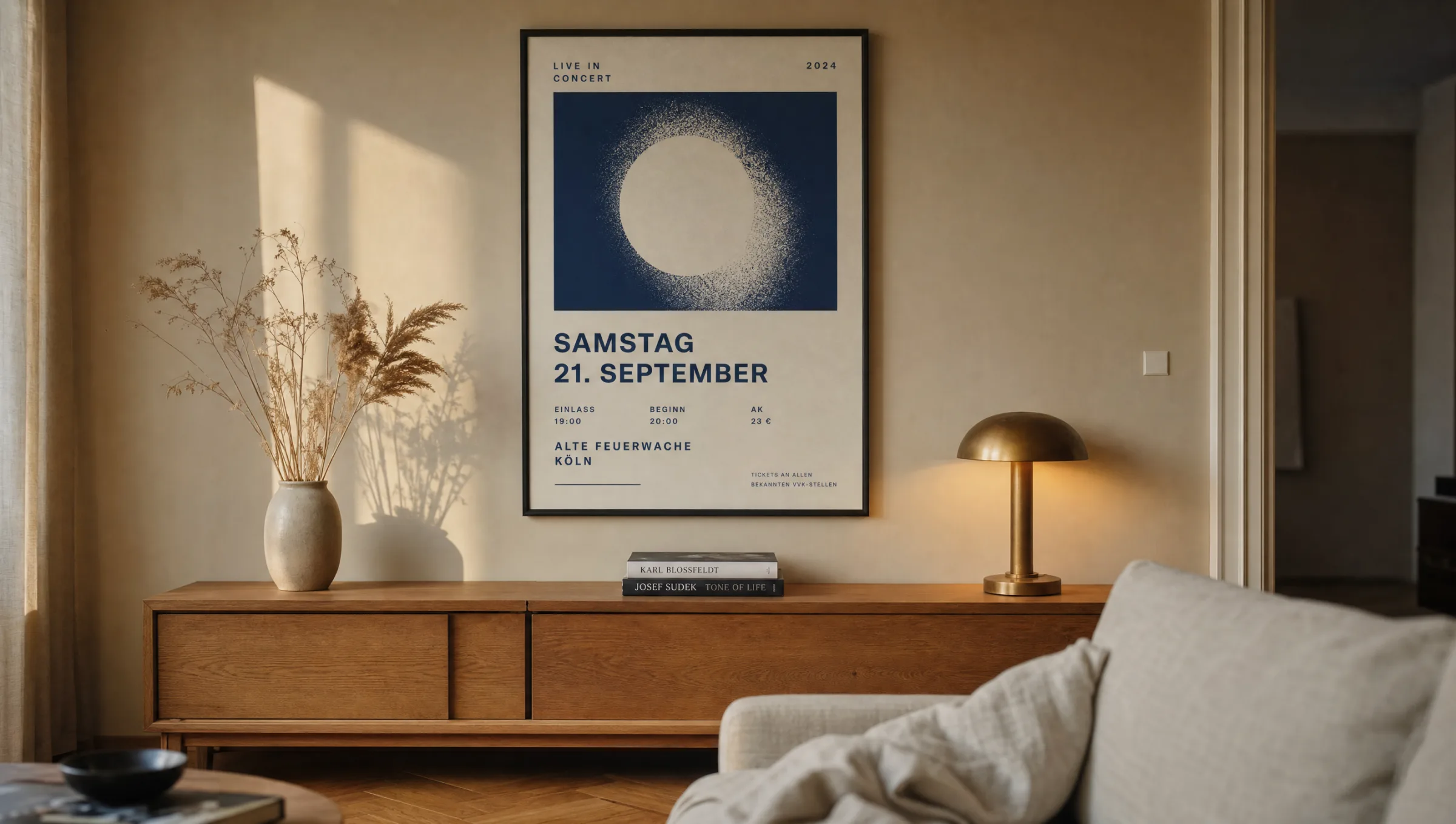
First: a single A1 poster above a low sideboard, flanked by two table lamps. The symmetry settles the often high-contrast motif and gives the wall a sense of weight and balance.
Second: a row of three prints in a hallway, all A2, all in the same frame. This creates a quiet chronicle of concerts attended without the space feeling overcrowded or busy.
Third: one concert poster in a study, combined with a calm photographic print and a graphic motif. The result is a trio of content, image and form – each held to the same format for coherence.
Häufige Fragen
-
01
What format works best for a concert poster in a living room?
A1 (59.4 × 84.1 cm) has proven itself as a composed standalone piece above a sofa or sideboard. Anyone grouping several prints will find A2 (42 × 59.4 cm) more manageable, as the motifs do not compete with one another. The key is matching the poster's width to the furniture below: a print between two-thirds and three-quarters of the width of the piece beneath it tends to look the most balanced.
-
02
What paper should a concert poster be printed on?
Matte premium papers from 200 g/m² upwards are the solid choice. That weight gives the print a physical presence, prevents warping and comes close to the feel of traditional poster printing. Matte surfaces reduce reflections and let black and colour areas appear rich and deep. For longevity, acid-free, FSC-certified papers with pigment-based inks are the sensible option and are standard in the premium segment.
-
03
Should a concert poster be framed or hung without a frame?
A narrow frame protects the edges and surface and gives the print a clean boundary against the wall. For minimalist rooms or larger collections, a poster rail in wood or aluminium can be enough – it emphasises the poster's character and makes swapping prints quick and easy. Adhesive tape or pins directly through the sheet are only suitable for short-term display, as they cause lasting damage to the paper.
-
04
How do you hang several concert posters neatly side by side?
The calmest result comes from a strict row or grid in which all concert posters share the same format and the same frame. Gaps of 4–6 cm between frames hold the composition together without making it feel cramped. Anyone wanting a little more movement can try a salon-hang, but should align everything along a shared central axis so the wall retains a sense of order and does not fragment visually.
-
05
How do you protect a concert poster from fading?
Direct sunlight is the primary cause of colour loss. Hanging a concert poster away from midday sun, and using anti-reflective or UV-filtering acrylic in the frame, noticeably extends colour stability. Rooms with moderate, stable humidity (around 40–55%) also help preserve the paper over time. For cleaning, a dry microfibre cloth is sufficient – liquid cleaners should never be applied to the surface.
-
06
What does Reetro look for in a concert poster?
Reetro operates as an editorial curator and works with prints produced in Germany on FSC-certified papers from 200 g/m² with a matte coating. Print files are reviewed editorially before production, colours are reproduced using pigment-based inks, and formats are available from A3 up to XXL. For anyone planning a considered wall arrangement, these prints sit naturally alongside premium canvas works or the aluminium wall art panels in the range.