Butterfly Poster: Motifs, Materials and Hanging — An Overview
Butterflies rank among the longest-curated subjects in natural history illustration. A butterfly poster bridges botanical tradition with contemporary wall design — considered, clear, and free from decorative excess. This overview takes an editorial look at motif styles, print quality and hanging options.
Why a Butterfly Poster Works in an Interior
Butterflies are compositionally generous subjects: symmetry, clean contours and a limited, often muted colour palette allow them to settle into a wide range of interiors without dominating the space. Unlike large-scale landscapes or abstract colour fields, they read as focused and calm.
Historically, the tradition of depicting butterflies is rooted in the natural history plate books of the 18th and 19th centuries. Maria Sibylla Merian's studies, for instance, established a visual language that still serves as a point of reference today. A butterfly poster in the classical plate style quotes that tradition while remaining graphic enough to hold its own in modern rooms.
In interior settings, the motif works particularly well in studies, bedrooms and hallways — spaces where a picture is observed over extended periods and a high visual stimulus density is not desirable.
Motif Directions: Which Butterfly Poster Suits Which Style
The range runs from scientific plate to reduced line drawing. Four directions can be editorially distinguished.
Botanical Plate
Detailed depictions of individual species with Latin names, often on a broken off-white ground. Suits classical interiors, book-lined walls and period apartments with decorative plasterwork.
Vintage Collection
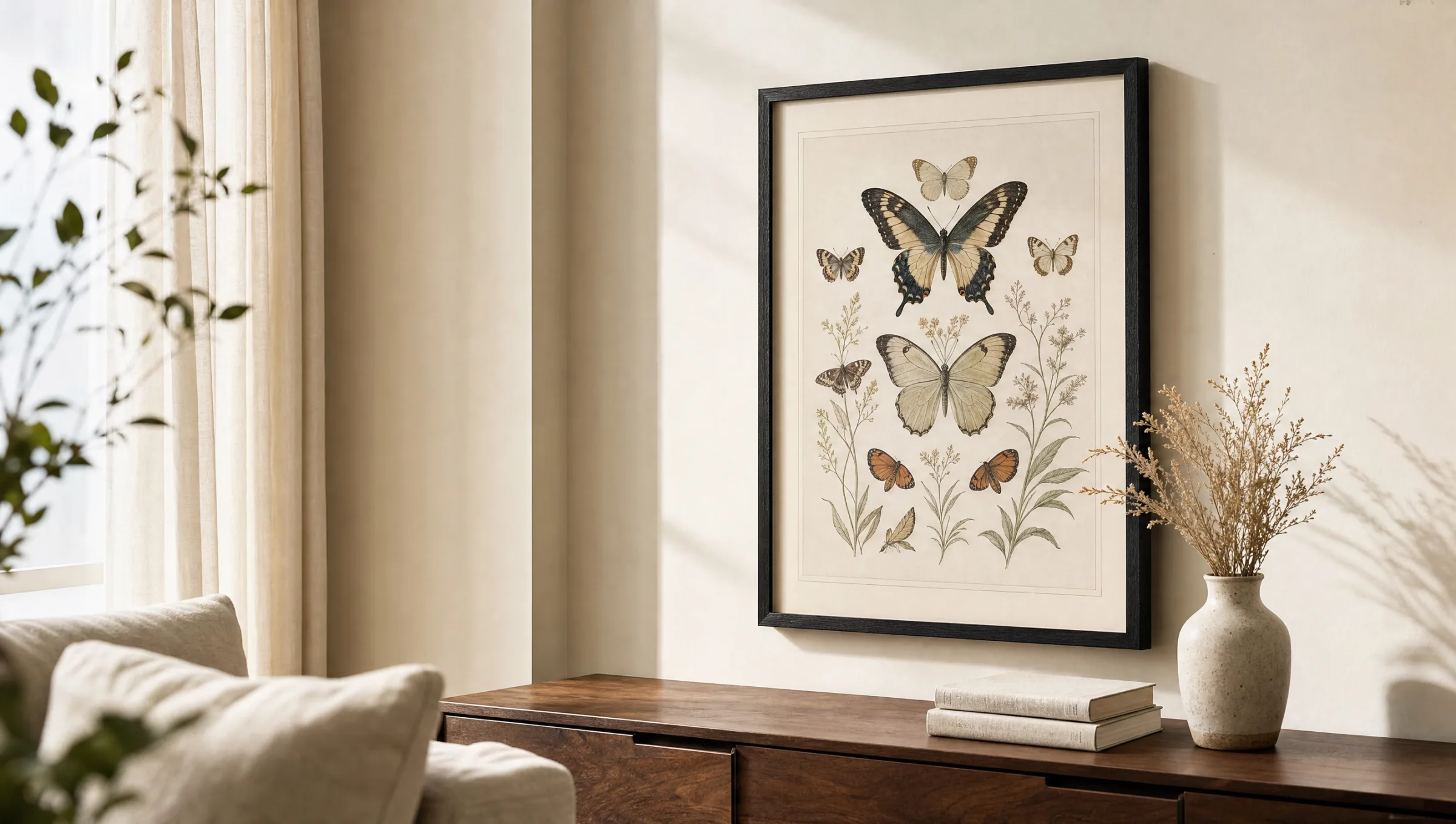
Multiple butterflies in a grid arrangement, reminiscent of entomological display cases. Reads as curatorial and works well on larger wall surfaces or as a central single image in a living room.
Minimal Line Art
Reduced outlines, often monochrome on a light ground. Works in Scandinavian-influenced spaces and complements natural textile tones without visual competition.
Watercolour Study
Soft colour gradients, visible brushwork, often a single butterfly without framing context. Well-suited to bedrooms and reading corners with subdued lighting.
Formats, Paper and Print Quality
The effect of a butterfly motif depends strongly on format. Smaller sizes from 30 × 40 cm emphasise the study character and lend themselves to groupings — three motifs side by side, for example. Mid-size formats around 50 × 70 cm work as a single image above a chest of drawers or a writing desk. XXL formats from 70 × 100 cm shift the character toward the graphic — the motif becomes surface.
At Reetro, printing is done on FSC-certified fine art paper from 200 g/m² upwards, with a matte coating. The matte surface reduces reflections and allows fine lines — such as the vein structures of wings — to register precisely. Gloss papers tend to read as too poster-like for this type of motif.
Anyone planning the piece long-term should look for pigment-based inks. They are more lightfast than standard dye inks and remain colour-stable for years even in brighter rooms.
A good butterfly motif draws its strength not from colour intensity, but from the precision of its contours and the stillness of its background.
Reetro Editorial
Hanging and Framing Your Butterfly Poster
Natural history motifs pair especially well with simple frames. A slim oak frame in natural wood or black-lacquered finish reinforces the plate character without overpowering it. Off-white mounts create additional breathing room between the motif and the frame — a classic device borrowed from museum display.
For gallery walls, several butterfly posters can be combined with other natural history studies: ferns, birds, botanical engravings. A consistent picture axis and even spacing of around 4 to 6 cm between frames are key to a coherent arrangement.
The ideal hanging height is guided by the eye level of the viewer — the centre of the image is conventionally placed at around 145 cm from the floor, somewhat lower in seated rooms such as dining rooms.
Care and Longevity
A framed butterfly poster requires little maintenance, but benefits from a few basic principles. Direct sunlight should be avoided, as UV light can cause gradual colour shifts over the years even with pigment-based prints. Positioning the piece away from direct light, or using UV-filtering glass in the frame, significantly extends colour stability.
Dust can be removed with a dry microfibre cloth. Glass cleaners should be avoided if the poster is hung without glazing — the matte coating is more sensitive to surfactants than gloss papers.
Häufige Fragen
-
01
What size should a butterfly poster be?
It depends on the location. For hanging above a chest of drawers or a desk, 50 × 70 cm works well as a single image because it optically balances the top of the furniture below. Above sofas or in larger hallways, 70 × 100 cm or bigger tends to feel more appropriate. As part of a picture group, smaller formats from 30 × 40 cm make sense because they fit neatly into symmetrical arrangements. A useful rule of thumb: the image should occupy roughly two-thirds of the width of the furniture beneath it.
-
02
Which frame suits a butterfly poster?
Butterfly motifs work particularly well with simple, narrow frames. Natural oak, black-lacquered wood or thin aluminium frames in black or anthracite support the study character without obscuring it. For botanical plate motifs, an off-white mount with a border of around 5 to 8 cm is a good addition. Watercolour and line-drawing motifs also work without a mount, provided the paper already carries a generous unprinted margin around the image.
-
03
Which rooms suit a butterfly poster best?
Bedrooms, studies, reading corners and hallways are the classic locations. The motif is focused and calm enough to sustain longer viewing without feeling restless. In children's rooms, watercolour or line art variants tend to work well. Rooms with high visual stimulus density — kitchens with many open shelves, for example — are less suitable, as the motif competes with too many other visual elements and loses its effect.
-
04
Are butterfly posters lightfast?
That depends on the ink and paper used. Pigment-based inks on acid-free fine art paper are colour-stable for many years, provided direct sunlight is avoided. Standard prints made with dye-based inks fade more quickly. Anyone planning to place a butterfly poster in a bright room should also consider UV-filtering glass in the frame. An indirect light situation — a north-facing window, or a wall without direct sun exposure — significantly extends colour stability.
-
05
How do I combine several butterfly posters into a gallery wall?
For a cohesive gallery wall, a consistent style works best — either exclusively botanical plates or exclusively watercolours, not mixed. Frames should share the same material and width. For a row of three to five posters, the ideal gap between frames is 4 to 6 cm. A shared central horizontal axis helps the group read as a unit. Those wanting variation can incorporate complementary natural history studies — ferns or bird motifs in the same visual language, for instance.
-
06
What paper does Reetro use for butterfly posters?
Reetro prints in Germany on FSC-certified fine art paper from 200 g/m² upwards with a matte coating. The matte surface reduces reflections and allows fine details — such as the vein structures of butterfly wings — to register precisely. Pigment-based inks are used throughout, which are more lightfast than standard dye inks. This combination of materials is particularly suited to detailed natural history motifs where contrast sharpness and a calm, slightly creamy paper tone matter more than a high-gloss finish.