Typography Poster: When Type Becomes Wall Art
A typography poster reduces design to its essentials: letters, words, sentences. What appears simple at first glance demands a surprising degree of care in the details — from typeface selection and paper choice to how it is hung. This overview offers an editorial look at styles, materials and typical contexts for typographic prints.
What defines a typography poster
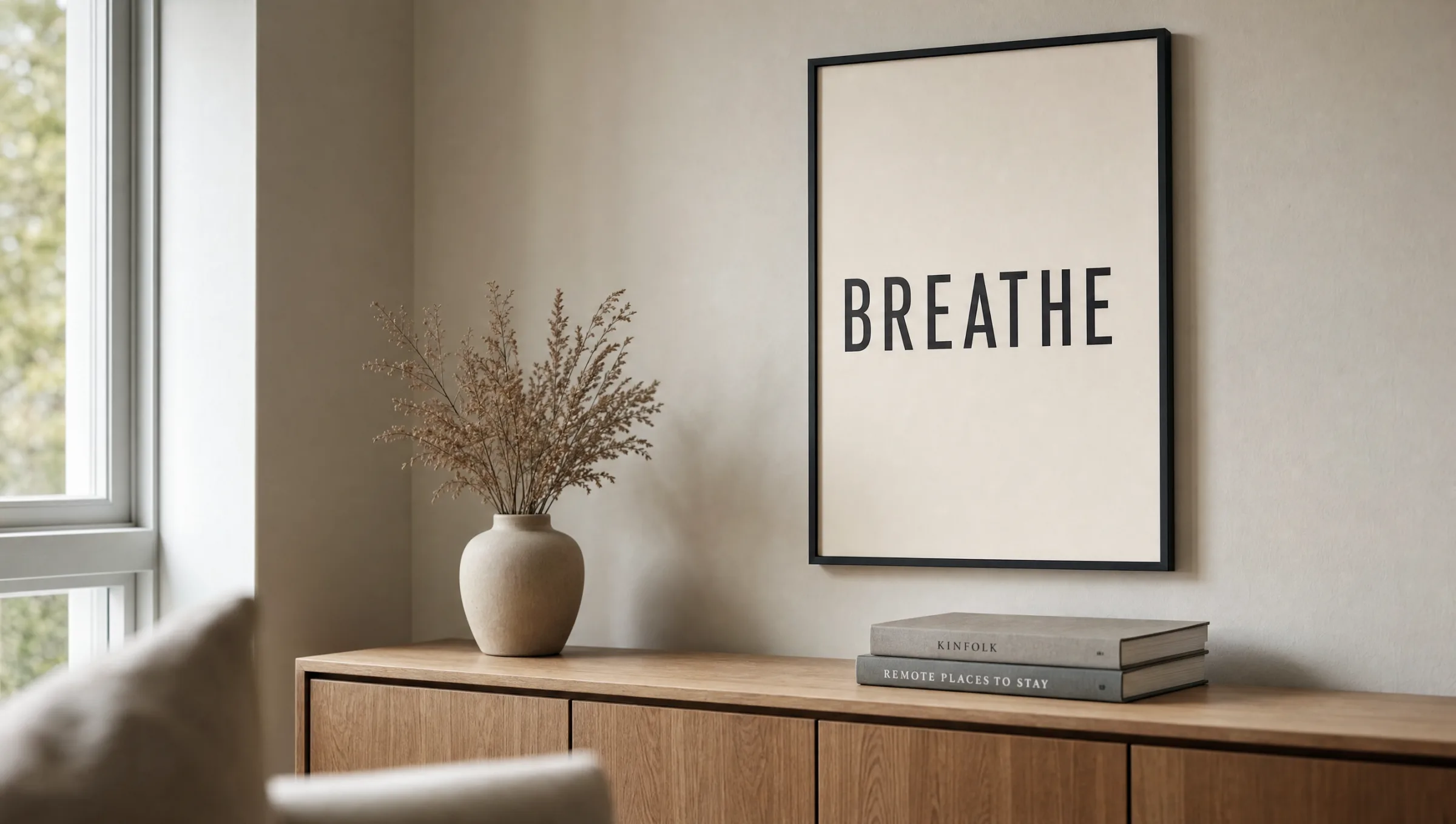
A typography poster uses type not merely as a means to an end but as the central design element. Unlike a conventional poster, where a visual motif takes centre stage and text plays a supporting role, here the typography itself carries the entire visual impact. Letterforms, tracking, contrast and composition determine whether a print feels calm or builds tension.
The range is broad: from minimalist single words set in a clean grotesque to densely typeset quotations in a serif face or hand-drawn lettering. Numbers, place names and standalone letters all qualify as typographic motifs. What matters is that the type is read consciously as form — not encountered in passing.
This reduction explains why typographic prints combine well with other visual content. Within a gallery wall they act as a compositional pause, guiding the eye without competing with surrounding motifs.
Styles within the typography poster segment
Typographic prints draw on distinct design traditions. The four directions below appear most frequently in curated collections and suit a variety of interior styles.
Swiss Style
Clean grotesque typefaces, asymmetric grids, generous white space. This 1950s Swiss school still shapes many typography posters today and sits well in minimal, contemporary interiors.
Bauhaus Typography
Geometric construction, primary colours, often all-caps. Type is treated here as a structural element. Such prints set a deliberate accent in rooms with clean lines and restrained furniture.
Vintage Lettering
Hand-drawn typefaces, decorative details, often inspired by old advertising posters or book covers. The result feels warm and narrative, harmonising with wood tones and muted wall colours.
Quote and Statement Posters
Literary excerpts, song lyrics or short phrases as the sole visual message. Their impact depends entirely on typeface choice and a composed, uncluttered type area free of decorative excess.
Material and format for a typography poster
Typography is sensitive to surface properties. Glossy finishes produce reflections that can wash out fine letterform edges. Matte coatings on FSC-certified papers from 200 g/m² upwards render letterforms with high contrast without the distraction of glare. Paper tone also plays a role: a slightly warm white reads less harshly against black type than a pure, cold white.
On format, the general rule is: the more text-heavy the print, the more generous the format should be. A single word works well at 30 × 40 cm, but a longer quotation or densely set lettering typically needs 50 × 70 cm or 70 × 100 cm so that line spacing and the type area can breathe.
Portrait orientations suit vertically arranged words or lists; landscape formats work for full sentences across multiple lines. Square formats are well suited when type and negative space are composed as equals.
A good typography poster is not read — it is looked at. The letters become form; the type area becomes composition.
Reetro Editorial
Hanging and combining a typography poster
Typographic prints can be placed in two ways: as a solitary, calm focal point above a sideboard or sofa, or as part of a gallery wall alongside photographic and illustrative works. In combination they often serve as a visual anchor, because the eye tends to linger longer on type than on purely pictorial content.
When hanging multiple typography posters side by side, a shared visual thread is important — the same typeface family, a consistent two- or three-colour palette, or identical frames. Without this common thread, a wall of typographic prints can quickly feel restless, as type always draws attention. Narrow black, white or oak frames support the typographic effect without overpowering it.
Hanging height should be guided by the natural eye level, with the centre of the print at roughly 145–150 cm from the floor. Above seating, prints can hang a little lower to maintain a visual connection with the furniture and keep any text comfortably legible.
Typography posters in work and living spaces
In an office or home workspace, typographic prints can support concentration, provided the message stays concise. Lengthy manifestos on the wall tend to distract rather than focus the mind. Single words, short maxims or abstract letterform compositions work well here — they do not demand to be re-read every time you pass them.
In living areas, quotations and literary excerpts can carry more depth, as viewing happens more deliberately. Kitchens and dining rooms accommodate more playful lettering styles, while bedrooms benefit from quieter, lower-contrast typography poster variants — light grey on warm white, for instance, rather than black on white.
Häufige Fragen
-
01
What sets a typography poster apart from a conventional art print?
In a typography poster, type itself is the motif. While a conventional art print presents a visual image that may be accompanied by text, here the typography carries the entire visual message. Letterforms, tracking, the type area and negative space take on the role that colour, composition and subject matter play elsewhere. This makes typographic prints particularly versatile to combine, because they do not overlap thematically with other pictorial motifs on the wall.
-
02
Which format works best for a typography poster?
It depends on the amount of text. A single word reads well even at 30 × 40 cm. Once multiple lines or dense lettering are involved, 50 × 70 cm or 70 × 100 cm are usually more appropriate, so that line spacing remains legible and the type area has room to breathe. Portrait formats suit vertical word arrangements, landscape formats work for full sentences, and square formats are ideal for balanced type-and-space compositions.
-
03
Which paper is best suited to typographic prints?
Matte papers from 200 g/m² upwards render type with high contrast and minimise reflections that could wash out fine letterform edges. A slightly warm white tone reads less harshly against black type than a pure cold white and makes the print easier to take in. Glossy surfaces are generally unsuitable, as light reflections reduce legibility. Textured natural papers can be attractive for hand-drawn lettering but should be used with restraint for very fine typefaces.
-
04
How can several typography posters be combined on one wall?
A shared visual thread is essential. This could be the same typeface family, a consistent palette of two or three tones, or uniform frames. Without this, a wall of multiple typographic prints can feel restless, because type always competes for attention. A well-tested approach is pairing one typography poster with two or three pictorial motifs, letting the type serve as a calm anchor within the arrangement.
-
05
Do typography posters work in a bedroom?
Yes, though the message and contrast should be kept understated. Long, bold statements can feel intrusive in a room intended for rest. Short words, abstract letterform compositions or quotations in muted tones — light grey on warm white rather than black on pure white — have proven most effective. This creates a quiet visual presence that supports the character of the room rather than competing with it.
-
06
Are Reetro posters printed in Germany?
Yes, the range is produced in Germany on FSC-certified papers from 200 g/m² with a matte finish. This choice of materials is especially relevant for typographic motifs, as letterform edges are reproduced with precision and minimal glare. The curated selection includes not only large-format prints but also premium canvas and hexagonal aluminium wall art, so typographic designs can be combined with different materials within a single gallery wall.