
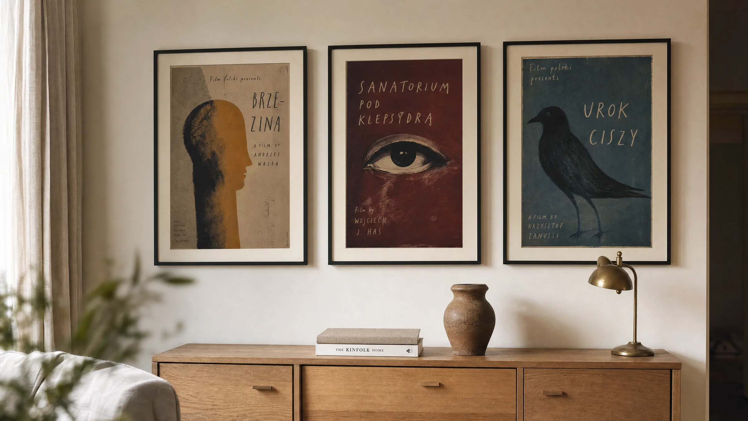
Polish film posters: a distinct graphic tradition
Few poster schools have left as lasting a mark on the international graphic design world as the Polish one. Between the late 1950s and the 1980s, a visual language emerged in Warsaw, Kraków and Poznań that transformed the film poster from an advertising tool into an independent artistic medium — built on metaphor, painterly handwriting and typographic experiment.
What sets Polish film posters apart from Western cinema posters
While Hollywood posters typically delivered star portraits and legible genre codes, Polish film posters followed a different logic entirely. The state film distribution structure of the People's Republic gave graphic designers an unusually wide degree of freedom: they had neither to negotiate actor image rights nor to sell in an overtly commercial way. The result was interpretation, not illustration.
A reduced central image idea is typical — often incorporating surreal or symbolic elements. Hand-painted surfaces, collaged photography and expressive lettering replaced smooth retouching. Title and director credits were frequently integrated calligraphically, so that type and image form a single unified composition.
This attitude makes the posters just as compelling in an editorial context today: they do not function as film advertising but as autonomous graphic works that can be read and appreciated without any prior knowledge of the film itself.
Four defining artists of Polish film posters
The so-called Polish Poster School was not a formal institution but a loose circle of designers with very different individual handwriting. Four names stand as representative examples of its breadth.
Henryk Tomaszewski
Widely regarded as the spiritual father of the movement. His reduced, often brush-drawn compositions and playful typography shaped generations of students at the Warsaw Academy of Fine Arts.
Jan Lenica
Combined poster art with animated film. His works make use of flowing lines, decorative patterning and a freedom of colour that was unusually expressive for the 1960s.
Waldemar Świerzy
Known for painterly, almost expressionist portraits — from jazz musicians to film characters. His posters show visible brushstrokes and rich, broken areas of colour.
Franciszek Starowieyski
Drew on baroque references, anatomical studies and a handwritten date signature. His posters have the quality of Old Master drawings translated into the graphic language of modernity.
Motifs and visual devices in Polish film posters
Looking at Polish film posters over an extended period, certain recurring motifs emerge: an isolated eye, a severed hand, masks, birds, ink running in rivulets across the sheet. These elements are rarely meant literally — they stand for moods, ambivalences, for what a film negotiates rather than what it shows.
In terms of colour, broken tones dominate: ochre, bordeaux, petrol, black. Pure red or yellow appears sparingly as an accent. The picture plane is frequently divided between a calm, often white zone and a dense, painterly zone. This compositional tension makes the posters quietly legible even in a contemporary interior.
Typographically, much is hand-drawn. Even typeset letterforms were stretched, overprinted or woven together with illustrations. This gives Polish film posters their unmistakable character — one that never feels industrial.
A Polish film poster does not sell a film. It comments on it — sometimes generously, sometimes with contradiction, always on its own terms.
Editorial note, Reetro
Placing Polish film posters in an interior
In a living space these motifs work best when they are not staged as nostalgia trophies. A single sheet above a plain sideboard, a matte passepartout and a restrained frame in natural oak or matt black are enough to let the graphic work speak for itself.
Because of their often broken colour palette, Polish film posters sit comfortably alongside warm neutral tones, linen, unbleached wood and matte brass. A cool, high-gloss interior can easily feel at odds with them. When combining several pieces, a shared point of reference helps — the same handwriting, a related colour family or a particular decade.
For everyday viewing, mid-sized formats between 50 × 70 cm and 70 × 100 cm work better than very large prints: the posters are designed for close viewing, and their typographic details reward careful attention.
Print, paper and reproduction
Originals from the 1960s and 1970s are now collector's items, often printed offset on wood-pulp paper and correspondingly fragile. For everyday home use, high-quality reproductions are the more practical choice — provided that the paper and printing respect the visual character of the source.
Matte, uncoated fine paper of at least 200 g/m² and a print with an expanded colour gamut are worthwhile, so that the characteristic broken ochres and bordeaux tones do not collapse into flat secondary colours. A slightly warm paper tone supports the graphic quality far better than a cold, blue-tinged bright white.
At Reetro, such reproductions are printed to order by a production partner in the EU on FSC-certified papers with a matte surface that avoids reflections and preserves the handmade quality of the originals. Printed to order in the EU, the prints arrive without aggressive coatings that would diminish the painterly feel of the source material.
Häufige Fragen
-
01
What makes Polish film posters so distinctive as an art form?
Polish film posters emerged under conditions that actively encouraged artistic freedom: the state film distributor required neither star portraits nor aggressive commercial messaging. This allowed designers to interpret a film rather than depict it. Characteristic features include a painterly hand, symbolic motifs such as eyes, hands or masks, hand-drawn typography and a reduced, often bipartite composition. These qualities place the posters well beyond functional commercial graphics and explain why they continue to feature in museum collections and auctions worldwide.
-
02
Which period produced the most important Polish film posters?
The main phase of the Polish Poster School spans roughly 1955 to 1985. Precursors existed as early as the late 1940s, particularly around Henryk Tomaszewski. The artistically richest period falls in the 1960s and 1970s, when names such as Jan Lenica, Waldemar Świerzy, Franciszek Starowieyski and Roman Cieślewicz gained international recognition. After 1989, the genre lost its special standing as the commercial film market took hold, though a younger generation of designers continues to work within the tradition.
-
03
How should Polish film posters be hung and framed?
Polish film posters work best when they are not over-styled. A plain frame in matt black, natural oak or brushed aluminium, a generous passepartout and a calm wall colour are sufficient. Because the posters are designed for close viewing, formats between 50 × 70 cm and 70 × 100 cm suit them better than very large prints. When combining several pieces, a visible point of connection helps — the same colour family, the same decade or the same artist. Direct sunlight should be avoided to prevent fading over time.
-
04
Are original Polish film posters still available to buy?
Original posters from the 1960s and 1970s are traded through specialist auctions, galleries and antiquarian dealers. Prices range from around one hundred pounds or euros for lesser-known pieces to four-figure sums for signed works by prominent artists in good condition. Condition, edition markings and provenance are decisive factors. Those who appreciate the visual world of Polish film posters but have no collecting ambitions are generally better served by high-quality reproductions, which can be displayed without concern and, when paper, colour gamut and format are chosen carefully, remain true to the originals.
-
05
What paper is best for reproducing Polish film posters?
For reproducing Polish film posters, matte uncoated fine paper of at least 200 g/m² is recommended. A slightly warm paper tone supports the broken colours of the originals far better than a cool, bright white. An expanded colour gamut in printing is important so that characteristic tones such as ochre, bordeaux and petrol do not flatten into dull secondary colours. Matte surfaces reduce reflections and allow the handmade quality of the originals to remain present. At Reetro, reproductions are printed to order by a production partner in the EU on FSC-certified papers and delivered without aggressive surface coatings.