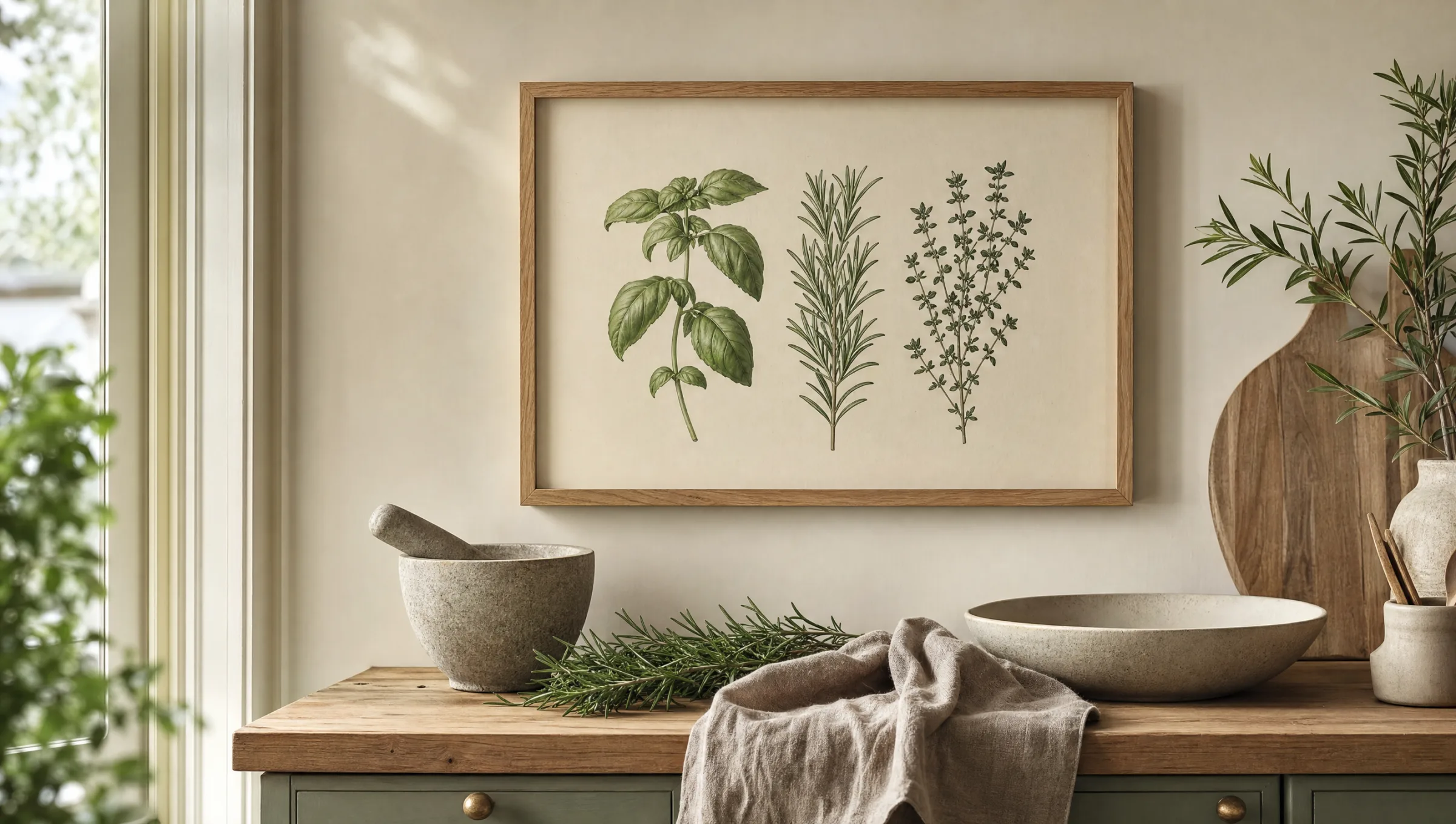
Kitchen Herbs Print: botanical wall art for the kitchen and dining area
A kitchen herbs print brings together botanical tradition and the everyday rhythm of cooking. Whether basil, rosemary or thyme – as a framed print, canvas or aluminium wall panel, it adds a sense of calm to the kitchen without tipping into decorative overload. This overview covers motifs, formats and placement ideas.
Why a kitchen herbs print suits almost any kitchen
Herb illustrations belong to the oldest motifs in botanical art. As far back as medieval herbals, basil, sage and thyme were drawn with care, labelled and gathered into printed plates. That visual language still resonates today: a kitchen herbs print connects to a tradition in which plant knowledge and aesthetics were closely intertwined.
In the modern kitchen-living space, this kind of motif plays a quiet role. It does not compete with crockery, food or appliances, but settles as a muted layer of colour between wall cabinet and worktop. Deep greens, warm beige tones and fine linework allow the print to hold its ground even when the kitchen itself is lively.
There is a practical dimension too: herb motifs translate across styles. They work equally well in a country-house kitchen and in a pared-back, almost laboratory-like fitted kitchen finished in matte anthracite.
Four design directions for a kitchen herbs print
Not every herb motif suits every kitchen. The four directions below are clearly distinct from one another and help narrow down the choice.
Classic botanical plate
A detailed illustration with the Latin name, typically on a cream ground. Works well in older-build kitchens, timber-fronted units and traditional interiors with bookshelves and vintage tableware.
Minimalist line drawing
Reduced outlines in black or deep green on white. Reads quietly in modern kitchens with handleless fronts and pale stone surfaces, and pairs well with series of three or four matching prints.
Watercolour study
Soft colour gradients, slightly irregular outlines and visible brushwork. Well suited to Scandinavian-influenced rooms with oak, linen and muted wall colours in sage, sand or clay.
Photographic still life
Fresh herbs on stone, wood or linen, shot in restrained light. Works in open-plan kitchen-living rooms and beside dark tall cabinets, where the photographic contrast finds a natural anchor.
Format, material and placement for a kitchen herbs print
The right material depends largely on position. In a closed kitchen with a powerful extractor hood, a framed paper print on FSC-certified paper of at least 200 g/m² with a matte coating is entirely sufficient. In open-plan kitchen-dining rooms where cooking and living space overlap, a premium canvas or a hexagonal aluminium wall panel is worth considering. Both are more tolerant of temperature fluctuations and can be wiped clean when needed.
On format: one larger print is usually more effective than several small ones that get lost between sockets and light switches. For open wall surfaces, 50×70 cm or 70×100 cm are reliable sizes. A series of three smaller prints works well along a long worktop or above a bench seat.
Placement follows use. Directly above the hob is not ideal – grease and heat settle on glass and frames. Better options are the wall beside the dining table, above a sideboard with crockery, in a breakfast nook or in the transition zone towards the living area.
A good herb print says nothing about decoration – it speaks of a kitchen where cooking actually happens.
Reetro editorial team
Colours and combinations around the kitchen herbs print
The colour palette of most herb motifs moves between sage, olive green, moss and warm off-white. These tones combine naturally with oak or walnut wood, brushed brass and natural stone such as travertine or pale marble. Anyone with a colour-saturated kitchen – in petrol blue, burgundy or deep navy, for instance – should look for motifs with a lighter background so the print does not disappear into the wall.
It makes sense not to think of the kitchen herbs print in isolation. A small gallery wall made up of two herb prints, a vintage map of Tuscany and a quiet still life with bread or wine forms a coherent narrative without feeling contrived. The key is a shared frame tone – natural oak, matte black or brushed aluminium all work well.
Care and longevity
Prints in the kitchen need a little more attention than those in a bedroom. Glass or acrylic surfaces can be cleaned with a soft, lightly dampened cloth; aggressive cleaning products are unnecessary and can attack matte coatings. For canvases a dry microfibre cloth is enough, while aluminium panels tolerate a mild cleaning solution.
Direct sunlight should be avoided, since even high-quality pigments can shift over the years. Anyone wanting to use the wall opposite a large window should choose UV-stable materials or a position that catches only diffused light. That way the motif remains colour-stable for many years and keeps its calm, considered character.
Häufige Fragen
-
01
What format works best for a kitchen herbs print?
Medium portrait formats between 30×40 cm and 50×70 cm tend to work well in the kitchen, as they fit neatly above worktops, beside wall cabinets or in dining nooks. For a larger open wall, 70×100 cm is a reliable choice, or a series of three smaller prints – basil, rosemary and thyme side by side – provides a cohesive arrangement. Square formats read quietly and suit gallery walls alongside other botanical motifs. The key consideration is that the print remains legible from seated height and does not hang directly above the hob, where steam and grease will stress the surface over time.
-
02
Can a kitchen herbs print handle the conditions inside a kitchen?
Generally yes, provided the print is not positioned directly above the hob or sink. High-quality FSC-certified papers of at least 200 g/m² with a matte coating are more resilient to temperature variation than thin poster stock. A frame with glass or acrylic glazing offers additional protection against airborne grease and can be wiped clean easily. Aluminium wall panels are particularly low-maintenance in open-plan kitchens because their surface resists moisture. If in doubt, choose a spot set back from the extractor hood and ensure adequate ventilation in the room.
-
03
Which herb motifs work well together in a series?
Classic culinary herbs such as basil, flat-leaf parsley, thyme, rosemary, sage, oregano and chives are well-established choices. Within a series, scale, background tone and drawing technique should be consistent – for example, all motifs as botanical plates on a cream ground, or all as minimalist line drawings on white. Mixing watercolour and photography in the same series tends to look restless. For a subtle accent, one motif featuring a mortar, olive oil or citrus fruit can be added, provided the overall colour palette stays muted.
-
04
How do I hang a kitchen herbs print correctly?
The centre of the print ideally sits at around 145 to 150 cm from the floor. Above a bench seat or sideboard, a gap of roughly 25 to 30 cm between the top of the furniture and the bottom of the frame is enough to create a visual connection between the two. For series, a consistent spacing of 3 to 6 cm between frames looks considered. In rented kitchens, lighter prints can be hung with adhesive hooks or picture rails; heavier canvases will require wall plugs. A small spirit level makes alignment straightforward.
-
05
Does a kitchen herbs print make a good gift?
Herb prints are a well-regarded gift for housewarmings, birthdays of friends who enjoy cooking, or as a considered house present. They feel personal without being intrusive, and they adapt to a wide range of interior styles. A thoughtful touch is to choose the recipient's favourite herb or put together a small series tied to a particular cuisine – basil, oregano and garlic for an Italian-leaning kitchen, for instance.
-
06
What does Reetro pay attention to when producing botanical prints?
Reetro prints botanical motifs in Germany on FSC-certified papers of at least 200 g/m², finished with matte coatings that reduce reflections and preserve colour nuance. For high-traffic spaces such as open-plan kitchens, aluminium wall panels and premium canvases are also available. The selection of kitchen herbs prints is editorially curated so that historical botanical plates, contemporary illustrations and quiet still lifes can coexist without competing with one another.