Comic Art Print: Visual Language Between Pop, Panel and Wall Design
A comic art print brings the graphic language of panels, speech bubbles and flat colour fields onto the wall — as a standalone image, not mere fan memorabilia. This page provides an editorial overview of styles, formats and materials, and shows which motif suits which room and why.
What Defines a Comic Art Print Today
The term comic art print covers far more than the classic superhero illustration of the 1960s. Today it encompasses Ligne Claire works in the tradition of Hergé, Japanese manga panels, Franco-Belgian album covers, and contemporary pop graphics that draw on the visual language of comics without belonging to any specific series.
What these motifs share is a reduced colour palette, a clear contour line and the narrative character of a single frozen image moment. Unlike photography or abstract painting, a comic art print always carries a trace of narration — a suspended panel that invites the imagination to continue the story.
For wall design, this means the motif sets a narrative accent and works particularly well in rooms where reading, playing or working already takes place.
Style Directions in Comic Art Prints Compared
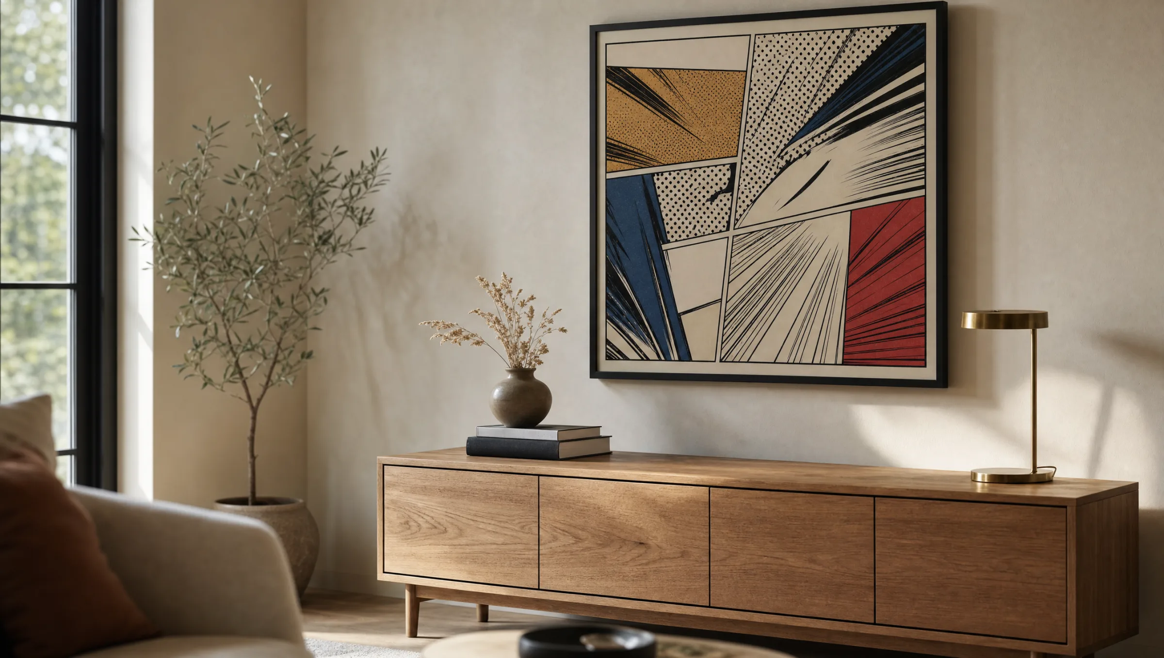
Four style families shape the market for comic art prints. They differ in line quality, colour application and the role of the background — and therefore in the effect they produce on the wall.
Ligne Claire
Clean, uniformly thick contour lines and flat colours without shading. Looks ordered and suits reduced, light-filled interiors with restrained furniture.
American Comic
Dynamic poses, strong light-dark contrasts and frequent halftone dots (Ben-Day dots). Makes a bold statement and needs space or high-contrast wall colours to breathe.
Manga & Anime
Fine lines, large eye areas, often black-and-white ink work or pastel tones. Fits well in teenage bedrooms and home offices with a warm, textile feel.
Pop & Editorial
Comic references without specific characters: speech bubbles, onomatopoeia, halftone screens. Works as a graphic statement between photography and typography.
Formats and Materials for a Comic Art Print
Comic motifs depend on the legibility of their lines. Very small formats swallow details, while very large formats can over-stretch individual panels. In practice, sizes between 50 × 70 cm and 70 × 100 cm work best — large enough to let the visual language breathe, but not so dominant that the rest of the room is overshadowed.
A matte FSC-certified paper from 200 g/m² upwards is particularly well suited as a substrate, because it renders flat colours cleanly without any glare. Anyone wanting to hang a comic art print in a children's room or a higher-traffic area is better served by a hexagonal aluminium wall print or a premium canvas with a more robust surface.
Framing should stay understated: slim black, white or natural wood mouldings support the graphic effect, while wide decorative frames compete with the already strong visual language of the motif.
A good comic art print is not a souvenir — it is a panel you consciously lift from the page and place on the wall, with all the narrative consequences that entails.
Reetro Editorial
Comic Art Print in the Room: Hanging and Combination
Single motifs have the most impact on a calm, uncluttered wall surface, ideally hung at eye level with the centre of the image around 145 to 150 cm from the floor. Above a sofa or sideboard, the lower edge of the print should sit roughly 20 to 30 cm above the top of the furniture so the motif reads as independent.
In a salon-style arrangement, several comic art prints can be combined with typographic prints, black-and-white photographs or abstract flat-colour works. The key is a consistent visual thread — a recurring colour tone, a unified frame style or a shared line quality running through all pieces.
If you want to position a single motif as the focal point of the room, resist adding too many other graphic elements around it. One panel on a pigmented wall — in a warm grey or muted sage green, for instance — often reads more powerfully than three smaller prints placed side by side.
Care, Light and Longevity
Comic motifs rely on high colour contrast — reds, yellows and cyans are especially sensitive to direct sunlight. A position away from direct midday sun noticeably extends colour brilliance. Pigment inks on matte paper are considerably more lightfast than lower-grade dye-based prints.
For cleaning, a dry microfibre cloth is sufficient. On framed prints, clean the glass or acrylic rather than the paper itself. Aluminium wall prints can be wiped down with a lightly damp cloth, making them a practical option for kitchens or bathrooms.
Häufige Fragen
-
01
What format works best for a comic art print?
For single motifs, sizes between 50 × 70 cm and 70 × 100 cm work well. At these dimensions, lines and flat colour fields remain clearly legible without individual panels feeling over-stretched. In larger rooms with high ceilings, XXL formats from 100 × 140 cm can also work, provided the wall has enough clear space around the print. For gallery-style arrangements with multiple comic art prints, smaller formats around 30 × 40 cm are more practical, as they are easier to compose into a cohesive group.
-
02
Does a comic art print work in an adult living room?
Yes, provided the motif is chosen deliberately. Editorial pop and Ligne Claire works without specific characters read as independent in a restrained living room setting. A simple frame, a calm wall surface and hanging at eye level all matter here. Combined with natural wood, linen and muted wall colours, a comic art print loses the feel of a teenage bedroom decoration and becomes a considered graphic accent instead.
-
03
What paper is best for printing a comic art print?
A matte fine-art paper from 200 g/m² upwards is recommended, ideally FSC-certified. The matte surface prevents reflections that can be especially distracting with the strong flat colours typical of comic motifs. Glossy or satin papers may make certain tones appear more vivid but make the image harder to read in daylight. For higher-traffic rooms, a premium canvas or an aluminium wall print offers greater durability. Reetro prints are made in Germany on FSC-certified papers with matte coatings.
-
04
How do I combine several comic art prints into a gallery wall?
A successful gallery arrangement needs a consistent visual thread. This can be a recurring colour tone, a unified frame style, or a shared aesthetic — for example, exclusively Ligne Claire motifs or consistently black-and-white manga works. Prints should hang with regular gaps of around four to six centimetres between them. Laying out a rough sketch on kraft paper at full scale before drilling any holes helps you check the composition in advance.
-
05
Will a comic art print fade over time?
All printed motifs lose colour depth under direct UV exposure. Comic motifs with a high proportion of red, yellow and cyan show this most visibly. A position away from direct midday sun, pigment inks rather than dye-based prints, and UV-filtering acrylic glazing all extend the lifespan considerably. When hung correctly, a high-quality pigment print on fine-art paper will remain colour-stable for many years.
-
06
What does Reetro pay attention to when producing a comic art print?
All prints are made in Germany on FSC-certified fine-art papers from 200 g/m² with matte coatings. For rooms subject to heavier use, premium canvases and hexagonal aluminium wall prints are also available. In curating the range, the focus is on a distinctive visual language that goes beyond licensed characters — with attention to line quality, composition and lasting suitability for the wall, so that each motif continues to hold its own as an independent work over the years.