
Western Wall Art: Open Skies, Dust and Typography on the Wall
A piece of western wall art speaks of landscapes, riders and sepia tones — but also of a very precise visual language. This guide sorts the key motif groups, explains formats and papers, and shows how the genre can sit quietly and comfortably within a modern interior.
What Defines Western Wall Art
Western wall art draws on a clearly defined visual vocabulary: red rock formations, wide prairies, dusty main streets, riders silhouetted against the light, and typography that recalls old wanted notices or film posters from the 1950s. This combination produces a style that is immediately recognisable without ever feeling heavy-handed.
Historically, the aesthetic feeds from two sources: the early landscape photography of the American Southwest by photographers such as Ansel Adams and Timothy H. O'Sullivan, and the Hollywood western film poster tradition stretching from John Ford to Sergio Leone. Both continue to shape composition, colour mood and lettering choices today.
Contemporary interpretations often reduce the genre to its essentials: monochrome mountain silhouettes, a single cactus study, a spare map of Monument Valley. This is precisely what makes western wall art interesting for rooms that are otherwise decorated with restraint.
Western Wall Art Motif Groups at a Glance
Within the genre, four recurring motif families can be distinguished, each serving different rooms and moods.
Landscape & Expanse
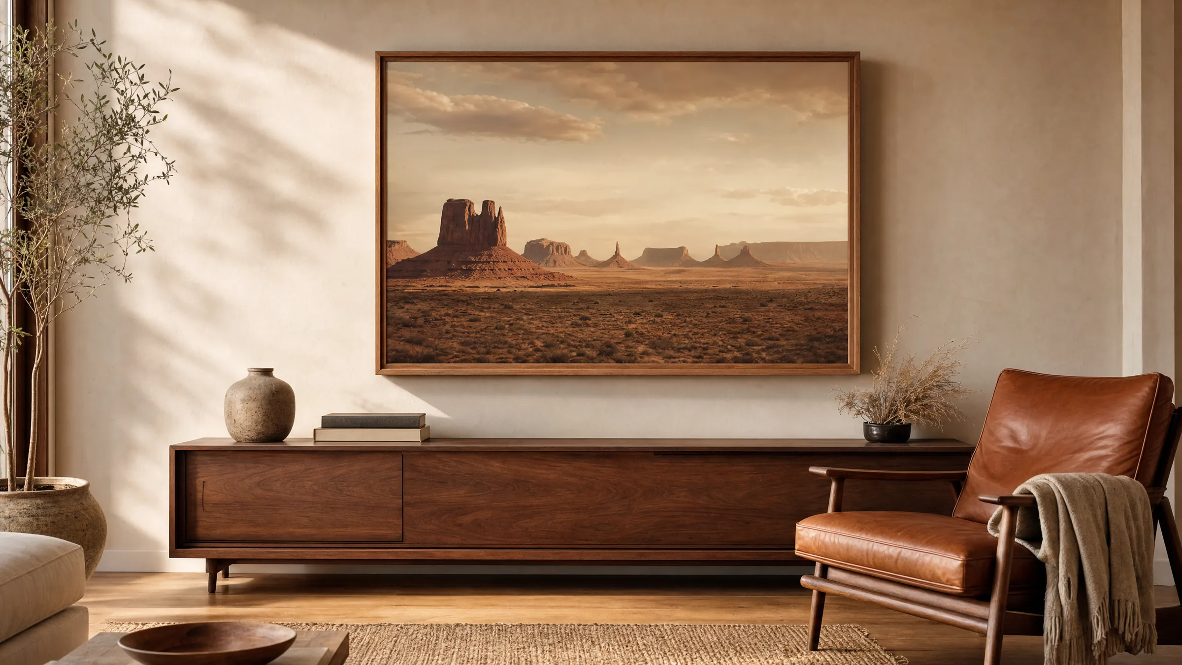
Monument Valley, the Grand Canyon, prairies at evening light: these motifs rely on strong horizontals and warm red-orange tones. They work especially well in panoramic or XXL formats above a sofa or sideboard.
Riders & Silhouettes
Cowboys against the light, horses in front of dust clouds, lasso scenes. The motifs live on contrast and also read well as graphic reductions — a black silhouette on a pale ground, for instance.
Typography & Posters
Wanted notices, saloon signs, rodeo announcements. Serif lettering with a woodblock feel generates nostalgia without tipping into kitsch — well suited to hallways, kitchens or home offices.
Botanicals & Detail
Cacti, yucca, desert blooms, eagle-feather studies. These quieter motifs combine well in sets of two or three and pair naturally with interiors featuring wood, leather and linen.
Formats and Papers for Western Wall Art
For western wall art with a landscape motif, a horizontal orientation or a generous portrait format works best — 50 × 70 cm, 70 × 100 cm or panoramic crops. The breadth of the motif needs space so that horizon and foreground can both register. Smaller formats from 30 × 40 cm upwards are better suited to detail studies or typographic pieces.
Paper surface plays a significant role: an FSC-certified matte paper of 200 g/m² or heavier softens the intensity of warm palettes and lets sepia and earth tones read with depth. Glossy surfaces increase contrast but can make landscape motifs feel overly cinematic. For large-format prints, a premium canvas whose texture complements the historical feel of the genre is worth considering.
Hexagonal aluminium panels work surprisingly well with reduced motifs — a single cactus silhouette or a mountain profile, for example. The clean edge of the hexagon provides a counterpoint to the soft desert aesthetic. All Reetro prints are printed to order by our production partner in the EU.
A good piece of western wall art needs no cowboy in the frame — the horizon alone is often enough to tell the story.
Reetro Editorial
Combining Western Wall Art in Modern Interiors
The genre's colour palette — burnt red, ochre, sand, anthracite — harmonises with materials that are already widely present in contemporary interiors: oiled wood, cognac leather, undyed linen, clay and terracotta. Western wall art therefore rarely feels out of place, as long as it is not surrounded by further decorative clichés from the same territory.
In living rooms, the principle of one strong piece rather than a collection tends to work best: one large landscape motif as an anchor, complemented at most by a smaller, quieter detail. In hallways or stairwells, on the other hand, a serial arrangement of three to five prints with matching frames works very well.
Frames in natural oak or matte black are a reliable choice. Anyone wishing to emphasise the cinematic quality of the genre can opt for slim aluminium frames in a bronze or brass finish — used sparingly.
Care and Longevity
The warm reds and oranges characteristic of this genre are more sensitive to direct sunlight than cooler colour ranges. A position away from direct midday sun significantly extends colour stability, regardless of the printing method used.
Pigment inks on matte fine-art paper are the most durable combination for this type of motif. For framed prints, anti-reflective glass with UV protection is recommended, particularly for formats of 70 × 100 cm and above. Canvas prints can be dusted with a dry microfibre cloth; damp cleaning is not necessary.
Häufige Fragen
-
01
Which motifs work best for western wall art in a living room?
Landscape motifs with a clear horizon are the most reliable choice for living spaces — Monument Valley, prairies at evening light or mountain silhouettes from the American Southwest. They bring a sense of openness to a room without imposing. Those who prefer a more reduced look can turn to graphic silhouettes or botanical studies featuring cacti or yucca. Typographic pieces in a wanted-notice or saloon style are more expressive and tend to suit hallways, kitchens or studies better than a position above the sofa.
-
02
What format makes sense for western wall art?
Landscape motifs need space for the horizon to register properly. From 50 × 70 cm upwards is a reasonable lower limit; above a sofa or sideboard, 70 × 100 cm or a panoramic format is often preferable. For typographic motifs and detail studies, 30 × 40 cm or 40 × 50 cm is sufficient. A practical rule of thumb: the print should span roughly two-thirds of the width of the furniture below it. A series of several smaller prints only partially substitutes for one large single work.
-
03
Which colours and materials pair well with western wall art?
The typical palette of ochre, sand, burnt red and anthracite harmonises with warm woods such as oak or walnut, with cognac and caramel leather, undyed linen, wool and clay. Cooler materials such as chrome or high-gloss white tend to create a sharp contrast. Frames in natural oak or matte black are restrained enough to let the motif speak. For those who want to bring out the cinematic quality of the genre, slim aluminium frames in a muted bronze finish are a considered option.
-
04
Does western wall art risk looking kitsch?
The genre tips into kitsch mainly when several clichés are stacked in the same room — cowboy hat, lasso, longhorn skull and a wanted poster all at once. Choosing one calm, considered motif and pairing it with quality everyday materials keeps the reference to the genre present without overdoing it thematically. Reduced landscapes or botanical studies read far more quietly than figurative scenes with riders.
-
05
How light-resistant are the warm colours in western wall art?
Reds, oranges and sepia tones are more sensitive to UV radiation than cool colours. A position away from direct midday sun noticeably extends colour stability. Pigment inks on matte fine-art paper are the most durable combination for this type of motif, particularly when paired with anti-reflective UV-protective glass in larger formats. With appropriate display conditions, colours remain stable for many years.
-
06
How does Reetro approach the production of western wall art?
Reetro prints to order through its production partner in the EU on FSC-certified fine-art paper of 200 g/m² or heavier with a matte coating that complements the warm palette of the genre particularly well. Premium canvas is available for large-format landscape motifs, and hexagonal aluminium panels are offered for reduced silhouettes and graphic works. Motifs are editorially curated with attention to composition, colour mood and typographic detail — carrying the genre without overstating it.