The Kiss Edvard Munch: Work, Meaning and Wall Art
Few depictions of love in modern art are quoted as often as The Kiss by Edvard Munch. The motif merges two figures into a single silhouette, making it an enduring symbol of closeness and dissolution at once. This page offers an editorial overview of the work and explores what matters when choosing a print, format, and hanging arrangement.
The Kiss Edvard Munch in Art-Historical Context
Edvard Munch worked on variations of this motif for more than two decades. Between 1892 and 1897 he produced several painted versions, supplemented by etchings and woodcuts. Munch placed the image within his large cycle of works known as the Frieze of Life, in which he portrayed love, anxiety, and death as interconnected human experiences.
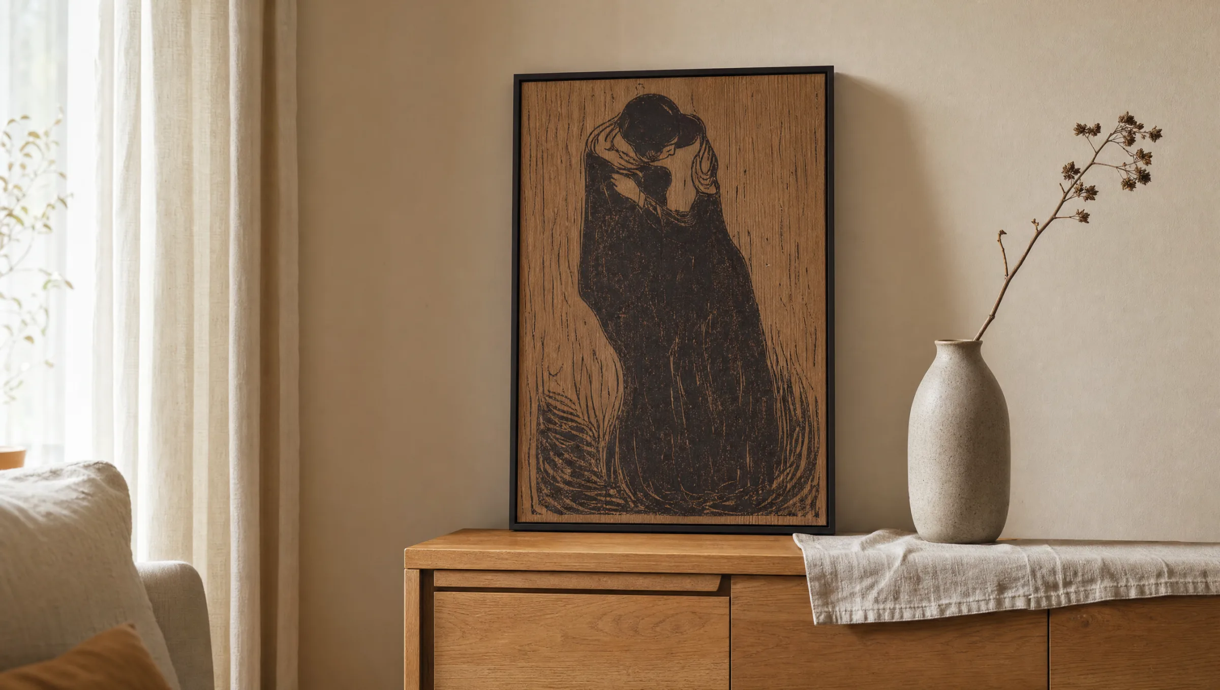
The best-known woodcut version of 1897 reduces the motif radically: two bodies stand before a coarsely grained wooden ground, their faces fused into a single shared surface. It is this formal rigour that makes The Kiss Edvard Munch so enduringly effective as a printed image — including in contemporary living spaces.
Contemporaries were divided in their reactions. While critics found the lack of individualised faces unsettling, younger Symbolists read precisely that quality as the work's central statement: the dissolution of the self in the encounter with another.
Key Versions at a Glance
Munch developed the subject across different techniques and moods. The four versions below have shaped how the work is understood and appreciated today.
The Kiss (1892)
An early painted version in muted tones. The figures stand at a window, a curtain parting to reveal a nocturnal cityscape. The mood and composition retain a narrative quality.
The Kiss (1897, Oil)
A more reduced oil version in which the faces almost completely merge for the first time. The background becomes flatter, and attention concentrates on the outline of the embracing pair.
The Kiss IV (Woodcut, 1902)
The iconic print variant: the grain of the woodblock remains visible and becomes part of the visual language. Black and the natural wood-brown tones are all Munch needed here.
Later Etchings
Munch experimented with etchings and lithographs in smaller editions. These works present the motif through finer lines while consistently retaining the merging of the two heads.
Composition and Symbolism in The Kiss Edvard Munch
The formal core of the work is the act of merging. Where classical depictions of couples show two distinct profiles meeting, Munch allows a single oval form to emerge. This reduction shifts the emphasis from a narrative moment to an archetypal statement about closeness.
The background remains restrained across most versions. In the early paintings a window opens onto the outside world; in the woodcuts the grain of the printing block dominates. This shift is deliberate: a private scene becomes a symbolic image.
The colour palette, too, is tightly held. Browns, broken whites, and deep blacks are enough to generate tension. This very economy explains why The Kiss Edvard Munch works so reliably in modern interiors: the image aligns itself with wall colours rather than overpowering them.
Munch does not show the moment of a kiss but its essence: the dissolution of two outlines into a single shared form.
Reetro Editorial
The Kiss as Wall Art: Formats and Materials
For reproduction, matte papers from 200 g/m² upwards are particularly well suited. The subdued spectrum of the original does not call for a high-gloss coating; a slightly textured FSC-certified paper picks up the woodcut character well and avoids distracting reflections in living spaces. Made in Germany, Reetro prints are produced to match the tonal qualities of each motif.
For format, portrait-oriented 50×70 cm works well on gallery walls and in mid-sized rooms, while 70×100 cm gives the motif enough room to stand alone above a sofa or sideboard. For XXL prints beyond 100 cm on any edge, the source files should carry sufficient resolution to keep the characteristic wood grain clearly legible.
Premium canvas slightly alters the impression: the texture of the support enters into a dialogue with the grain of the woodcut. Those who prefer a more graphic, reduced effect are best served by paper behind glass or a matte aluminium wall print.
Hanging and Combination
The Kiss sits comfortably alongside other works. On a curated gallery wall it can be paired with further Munch motifs, but also with linocuts or calm black-and-white photographs. A consistent frame tone is important — ideally slim, in natural oak or matte black.
As a standalone piece the image has the greatest presence above a seat or at the end of a hallway. Indirect lighting from above draws out the wood grain without bleaching the dark ground of the image.
Häufige Fragen
-
01
When was The Kiss by Edvard Munch created?
Edvard Munch worked on the motif in several stages between 1892 and around 1902. The first known painted version dates from 1892, with a more reduced oil version following in 1897. The best-known variant is the woodcut of 1897 and the reworked print sequence up to 1902, in which the grain of the woodblock itself becomes part of the image. Munch assigned these works to his Frieze of Life, a cross-work cycle addressing love, anxiety, and death.
-
02
What does The Kiss Edvard Munch mean thematically?
The Kiss Edvard Munch is widely understood as a symbol of the dissolution of the individual in the encounter with another person. Unlike classical depictions of love, Munch does not show two separate profiles but allows the faces to merge into a single shared surface. Scholarship reads this merging both as an image of profound intimacy and as a reference to the loss of personal boundaries — a duality typical of Symbolism.
-
03
Where is the original held?
Several original versions exist in parallel. The 1897 oil painting is held at the Munch Museum in Oslo, while further painted and print variants are in the Nasjonalmuseet and in international collections. Woodcut impressions appear regularly in exhibitions on Munch and on printmaking around 1900, since Munch himself placed great value on his graphic work.
-
04
Which format suits The Kiss Edvard Munch as a wall art print?
For gallery walls and mid-sized rooms, portrait-format 50×70 cm is a reliable choice. As a standalone piece above a sofa, bed, or sideboard, 70×100 cm provides a calmer presence and gives the composition enough room to breathe. For XXL prints the source resolution should be high enough that the characteristic wood grain remains clearly visible. Landscape crops are possible but alter the composition and are generally not recommended.
-
05
Which material suits this motif best?
Because Munch works with a reduced colour palette and visible wood structure, matte surfaces are particularly appropriate. An FSC-certified fine paper from 200 g/m² upwards with a slight texture picks up the woodcut character and avoids unwanted reflections. Premium canvas adds a textile quality to the surface, while a matte aluminium print gives the image a more graphic feel. Reetro prints all variants in Germany, with each material editorially matched to the motif.