Pastel Wall Art: Prints in Restrained, Soft Tones
Pastel wall art shapes the mood of a room without trying to dominate it. It works through broken tones, soft transitions and an inherently light atmosphere. This overview covers motifs, print materials and ways to combine pieces, and outlines what to look for when making a selection.
What defines pastel wall art
Pastel colours are not a colour family in their own right but a level of brightness: pure hues are mixed with white, which lowers their saturation and softens their intensity. Typical examples are dusty rose, mint green, pale blue, muted yellow, lilac and warm beige tones. This palette rarely feels bold and tends to sit comfortably alongside furniture and textiles rather than competing with them.
Pastel wall art therefore plays a different role from high-contrast graphics or dark photography. These prints act as quiet surfaces that articulate wall areas without demanding attention. In rooms with plentiful natural daylight they are particularly effective, because the subtle tonal gradations are not overpowered by warm artificial light.
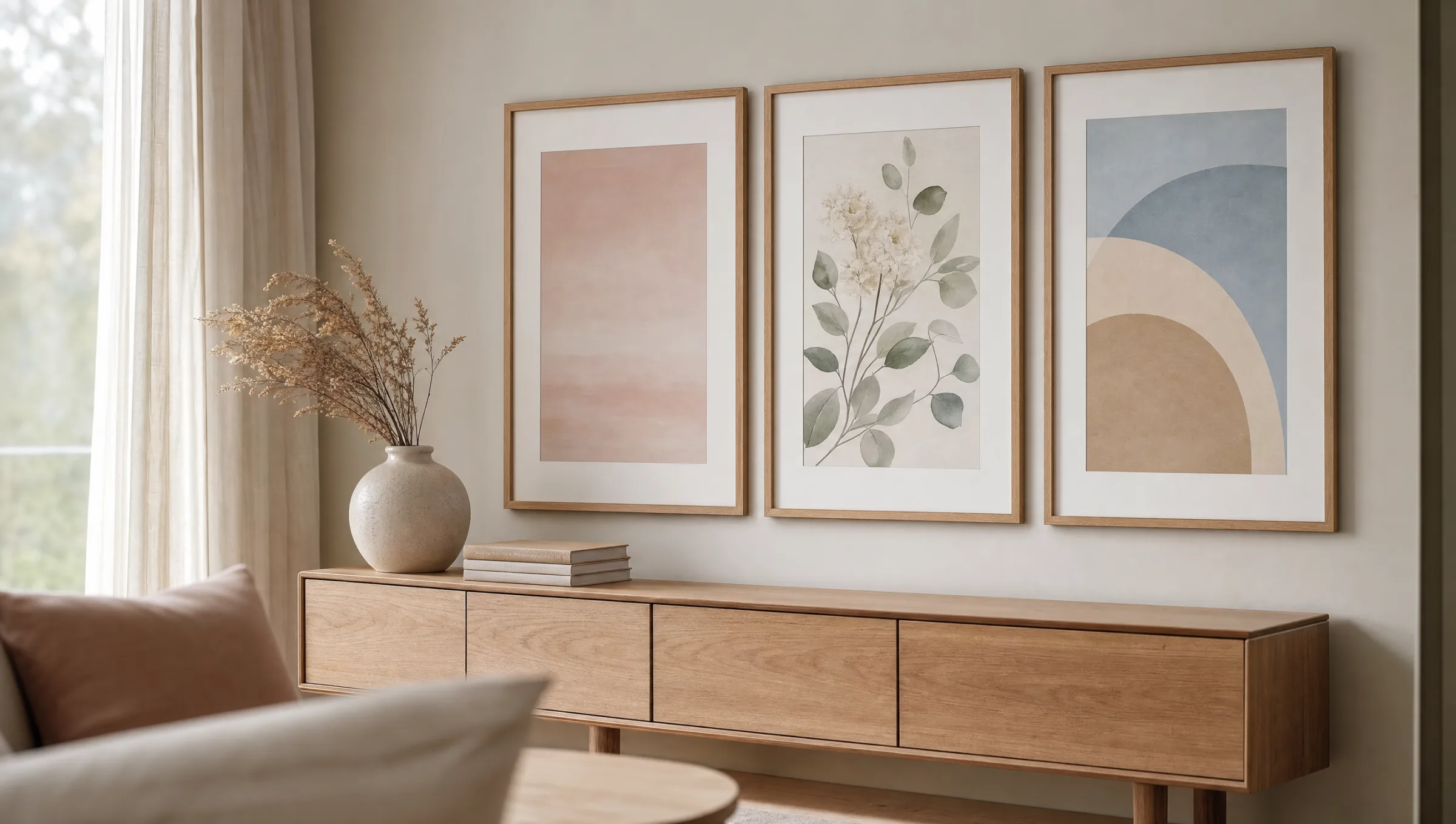
In editorial terms, pastel imagery can be loosely grouped into three categories: abstract colour fields and gradients, floral or botanical motifs rendered in a watercolour or pastel-chalk manner, and contemporary illustrations with a reduced formal vocabulary. All three approaches share an avoidance of sharp light-dark contrasts.
Motif directions for pastel wall art
Four categories appear most frequently in pastel wall art. They differ in visual language and in the interior contexts they suit best.
Abstract colour gradients
Soft gradients from rose to sand or from pale blue to off-white. They read like painted light moods and work well in bedrooms and living rooms with calm, understated furniture.
Botanical watercolours
Grasses, eucalyptus, dried flowers or branches in subdued greens and rose tones. Popular as a triptych above a sideboard or as a quiet series in a hallway.
Geometric forms
Circles, arcs and half-moons in powdery tones, often with a Bauhaus reference. They give modern interiors structure without causing disruption through strong contrasts.
Still lifes and ceramics
Vases, bowls and fruit in a toned-down palette. This motif direction pairs well with natural materials such as linen, oak and raw clay.
Choosing materials for pastel wall art prints
Because pastel motifs rely on fine tonal differences, the choice of print substrate is decisive for the finished result. Glossy surfaces reflect light and wash out colours that are already reduced in saturation. Matte papers and matte coatings, on the other hand, keep tones quiet and avoid hard reflections.
FSC-certified fine art papers from 200 g/m² upwards give pastel prints a subtly tactile depth and are a widely used choice for poster formats. Premium canvas suits abstract gradients particularly well, since the textile surface further softens gentle transitions. Aluminium wall panels — such as in hexagonal form — become more interesting when pastel tones are paired with clear geometry.
When it comes to framing, restraint is advisable. Slim natural oak, ash or matte white frames disturb the colour calm far less than wide, lacquered profiles. Off-white passepartouts increase the visual breathing space and support the effect of the light palette. Reetro's prints are made in Germany on acid-free substrates designed to hold these quiet tones over time.
Pastel tones need no staging — they work best when frame, wall and light give them room rather than competing with them.
Reetro editorial team
Combining pastel wall art in a room context
In light, Scandinavian-influenced rooms, pastel wall art reinforces an already restrained atmosphere. A single larger format above a sofa or bed is often sufficient. It matters that the wall itself is not painted in a cold, stark white — a creamy or slightly warm wall tone carries the pastel palette noticeably better.
In darker or more richly furnished rooms, pastel prints work effectively as a counterbalance. Against a deeply painted wall in sage green or clay brown, dusty rose and muted yellow gain presence without losing their quietness. The same principle applies here: fewer, larger formats tend to work better than many small pieces, which can feel restless.
A classic arrangement is a three-part series above a low piece of furniture. Three pastel wall art pieces in the same format and with a related colour palette read as a single coherent wall object. Anyone planning a salon-style hang should consciously limit the tonality to two or three pastel colours so that the wall does not appear fragmented.
Care and longevity of pastel prints
Light prints are inherently more sensitive to direct sunlight than dark motifs, because colour shifts become visible sooner within a pale palette. Positioning away from direct midday sun significantly extends colour stability. Pigment inks and acid-free papers are the standard choice for this reason.
For cleaning, a soft dry cloth or a dusting brush is generally sufficient. Cleaning agents should be avoided, as they can attack matte coatings and leave visible streaks. For framed pieces, occasionally wiping the glass with a lightly dampened microfibre cloth is all that is needed.
Häufige Fragen
-
01
Which rooms suit pastel wall art best?
Pastel wall art works particularly well in rooms where a calm baseline atmosphere is wanted — bedrooms, living rooms, reading corners and hallways. It is also frequently used in children's rooms because it is neither garish nor dark. Adequate natural light is important, as pastel tones can look flat in heavily shaded spaces. In kitchens and bathrooms, both print substrate and framing should be chosen to withstand higher humidity levels.
-
02
What wall colour works with pastel wall art?
Pastel wall art looks most balanced against walls in natural white, cream, light sand or a slightly warm grey. Deeper tones such as sage, clay brown or muted teal also work well because they bring out the pastel palette as a counterpoint. Pure cool white is less ideal, as it makes the already reduced saturation of the prints feel even cooler. If in doubt, test the wall colour with a sample patch next to the intended piece before committing.
-
03
How do I combine several pastel wall art pieces into a series?
When grouping multiple pastel wall art prints into a series, limiting the palette to two or three recurring tones is key. If dusty rose and sage green appear across all motifs, the overall picture stays cohesive even when the subjects vary. Identical frames and consistent formats reinforce this unity further. For three pieces, a symmetrical hang above a piece of furniture is a common approach; for four or more, a strictly rectangular grid with even spacing tends to work best.
-
04
Do pastel colours fade faster than bold colours?
Pastel colours do not necessarily fade faster, but changes become visible earlier within a light palette. What matters most is the quality of inks and papers used, as well as the location of the piece. Pigment inks and acid-free, wood-free papers offer high lightfastness. Direct sunlight should still be avoided, as should significant fluctuations in humidity. Under normal living conditions, high-quality prints retain their colour effect for many years.
-
05
What format makes sense for pastel wall art?
The right format depends on the motif and the available wall space. Abstract gradients and quiet colour fields benefit from larger formats from 50 × 70 cm upwards, because subtle transitions read better at scale. Detailed watercolours or small geometric compositions can also work convincingly in smaller formats, especially when hung as a series. A useful rule of thumb is that a print or group of prints should span roughly two thirds of the width of the furniture piece below it.
-
06
What should I look for in print quality when buying pastel wall art?
For pastel wall art, the key factors are clean gradients without visible banding, a matte surface free from reflections and a sufficiently heavy paper stock. Reetro prints its posters and art prints in Germany on FSC-certified fine art papers from 200 g/m² using pigment-based inks and a matte coating. This combination gives the pastel palette the depth it needs and prevents tones from appearing flat or with an unwanted colour cast.