Landscape Poster: Motifs, Formats and Styles at a Glance
A landscape poster often changes a room more profoundly than any other wall object. It opens up perspectives, gives the eye an anchor point and shapes the mood of a space. This guide covers motif categories, formats and materials — so the choice fits the room, not just the trend.
Why a Landscape Poster Carries a Room
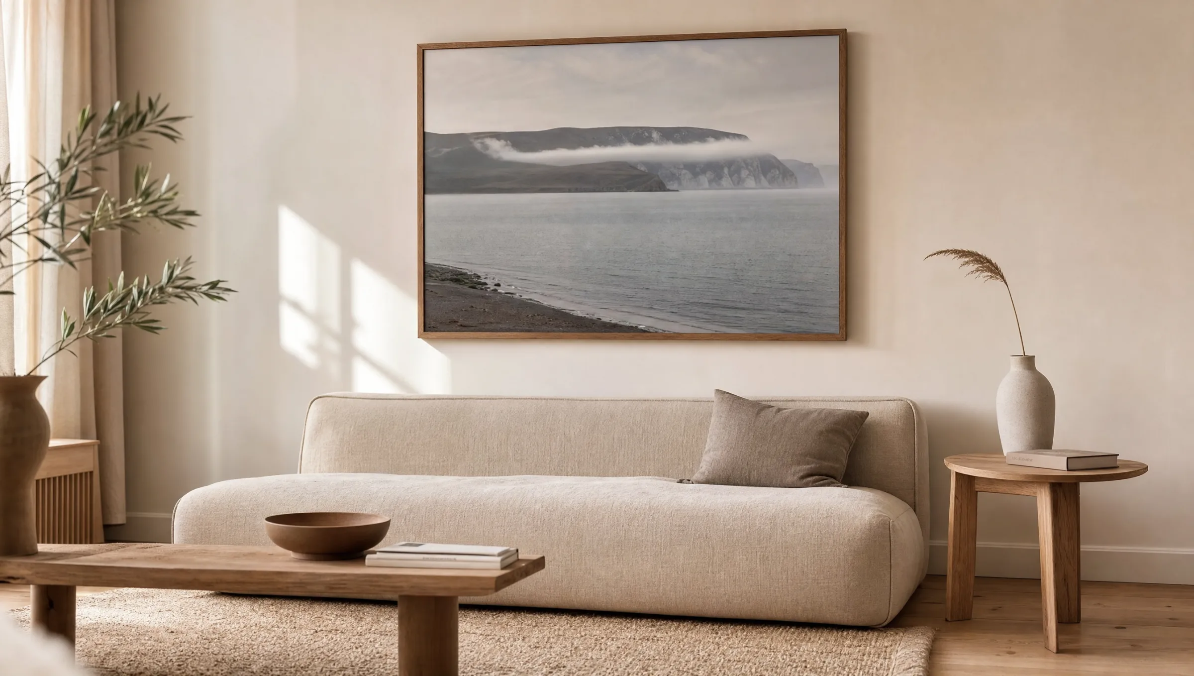
Landscape motifs work with breadth and depth. Unlike graphic prints or portraits, they create a vanishing line that draws the eye out beyond the room. This is precisely what makes a landscape poster particularly well-suited to compact living spaces: it can visually open up a wall without overloading the room with patterns or flat blocks of colour.
The picture axis matters. Horizontal motifs — coastlines, high plateaus, gentle hills — calm the eye and emphasise the width of a wall. Vertical compositions such as forests, waterfalls or ravines draw the gaze upward and work well in spaces that feel low, such as hallways or narrow niches between furniture.
Light climate plays a role too. A cool Nordic mountain scene has a balancing effect in a south-facing living room, while warm desert or Tuscan scenes warm up cooler spaces optically. It is worth thinking through this interplay consciously before settling on a motif.
Four Styles of Landscape Poster
Landscape photography and painting can be broadly grouped into four recurring styles. Each has its own visual language, colour world and natural setting.
Nordic Expanse
Fjords, coastlines, misty mountains in muted blue and grey tones. Works well alongside Scandinavian interiors, light oak furniture and linen textiles. Strongest as a single large-format print.
Mediterranean Hills
Tuscany, Provence, Greek islands. Warm ochre, olive and terracotta tones. Suited to dining rooms and kitchens where an earthy colour accent carries the atmosphere.
Desert and Canyon
Sandstone formations, dunes, high plateaus. A reduced palette of rust, sand and deep shadow. Works well in minimalist interiors with concrete or clay surfaces.
Forest and Mist
Dense woodland, morning haze, shafts of light. Darker image plane, often near-monochrome. Sets a focal point in bedrooms, reading areas or more dimly lit living rooms.
Formats and Papers for Landscape Posters
Format choice determines whether a landscape poster reads as the main motif or as part of a gallery wall. For solo hanging above a sofa, bed or sideboard, formats from 70 × 100 cm upward have proven well-balanced; XXL prints from 100 × 140 cm place a motif clearly in the room without needing additional images alongside.
For gallery walls, smaller formats between 30 × 40 cm and 50 × 70 cm are practical. Here it is less the individual motif that matters than the picture axis: landscape posters should hang at a similar horizon line so the eye finds a calm reading line across the arrangement.
When it comes to paper, restraint pays off. Matte FSC-certified paper from 200 g/m² upward — as used on all Reetro prints made in Germany — reflects very little ambient light and reproduces fine gradients in fog, dusk and water surfaces cleanly. Gloss finishes quickly feel overworked on landscape motifs because contrast and saturation are amplified artificially.
A good landscape image in a room works like a second window — it does not show what is outside, but expands what is allowed to exist inside.
Reetro Editorial
Hanging, Framing and Care
The centre of the motif should sit at roughly 145 to 150 cm height — this corresponds to average standing eye level. Above sofas or sideboards, this line shifts slightly downward so that a visual relationship to the furniture is established. A gap of 20 to 30 cm between the top of the furniture and the bottom edge of the frame has become the accepted comfortable distance.
Frames make a difference. Slim wood frames in oak or ash reinforce the natural character of a landscape motif; black aluminium frames provide a clearly editorial edge. Frameless hanging with magnetic rails suits reduced, Japanese- or Scandinavian-influenced rooms.
For care, dry dusting with a soft microfibre cloth is sufficient. Prolonged direct sunlight should be avoided — not because of print technology, but because of paper fatigue over time. Anyone who wants to keep a landscape poster looking fresh for years should avoid hanging it directly opposite a south-facing window.
Combining Landscape Posters with Other Motifs
Landscapes pair well with calm still lifes, abstract colour fields and architectural photography. Strong typographic posters or very colourful illustrations placed directly alongside are less suitable — they compete for attention and strip the landscape of its depth.
A tried-and-tested trio: one large landscape motif as the anchor, alongside it a smaller nature detail (stone, plant, water texture) and an abstract print in one of the landscape's own colours. This creates a coherent group of images without repetition becoming monotonous.
Häufige Fragen
-
01
What format works best for a landscape poster above a sofa?
Above a standard sofa 200 to 240 cm wide, formats between 70 × 100 cm and 100 × 140 cm tend to look balanced. The image should occupy roughly two-thirds of the sofa's width and not exceed the width of the furniture below. For very wide sofas or sectionals, an XXL landscape poster from 120 × 180 cm makes sense, as smaller formats can look lost. The bottom edge of the frame ideally sits 20 to 30 cm above the top of the sofa back.
-
02
Which motifs work best in darker rooms?
In rooms with little natural light, landscapes featuring bright sky areas, mist or water surfaces carry the most weight. They open up the wall visually and introduce lighter planes without requiring a change of wall colour. Very dark forest or night-time motifs can also work, but they need targeted lighting — such as a small picture light or a warm spotlight — to keep the image depth visible.
-
03
Is a matte or gloss finish better for a landscape poster?
For landscape motifs, a matte surface is the better choice in most situations. It reflects very little ambient light and renders fine gradients in sky, fog or water more calmly. Gloss surfaces amplify contrast and saturation, which can quickly feel artificial on landscape subjects. Semi-matte coatings are a reasonable compromise when slightly more colour depth is desired without the mirror effect of high gloss.
-
04
How do I combine several landscape posters into a gallery wall?
A shared through-line is key — this could be the colour palette, the time of day, or the geographic origin of the motifs. Three to five prints in a similar style read as more coherent than an eclectic mix. Hang the pieces so that either the top edge of the frames or the horizon lines of the landscapes sit at the same height. A gap of 5 to 8 cm between frames is a reliable guideline for a calm overall composition.
-
05
How do I care for a framed landscape poster long term?
Dust regularly with a soft microfibre cloth. Glass surfaces can be cleaned with a lightly dampened cloth — never spray directly onto the glass; apply to the cloth first. Avoid prolonged direct sunlight, as well as rooms with strongly fluctuating humidity such as unventilated bathrooms. Reetro landscape posters are printed in Germany on FSC-certified paper from 200 g/m² with a matte coating, which maintains colour stability under normal residential use for years.