Kandinsky Abstract Art: Colour, Form and Composition for Your Wall
Wassily Kandinsky is considered one of the founders of non-objective painting. His works combine geometric clarity with musical composition. This overview places Kandinsky abstract art in its stylistic context and shows which print formats, materials and sizes are particularly well suited to wall decoration in the home.
Kandinsky Abstract Art: Stylistic Context
Wassily Kandinsky (1866–1944) is one of the defining figures of classical modernism. His work marks the transition from the Expressionism of the Blue Rider movement to the constructivist-geometric phase at the Bauhaus. Characteristic features include clear colour fields, floating circles, triangular structures and a rhythmic interplay of lines that Kandinsky himself frequently compared to musical composition.
Early works such as Composition VII (1913) still feel dynamic and colour-intense. Later pieces like Yellow-Red-Blue (1925) or Several Circles (1926) are calmer, more austere and more strictly geometric in structure. This range makes Kandinsky abstract art accessible for a wide variety of interior styles – from warm, classically furnished rooms to pared-back, contemporary spaces.
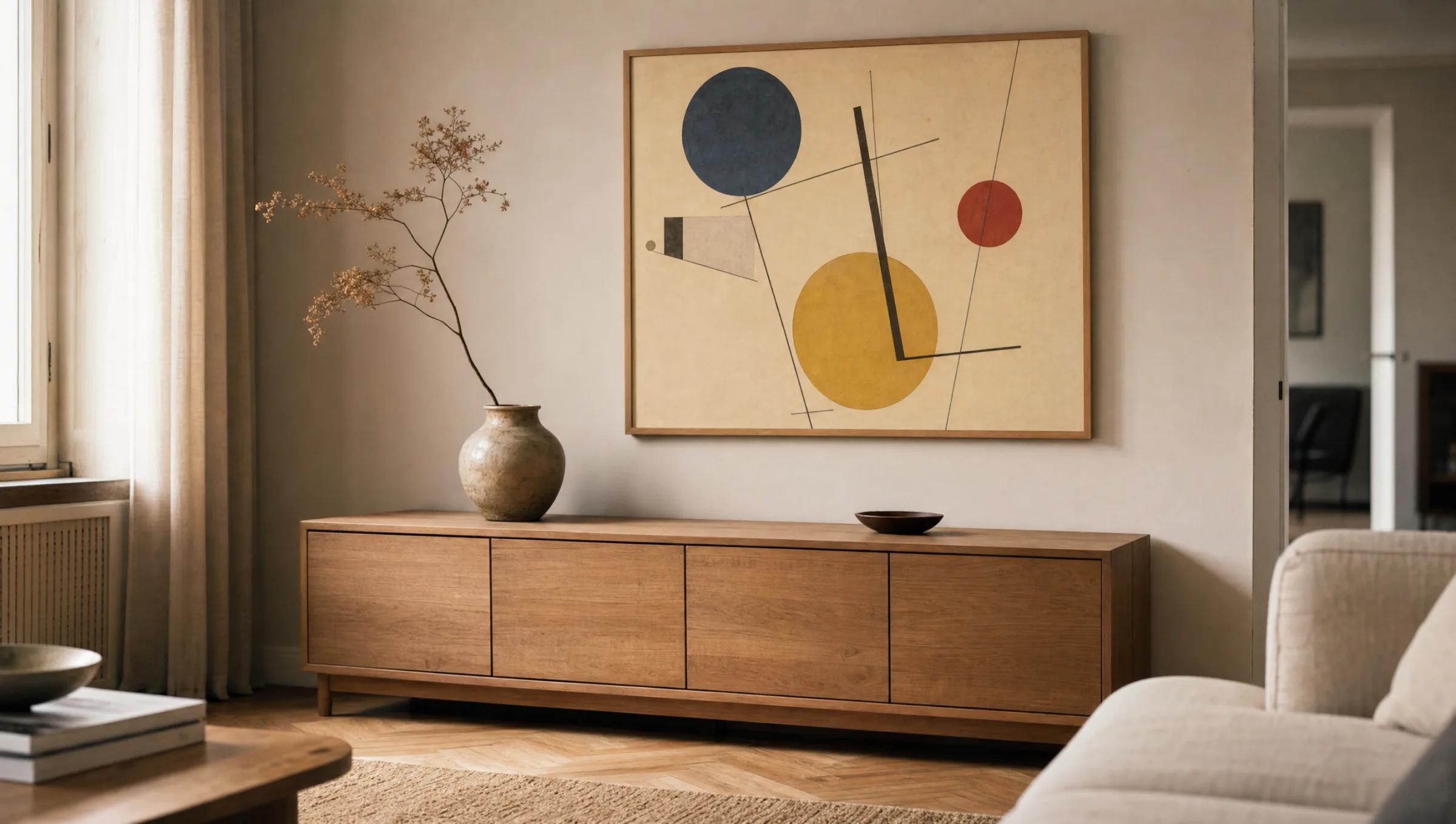
Anyone selecting a print should first consider which phase of Kandinsky's career suits the room: the colour-rich early abstraction or the cooler, geometric Bauhaus period.
Key Work Groups within Kandinsky Abstract Art
Four creative phases help to place the extensive body of work and to choose the right motif for your wall.
Munich Years (1908–1914)
Expressive landscapes and the first non-objective compositions. Bold colour fields, gestural lines, with occasional hints of riders, mountains or churches still visible.
Russian Phase (1915–1921)
A more restrained palette and clearer pictorial order. Constructivist influences emerge, and geometric elements gain weight over gestural painting.
Bauhaus Period (1922–1933)
Strict geometric forms: circles, triangles, lines. Works such as Yellow-Red-Blue and Several Circles are created. The theory Point and Line to Plane is published.
Late Parisian Work (1934–1944)
Biomorphic forms, structures reminiscent of micro-organisms, and a more subdued palette. Compositions feel lighter, more floating and at times ornamental.
Format and Material: Choosing Prints of Kandinsky Abstract Art
Kandinsky's visual language relies on precise colour transitions and clearly placed forms. This places real demands on paper, printing and coating. A matte FSC-certified paper from 200 g/m² gives colour fields depth without reflection, and preserves the characteristic materiality of early lithographs and watercolours.
For large-format compositions such as Composition VIII, XXL posters from 70×100 cm or premium canvases work particularly well, lending the work an almost panel-painting quality. Geometric late works are especially striking on hexagon aluminium wall prints, where the metallic surface reinforces the crispness of the forms.
With smaller formats it is worth grouping prints in sets of three or five. Two works from the Bauhaus phase combined with a quieter late piece create a coherent narrative that makes Kandinsky's development across two decades visible on the wall.
Colour is the keyboard, the eyes are the hammers, the soul is the piano with many strings.
Wassily Kandinsky, Concerning the Spiritual in Art, 1912
Placing Kandinsky Abstract Art in a Room
In a living room, large single motifs above a sofa or sideboard look most composed when a wall gap of around 20 to 30 centimetres is kept between the bottom of the frame and the furniture. The centre of the image should sit at roughly 145 to 150 centimetres from the floor – the average eye level when standing.
In a study or home office, the geometric works of the Bauhaus phase support a focused environment without becoming decoratively overwhelming. In a hallway, smaller formats can be arranged in a series, drawing the eye through the space. In all cases, a restrained wall colour is important; off-white, light greige or warm sand beige allow Kandinsky's colour harmonies to read without interference.
Care and Longevity
High-quality art prints tolerate direct sunlight only to a limited degree. UV radiation can shift colours over the years, particularly reds and yellows. Positioning prints away from direct midday sun, or adding UV-protective glazing or a matte protective coating, extends their lifespan considerably.
Canvases should be dusted occasionally with a dry, soft cloth. Aluminium wall prints can be wiped carefully with a slightly damp cloth. For framed paper works, acid-free mat board is recommended to prevent yellowing over time – a point that is especially relevant for colour-sensitive motifs from classical modernism.
Häufige Fragen
-
01
What characterises Kandinsky abstract art?
Kandinsky abstract art combines basic geometric forms with a musically conceived composition. Circles, triangles and lines become a rhythmic interplay in which colour carries independent meaning. Kandinsky understood colour tones like sounds that together create harmonies or tensions. Also characteristic are floating picture spaces, often free of gravity, and a clear arrangement of foreground, middle ground and background without any figurative narrative.
-
02
Which works are a good starting point?
For a first print, well-known works from the Bauhaus phase are a sound choice – for example Yellow-Red-Blue (1925) or Several Circles (1926). They are restrained enough to work in a variety of rooms and at the same time are tonally characteristic of the period. Those looking for a stronger visual impact can turn to Composition VIII (1923). Early works like Improvisation 28 feel more expressive and suit warm, classically decorated interiors well.
-
03
What format suits Kandinsky abstract art?
As many originals were conceived on a large scale, prints benefit from adequate wall space. XXL posters from 70×100 cm or canvases of comparable size give the compositions room to breathe. For narrow wall sections or gallery walls, smaller formats from 30×40 cm can be grouped in series. Geometric late works are particularly clear on hexagon aluminium wall prints, where the forms correspond naturally with the hexagonal outer contour.
-
04
How do I combine several motifs?
A calm combination results from hanging works from a single creative phase side by side – for example three Bauhaus pieces in similar colour ranges. For more visual tension, mix an expressive early composition with a strict late work. Consistent framing, or a consistently frameless print across all pieces, is important so that the overall effect reads as a curated series rather than having the different visual languages compete with one another.
-
05
Do colours change over time?
Every art print responds to light over the long term. UV radiation causes reds and yellows in particular to fade, which matters given Kandinsky's colour-intense palette. Positioning prints away from direct sunlight, using UV-protective glazing or a matte protective coating all help to keep colour values stable over many years. Consistent room temperature and moderate humidity also extend the lifespan of the print.
-
06
What does Reetro consider when printing classical modernist works?
With subjects such as Kandinsky abstract art, clean colour fields and precise edges are essential. Reetro prints in Germany on FSC-certified papers from 200 g/m² with a matte coating that avoids reflections and preserves colour depth. Canvases are stretched over solid wood frames; hexagon aluminium wall prints are printed directly onto the panel. Every motif is editorially curated and colour-matched to produce a calm, faithful rendition of the original.