Japanese Painting: Styles, Motifs and Wall Art
Japanese painting encompasses a tradition stretching back over a thousand years, in which ink drawing, woodblock printing and refined pigment work merged into a distinct visual language. This overview maps out the key styles, motifs and materials, and explains what to look for when choosing a print for your home.
Historical Roots of Japanese Painting
Japanese painting developed from the 7th century onward in close dialogue with Chinese ink painting and Buddhist imagery. From these influences, distinct schools eventually emerged: Yamato-e, which depicted courtly themes in flat, layered colour, and Kanō, which combined monochrome ink with decorative gold grounds.
The Edo period (1603–1868) gave rise to a popular visual culture in which woodblock prints became affordable and everyday subjects — actors, courtesans, landscapes — reached a wide audience. Artists such as Hokusai and Hiroshige shaped a visual sensibility during this era that continues to define how Japanese painting is understood today.
In the late 19th century this visual language reached Europe and left a lasting mark on Impressionism and Art Nouveau. The exchange — Japonisme on one side, Western perspective on the other — continues to resonate in contemporary art practice.
Key Styles of Japanese Painting at a Glance
Four movements are particularly influential and appear most frequently in today's art prints. They differ markedly in technique, use of colour and compositional approach.
Sumi-e (Ink Painting)
Monochrome painting with black ink on rice paper. Restrained brushwork, generous negative space and a meditative stillness. Common motifs: bamboo, cranes, mountain landscapes.
Ukiyo-e (Woodblock Print)
Multi-colour woodblock printing of the Edo period, characterised by clear outlines and flat areas of colour. Landscapes, waves and genre scenes form the core subject matter — Hokusai's Great Wave is the best-known example.
Nihonga
Classical pigment painting using mineral colours on silk or Washi paper. Fine lines, subtle gold accents and stylised natural motifs define this style, which came into its own in the late 19th century.
Rinpa
A decorative school built on flat gold grounds, stylised plant forms and ornamental compositions. Particularly effective as a quiet, refined focal point when reproduced at large format.
Recurring Motifs in Japanese Painting
Close observation of nature is central: cherry blossoms, maple leaves, waves, mountains, cranes and koi recur across centuries and across styles. These motifs are rarely purely decorative — they carry symbolic weight. The cherry blossom, for instance, stands for transience; the crane for longevity.
Composition also follows its own principles. The concept of Ma describes the deliberate interval or negative space that gives a picture room to breathe. Wabi-Sabi emphasises the beauty of the imperfect and the transient. Both ideas explain why works of japanese painting so often feel calm and composed.
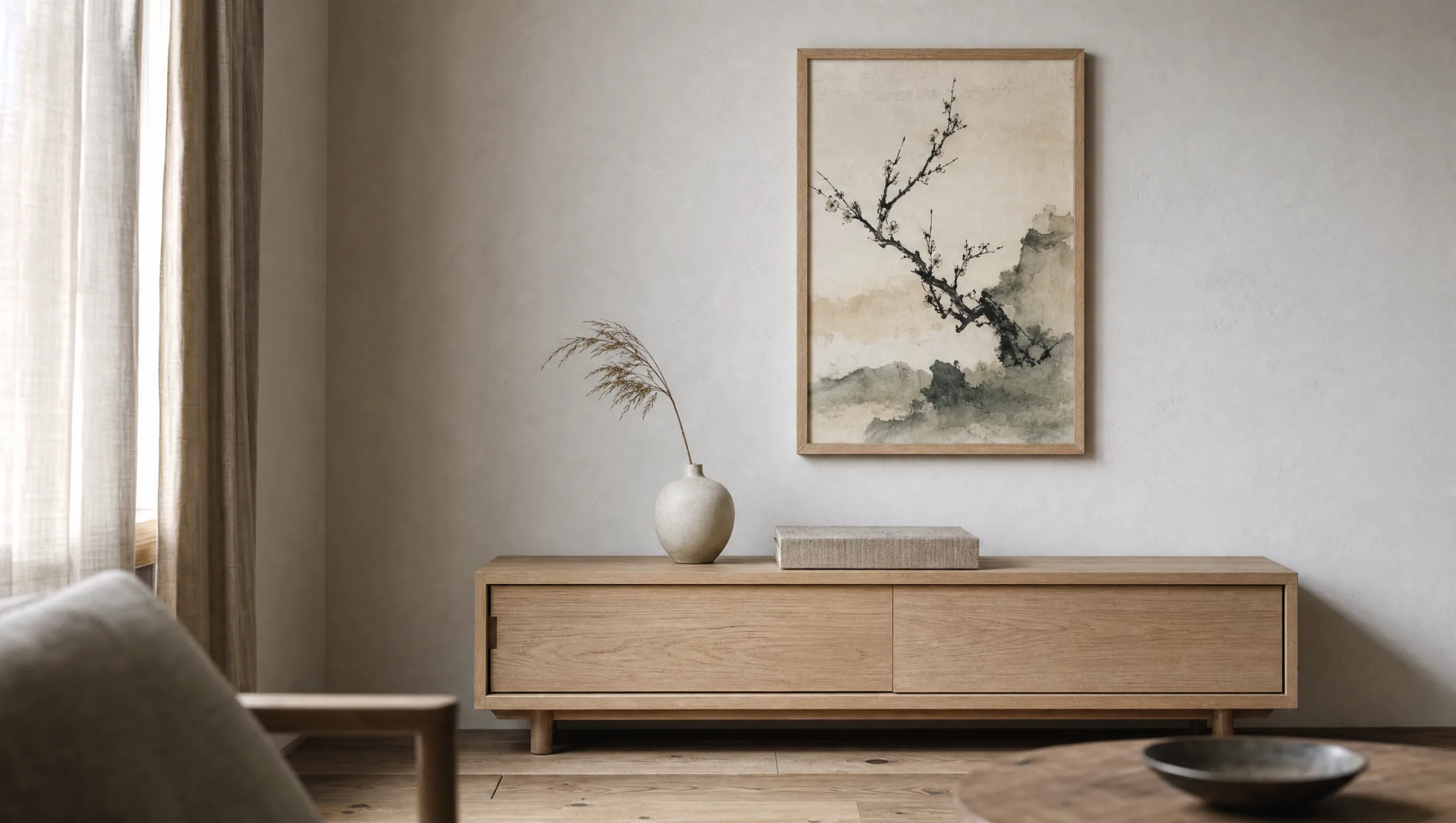
When selecting a print, it is worth considering the motif in relation to the room. A Sumi-e bamboo study reads differently in a study than a colourful Ukiyo-e landscape does in a living room. The visual language carries its own atmosphere, which in turn shapes the character of the space.
The strength of japanese painting lies not in what it shows, but in what it deliberately leaves out — the empty space is part of the image.
From an art-historical introduction to Sumi-e
Japanese Painting as an Art Print at Home
For a print to approach the effect of the original, paper choice and surface finish are decisive. Matte fine-art papers of 200 g/m² or more give ink work the depth it needs without introducing unwanted sheen. For coloured Ukiyo-e reproductions, a lightly textured paper allows the flat colour fields to read as calm and settled.
Format and hanging arrangement should ideally follow the logic of the composition. Vertical hanging-scroll motifs (Kakemono) suit portrait format; landscape prints work in landscape orientation. For grouped arrangements, two or three works sharing a related colour palette — Sumi-e alongside Rinpa, for example — can be combined, provided the framing remains consistent throughout.
Japanese painting reads especially well in pared-back rooms furnished with wood, linen and natural tones. Restrained furniture gives the image the space its composition requires. Made in Germany on FSC-certified papers, Reetro's editions are produced with matte coatings that respect the fine lines and negative space this tradition depends on.
Care and Light Protection
Art prints should not hang in direct sunlight, as UV radiation gradually alters pigments over time. A wall opposite or to the side of a window is usually preferable. For framed works, UV-filtering glass or acrylic is worth considering, particularly for prints with strong colour.
Dust the frame regularly with a dry microfibre cloth. No cleaning product should touch the print itself — fine print surfaces are sensitive to moisture. For canvases, gently removing dust with a soft brush is sufficient.
Häufige Fragen
-
01
How does Japanese painting differ from Chinese ink painting?
Both traditions share tools — brush, ink and rice paper — and a common focus on observing nature. Japanese painting, however, developed its own distinct schools, including Yamato-e, Rinpa and Ukiyo-e, which make greater use of flat compositions, gold grounds and decorative ornament. Chinese ink painting tends to emphasise calligraphic line and spatial depth in landscapes, while Japanese works more often feature deliberate negative space and stylised flatness. The Edo period's woodblock print culture is also particular to Japan, with no direct equivalent in the Chinese tradition.
-
02
Which style of Japanese painting works best in a modern interior?
For minimal, contemporary rooms, Sumi-e is a natural fit. The monochrome ink work, with its generous negative space, pairs well with light walls, wood and natural textiles without ever feeling busy. Rinpa motifs can also work well when a single, quiet accent is the goal — a stylised plant form on a muted gold ground, for example. More colour-saturated Ukiyo-e prints suit rooms with a stronger existing colour tone, or work as a deliberate contrast on an otherwise bare wall.
-
03
What formats suit prints of Japanese painting?
Traditional Japanese picture formats such as the Kakemono (hanging scroll) favour portrait orientation with a slender aspect ratio. Landscapes and many Ukiyo-e compositions work well in landscape format. Large-format prints read best when the motif has a calm, clear-lined composition — waves, mountains or a solitary tree, for instance. For grouped arrangements, combining two or three works in the same format and matching frames helps preserve the quiet character of japanese painting.
-
04
How should I care for framed art prints?
Avoid direct sunlight and high humidity — proximity to a bathroom, for instance, is not ideal. Dust the frame with a dry microfibre cloth and, on the glass, use only a mild, ammonia-free cleaner applied sparingly to the cloth rather than directly to the glass. The print itself should not be touched or cleaned. UV-filtering glass helps keep colours stable over time, and is particularly worthwhile for colour-intensive reproductions.
-
05
What should I look for when buying japanese painting prints?
Printing process, paper quality and colour accuracy are the key factors. High-quality reproductions of japanese painting use pigment-based printing on acid-free paper of at least 200 g/m² with a matte surface, so that ink blacks read as deep and colours remain settled. Reetro prints its editions in Germany on FSC-certified fine-art papers with matte coatings that give fine lines and negative space the presence they require — a detail that makes a genuine difference with this visual tradition.
-
06
Can Japanese painting prints work as a grouped wall arrangement?
Yes, and the results can be particularly coherent when the works are chosen carefully. Two or three prints sharing a related colour palette — for example a Sumi-e ink study alongside a Rinpa botanical — create a quiet dialogue without visual noise. Keeping frames identical or closely matched in material and finish holds the grouping together. The key is restraint: japanese painting compositions rely on space, and a crowded arrangement works against that.