Coral Wall Art: Motifs, Formats and Effect in the Home
A piece of coral wall art combines maritime subject matter with fine structural detail. Whether rendered as a botanical illustration, underwater photography or abstract colour study — coral motifs bring organic lines and warm tones into living spaces. This editorial overview covers styles, formats and hanging approaches.
Motif Guide: What Defines Coral Wall Art
Corals are structures that have grown over millions of years, possessing a high graphic density. In wall art, this complexity is interpreted in a range of ways: as a precisely detailed botanical plate in the style of the 19th century, as a minimalist ink drawing, or as a large-format underwater photograph with soft, diffused light. Each approach emphasises different qualities — line work, colour gradation or spatial depth.
In terms of colour, coral motifs move between warm reds and apricot tones, broken rosé nuances, sandy hues and cool turquoise reflections. A piece of coral wall art therefore rarely reads as purely decorative — it gives a wall its own temperature. In bright, neutral rooms it introduces a quiet accent; in more colourful interiors it takes on a mediating role.
Stylistically, three broad directions can be distinguished: the scientific-illustrative tradition, photographic nature documentation, and free artistic abstraction. Which approach fits depends on the character of the room — precise, atmospheric or graphic.
Styles of Coral Wall Art
Four directions commonly found in contemporary wall art, each bringing a different mood to the room.
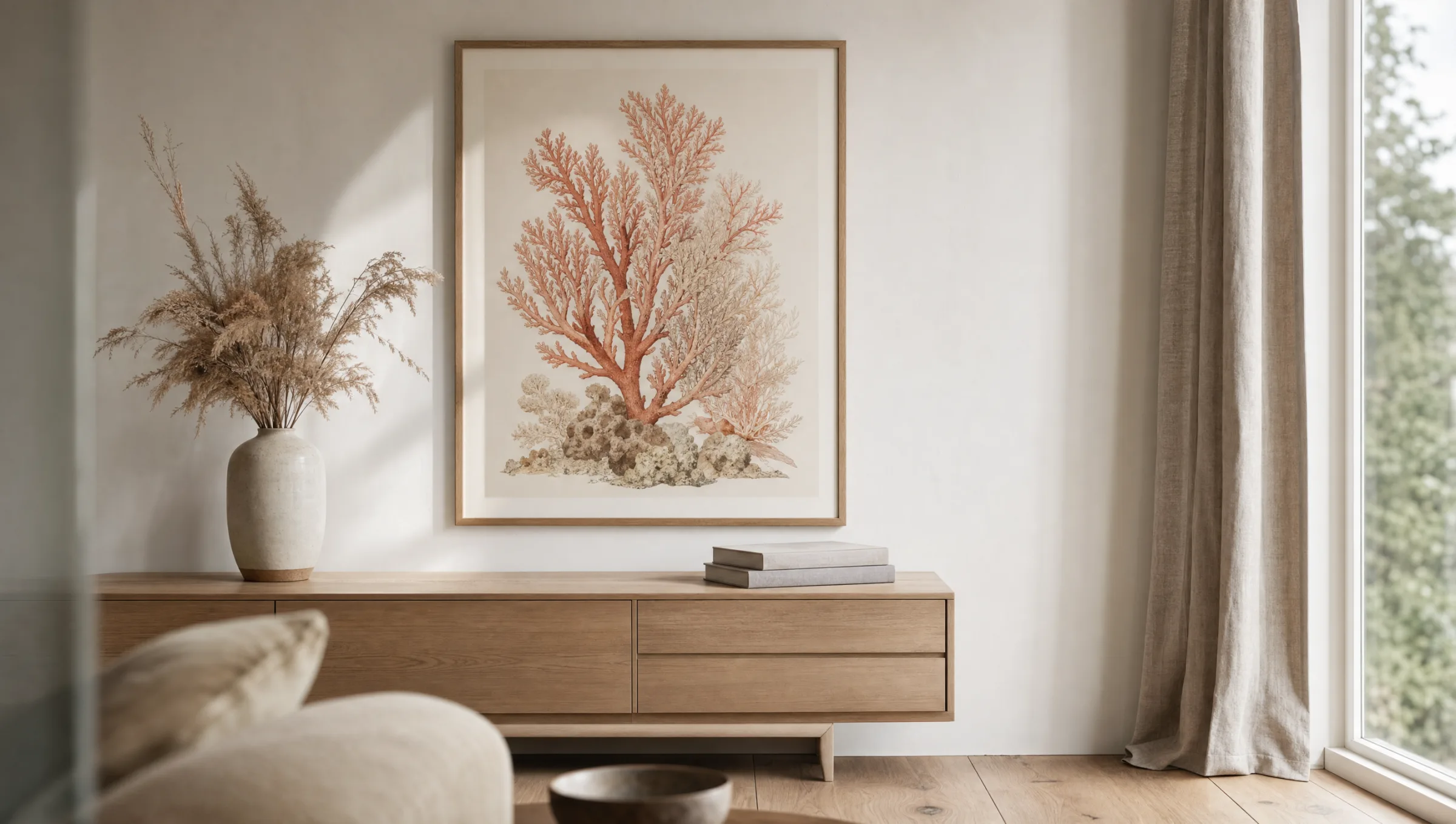
Botanical Illustration
Fine linework, annotated plates and muted watercolour tones. Well suited to studies, libraries and classically furnished rooms.
Underwater Photography
Large-format images with gentle light play and depth of field. Work powerfully as a single statement piece above a sofa or bed.
Abstract Colour Study
Reduced forms and flowing gradients in coral and sand tones. A natural fit for Scandinavian- or Mediterranean-influenced interiors.
Ink and Linocut
Black-and-white or two-tone, with a clear graphic contour. Holds its own next to bookshelves and against textured walls.
Formats and Hanging
The choice of format determines whether a piece of coral wall art reads as a quiet accent or as a room-defining element. Smaller portrait formats from around 30 × 40 cm are well suited to gallery walls and groupings in which several motifs enter into dialogue. Mid-sized landscape formats work above sideboards, consoles or narrow benches.
Large formats from 70 × 100 cm take on the role of a standalone piece. They require open wall space and distance — ideally at least 20 to 30 centimetres from furniture edges. For coral motifs with fine structural detail, an even shorter viewing distance is worthwhile: the intricacy only fully reveals itself up close.
For hanging height, the established rule of thumb is to position the centre of the artwork at roughly 145 to 150 centimetres above the floor. In rooms with high ceilings the centre may sit slightly higher; in dining rooms somewhat lower, since the motif is perceived from a seated position.
Coral motifs serve as a bridge between natural illustration and interior design — they introduce organic form into geometrically structured spaces.
Reetro Editorial
Material and Print for Coral Wall Art
The choice of material significantly influences the overall effect. Matte FSC-certified paper from 200 g/m² upwards emphasises the draughtsmanlike quality of botanical illustrations and avoids distracting reflections. Premium canvas gives photographic coral motifs a restrained texture, removing any glossy character from the picture surface.
Hexagonal aluminium wall panels are particularly suited to abstract colour studies: the clean edge and the slightly raised wall mount allow the motif to appear to float, reinforcing the graphic composition. For underwater images with dark areas, a matte finish is recommended, as it preserves depth without introducing reflections.
Modern prints require little upkeep. A dry microfibre cloth is sufficient for cleaning; direct, prolonged sunlight should be avoided to preserve colour stability over time. At Reetro, all coral wall art is printed in Germany on FSC-certified papers or premium canvas, ensuring long-term colour accuracy and a matte, low-reflection surface.
Häufige Fragen
-
01
Which colours work well with coral wall art?
Coral motifs pair especially well with warm neutrals such as sand, cream, linen and off-white. Muted greens — sage and olive in particular — make for a calm accompaniment. For a more contrasting look, deep teal or navy can work well; these colours reference the maritime origins of the motif without tipping into cliché. Light oak or smoked-walnut wood tones support the organic feel. Bold, saturated colours in the immediate surroundings are best avoided, as they tend to overwhelm the fine structural detail of the coral.
-
02
Which rooms suit coral wall art best?
Coral motifs are more versatile than their purely maritime associations might suggest. In the living room, a single piece above a sofa or sideboard takes on a quiet, central role. In the bedroom, the soft linework above a bed has a calming quality. Bathrooms with adequate ventilation and entrance halls also benefit from the organic form. Less suitable are very damp or steam-heavy rooms without protective glazing, and heavily used kitchen zones with direct exposure to cooking grease.
-
03
What format works best for coral wall art as a standalone piece?
For a single hanging, a format of around 70 × 100 cm is a good starting point; for larger wall surfaces, 100 × 140 cm or more. The key is the relationship to the furniture below: the artwork should occupy roughly two thirds of the width of the sideboard or sofa beneath it to appear proportionate. Portrait formats emphasise the vertical growth structure of many corals, while landscape formats suit reef and underwater compositions with a horizontal arrangement.
-
04
Can coral wall art be combined with other motifs?
Yes — coral motifs integrate well into gallery wall arrangements. Complementary choices include other botanical plates, abstract colour fields in related tones, or understated landscape photography. A consistent approach to frame colour and mount is important so that the group reads as a coherent composition. Three to five prints in varying formats but with a shared visual language tend to feel balanced. Too many competing subject worlds — portraits, animals and architecture mixed together, for instance — weaken the presence of the coral.
-
05
How do I care for coral wall art over the long term?
Coral prints require very little maintenance. A soft, dry microfibre cloth removes dust from the frame and glass or print surface. Damp cleaners and spray products should be avoided as they can damage matte coatings. Direct, sustained sunlight shortens colour stability — a position with indirect daylight is ideal. At Reetro, coral wall art is printed in Germany on FSC-certified papers from 200 g/m² or on premium canvas, supporting long-term colour accuracy and a matte, low-reflection finish.