Cool Wall Art: Motifs, Materials and Hanging with Character
Calling a print cool wall art is a matter of attitude, not volume. It comes down to clear motifs, precise print quality and a hanging arrangement that gives the image room to breathe. This overview covers style directions, formats and materials — and shows how a single print can become a calm, self-assured wall composition.
What Makes Cool Wall Art
Coolness in wall design rarely comes from a single element. It is the result of motif choice, material quality and context. A graphic black-and-white photograph reads differently in a tidy room with warm wood tones than it does in a heavily decorated setting — and it is precisely this interplay that determines whether a print feels considered or arbitrary.
What characterises cool wall art is restraint. Few pictorial elements, a clear composition, a consistent colour language. That applies equally to street photography, abstract painting and typographic posters. Choosing a motif that enters into dialogue with the surrounding interior rather than overpowering it creates a wall with character rather than mere effect.
Print technique also plays a role. Matte surfaces reduce reflections and let depth read more quietly. High-quality papers from 200 g/m² upwards bring solidity and a subtly tactile quality to the image — properties that a cheap discount poster simply cannot replicate.
Style Directions for Cool Wall Art
Four visual worlds that consistently work in modern interiors — as a standalone piece or as building blocks for a curated wall.
Street Photography & Urban
Black-and-white shots from Tokyo, New York or Berlin, often with hard shadows and strong linework. Works especially well in large formats from 70 × 100 cm upwards and in rooms with a calm background.
Graphic & Typographic
Posters with a Risograph feel, Bauhaus-influenced colour planes or reduced letterforms. These motifs bring structure to a room and sit comfortably alongside design classics as well as a purist Scandinavian aesthetic.
Abstract Painting
Generous brushwork, muted colour palettes, sometimes a single accent tone. Well suited to living spaces where a piece should create atmosphere without dictating a specific subject.
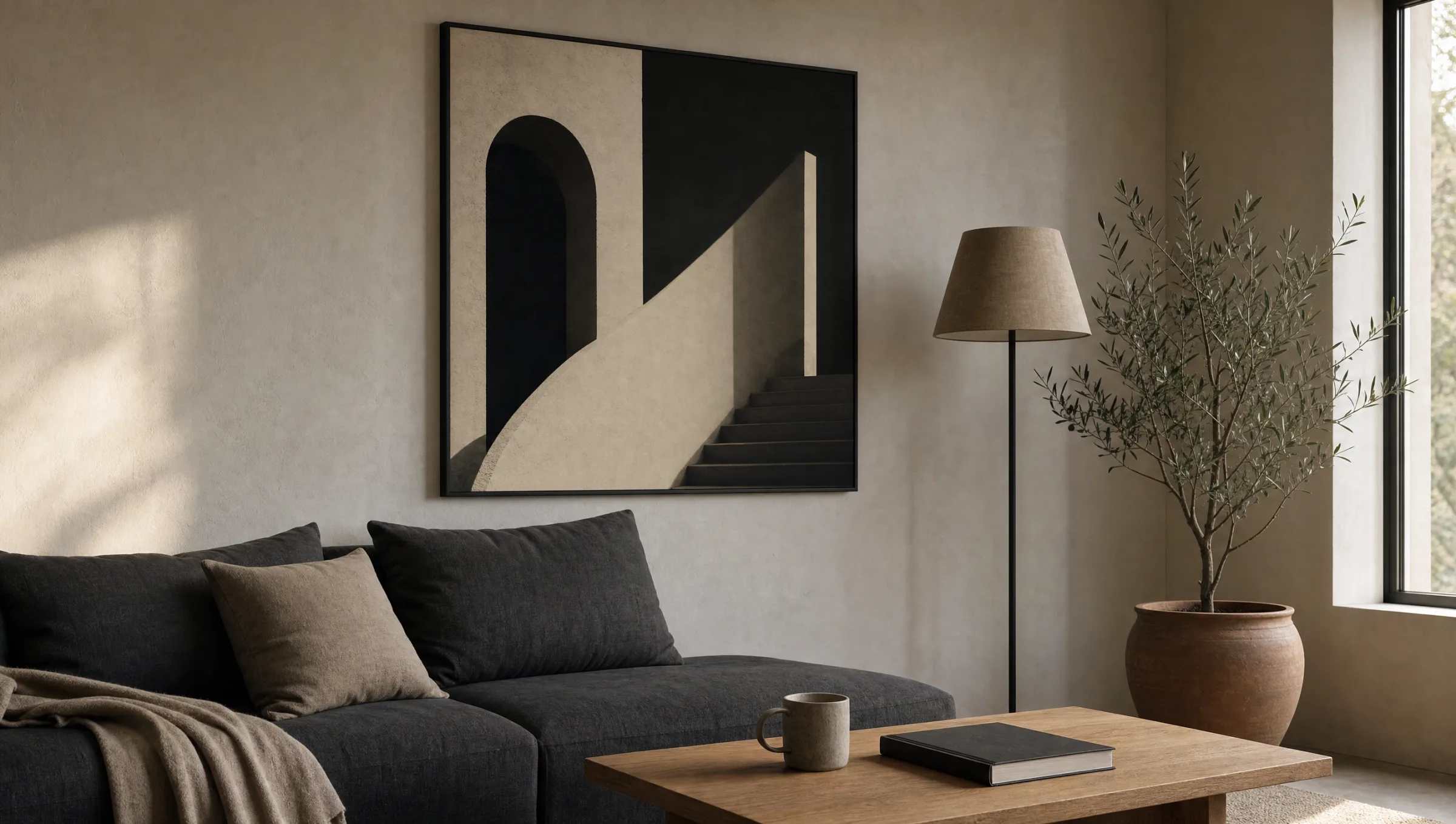
Architecture & Brutalism
Concrete, symmetry, unusual perspectives. Architectural motifs work particularly well on aluminium, as the material further sharpens the clarity of the lines.
Material and Format Choices for Cool Wall Art
The choice of material is more closely tied to the motif than is often assumed. Cool wall art in an urban style suits the hard edge of an aluminium panel or a bleed-to-edge poster better than the textile feel of a canvas. Conversely, an atmospheric painting benefits from the slight texture of canvas, which draws the motif into the room more gently.
On format: one generously sized centrepiece is usually preferable to several smaller distractions. Above a standard 200 cm sofa, a print at 100 × 140 cm or 120 × 80 cm is typically the calmer solution compared to a tightly grouped set of three. In narrow hallways, portrait formats from 50 × 70 cm work well, provided there is enough clearance from door frames and light switches.
Reetro prints its posters on FSC-certified natural paper from 200 g/m² with a matte coating, canvases on 380 g canvas and aluminium wall art on 3 mm Dibond — all made in Germany. These specifications are not incidental: they directly affect sharpness, colour behaviour and the long-term durability of the print.
A cool piece is rarely the loudest thing in the room — it is the one your eye returns to last, because it holds up the longest.
Reetro Editorial
Hanging and Positioning
For a single piece, the centre of the image should sit approximately at eye level for a standing person — roughly 145 to 155 cm from the floor. Above furniture, this shifts: here the hanging is guided by the top edge of the furniture, with a gap of 20 to 30 cm between the back of the sofa and the bottom edge of the print.
For a gallery wall with multiple pieces, it helps to lay out the arrangement on the floor first, or to fix paper templates to the wall. This lets you check whether the composition holds before any holes are drilled. A shared horizontal or vertical axis keeps the group visually coherent, even when individual formats vary.
Lighting is frequently underestimated. A directed wall light or a floor lamp in the room significantly changes how a print reads — matte surfaces respond more softly to raking light than glossy ones, and retain their depth even under lower illumination.
Cool Wall Art in the Context of the Wider Interior
A piece of art is never isolated. It exists in relation to wall colour, furniture heights, textiles and light conditions. Anyone wanting to integrate cool wall art should allow at least one tone from the motif to recur somewhere in the room — through a cushion, a vase or a book spine, for instance. This creates visual continuity without making the room feel thematically rigid.
At the same time, the piece is allowed to keep its own voice. It does not need to defer to the furniture; it can introduce a slight break — a colour that appears nowhere else, a style that does not obviously harmonise with the rest of the room. This controlled tension is what keeps an interior feeling alive and lifts a print beyond the merely decorative.
Häufige Fragen
-
01
What makes something cool wall art in a design sense?
Cool wall art works when motif, format and material align and a clear visual attitude emerges. That might be a reduced black-and-white photograph, a graphic statement with a neon accent, or an unusual perspective drawn from architecture or street photography. What matters less is the subject itself than the consistency of its execution: sharp print quality, a format that suits the space and a wall position that gives the piece room. Coolness in interior design usually means restraint with a point — not loud, but precise.
-
02
Which motifs work best for cool wall art?
Monochrome portraits, architectural photography with strong lines, night skylines, abstract colour planes, Risograph-style lettering and nature motifs with an unusual crop have all proven effective. Typographic works, retro-inflected film stills and reduced illustrations also work well. The key is to think about the motif in relation to the rest of the room: in a calm space, cool wall art can afford to be high-contrast; in an already busy setting, something more restrained is usually the better choice.
-
03
What format suits cool wall art above a sofa?
Above a sofa, a landscape format that spans roughly two thirds of the sofa's width generally works best. Common sizes range from 100 × 70 cm to 150 × 100 cm. Alternatively, two smaller prints can be arranged as a diptych. The bottom edge of the print should hang around 20 to 30 cm above the sofa back, keeping the motif visually connected to the seating without crowding it.
-
04
Canvas, poster or aluminium — which looks the coolest?
It depends on the motif. Street photography and graphic subjects benefit from the hard edge of a matte poster or an aluminium panel. Painterly or atmospheric motifs often feel more coherent on canvas, where the slight texture softens the transition into the room. Aluminium brings a cool, mildly industrial quality that suits contemporary interiors. For cool wall art in the most versatile, understated sense, matte poster paper remains the quietest and most widely combinable choice.
-
05
How do I combine several pieces of cool wall art into a gallery wall?
A shared common thread helps: a consistent colour palette, a uniform frame format or a thematic link such as architecture, music or travel. Three to seven pieces are usually sufficient. Start with the largest motif as an anchor piece and group smaller formats asymmetrically around it. Gaps of 5 to 8 cm between pieces hold the composition together without making it feel crowded.
-
06
How do I care for cool wall art over the long term?
Prolonged direct sunlight should be avoided, as even pigment-stable prints will fade over time. Dust can be removed with a dry microfibre cloth; aluminium panels can also be wiped with a lightly dampened cloth. Reetro prints on FSC-certified paper from 200 g/m² with a matte coating, made in Germany — this reduces reflections and ensures the motif retains its depth for years to come.