Caspar David Friedrich Art Print: Romanticism for Your Wall
A Caspar David Friedrich art print brings the contemplative visual world of German Romanticism into the home: seas of fog, moonlit nights, solitary wanderers. This guide covers the most important motifs, suitable formats, and what to look for in paper, framing and hanging.
Friedrich's Visual World: Romanticism Between Nature and Inner Life
Caspar David Friedrich (1774–1840) is considered the central painter of early German Romanticism. His works were produced mainly in Dresden, but their motifs draw on his journeys through the Riesengebirge, Saxon Switzerland, the Harz mountains and the Baltic coastline around Greifswald and Rügen. Friedrich first recorded these landscapes in meticulous pencil and sepia sketches before composing them in the studio into layered pictorial spaces — landscape as a mirror of inner states.
A defining feature is the so-called Rückenfigur: a human figure seen from behind, gazing into the distance. Rather than narrating a story, this figure invites the viewer to look for themselves. It is precisely this open, meditative quality that keeps a Caspar David Friedrich art print relevant today: the images work not through narrative, but through atmosphere, light and a clear pictorial structure.
Friedrich's colour palette is remarkably restrained. Greys, blues and earth tones dominate, with warm morning or evening light used sparingly as an accent. This reduction makes his work far easier to integrate into contemporary interiors than the stronger palettes of other Romantic painters.
The Most Important Motifs as an Art Print
Four of Friedrich's works are chosen most frequently as reproductions. Each brings a distinct mood to a room — from contemplative to dramatic.
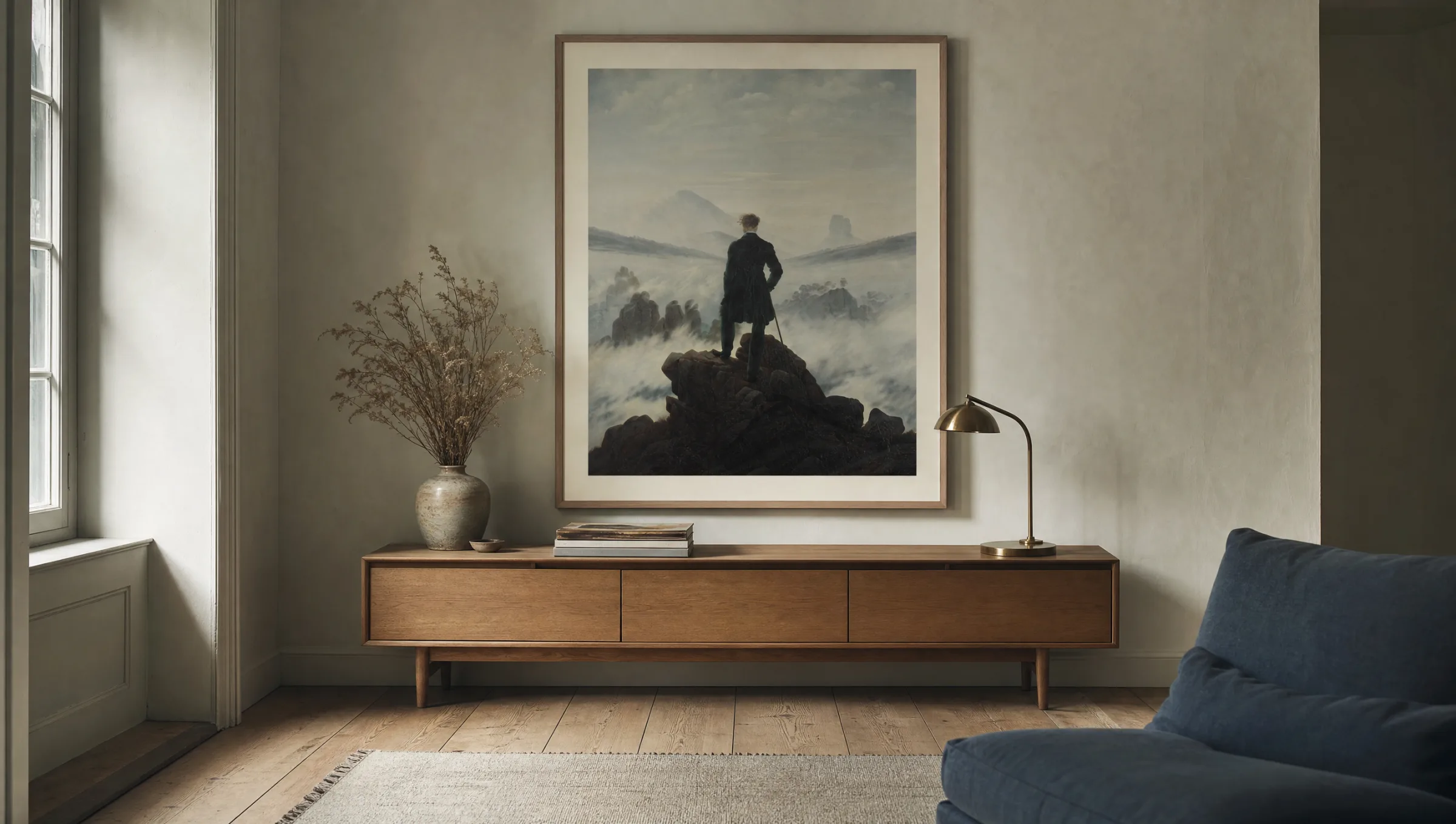
Wanderer Above the Sea of Fog
Friedrich's best-known work, painted around 1818. A rear-facing figure stands on a rocky outcrop gazing into a sea of mist and mountain peaks. As a portrait-format print above a sideboard or desk, its effect is particularly focused and concentrated.
The Sea of Ice
Painted in 1823/24, it shows shards of ice piled over a shattered ship's hull. A landscape-format work with considerable dramatic depth, well suited to longer wall surfaces in a dining room or hallway.
Chalk Cliffs on Rügen
Painted around 1818: three figures on a slope, with bright white cliffs and blue sea beyond. One of the few Friedrich motifs with noticeably lighter colours — it pairs well with sandy and maritime palettes.
Monk by the Sea
A radically reduced composition from 1808–1810: a narrow strip of shore, an expansive sky, one tiny figure. A meditative motif for pared-back interiors with calm wall colours.
Material and Format: What Matters in a Caspar David Friedrich Art Print
Friedrich's tonal values are finely gradated and respond sensitively to paper and printing method. Glossy photo papers overexpose the delicate grey and blue gradients, making the images look harsh. Matte fine art papers from 200 g/m² upwards are recommended, ideally with a slight natural texture. They absorb pigment inks deeply and produce a calm, almost velvety impression that comes closer to the original oil paintings than any high-gloss reproduction.
On format: slightly larger is always better than too small. Friedrich's compositions depend on depth and atmospheric space. Portrait formats such as the Wanderer read well from 50×70 cm, but develop their full presence from 70×100 cm. Landscape formats like The Sea of Ice need at least 70 cm of width to keep the movement of the ice floes legible. XXL variants from 100 cm on the longest side suit gallery walls or generous living spaces with ceiling heights of 2.60 m or more.
Those who prefer an unframed look can opt for a premium canvas — its texture supports the painterly impression. For modern interiors, borderless aluminium wall panels are a restrained alternative that places the motif in the room without any historicising frame.
Friedrich's landscapes tell no story — they open a space in which the viewer finds stillness. That is the source of their continuing relevance.
Reetro Editorial
Framing and Hanging a Caspar David Friedrich Art Print
The frame should not compete with the motif. Narrow wooden mouldings in ash, oak or dark smoked oak support the historical character without tipping into a museum aesthetic. For a more contemporary feel, a slim black aluminium frame works well, or the print can be left unframed altogether. A cream-coloured mount board of 5–7 cm width gives the image additional calm and protects the print surface from direct contact with the glass.
For hanging, eye level is the practical guide: the centre of the image should sit approximately 145–150 cm above the floor. Above a sofa or sideboard, a gap of 20–30 cm between the lower edge of the frame and the top of the furniture is recommended. Direct sunlight should be avoided — Friedrich's fine glazes, even in reproduction, are sensitive to UV radiation. A position facing a window is generally preferable to hanging directly beside one.
For gallery walls, Friedrich's motifs combine well with contemporary black-and-white photography or with botanical studies from the 19th century. A consistent frame family is important so that the different pictorial worlds hold together visually.
Caspar David Friedrich Art Prints in the Reetro Range
Reetro curates Friedrich's motifs from high-resolution museum scans and calibrates the colour profiles individually to the chosen substrate. All prints are made in Germany on FSC-certified fine art papers from 200 g/m², as premium canvas, or as hexagonal or rectangular aluminium wall panels. The matte coating ensures that tonal values remain stable under varying natural light throughout the day.
The selection focuses deliberately on the iconic principal works alongside lesser-known sepia studies that function as quieter companions on the wall. The result is an editorially considered range that gives each Caspar David Friedrich art print the space its contemplative visual language deserves.
Häufige Fragen
-
01
What format works best for a Caspar David Friedrich art print?
Medium to large formats between 50×70 cm and 70×100 cm are recommended for a Caspar David Friedrich art print. Friedrich's compositions depend on the depth of their landscape spaces — seas of fog, rocky coastlines, moonlit nights. Smaller formats quickly lose this atmospheric quality. Portrait formats such as Wanderer Above the Sea of Fog work particularly well above a sofa or sideboard, while landscape formats like The Sea of Ice come into their own in a dining room or hallway. Anyone planning a gallery wall can pair a larger main motif with two smaller studies in a 2:3 ratio.
-
02
Which paper suits Friedrich's Romantic motifs best?
Matte, lightly textured fine art paper from 200 g/m² reproduces the tonal values of Romanticism most authentically. Friedrich worked with fine glazes and subtle grey tones — glossy surfaces would overwhelm these nuances and produce a plastic-like appearance. A matte natural paper with a slight tactile quality absorbs ink deeply and creates that calm, almost velvety impression that comes closest to Friedrich's originals. FSC-certified papers are today's standard and underline the nature-connected character of the motifs.
-
03
Which are Friedrich's most well-known motifs?
The most frequently reproduced works include Wanderer Above the Sea of Fog (c. 1818), The Sea of Ice (1823/24), Monk by the Sea (1808–1810), Chalk Cliffs on Rügen (c. 1818) and Two Men Contemplating the Moon (1819/20). Alongside these, numerous sketches, sepia drawings and smaller landscape studies make compelling art prints that serve as quieter alternatives to the main works. Those bringing Friedrich to their wall for the first time often choose the Wanderer — an iconic motif that holds its own in modern interiors.
-
04
How do I hang a Caspar David Friedrich art print correctly?
A Caspar David Friedrich art print has the most impact when the centre of the image sits at eye level, around 145–150 cm above the floor. Above furniture, a gap of 20–30 cm between the lower edge of the frame and the top of the piece is a useful guide. Indirect daylight is important: Friedrich's tonal values lose depth quickly under direct sunlight, and the paper will yellow over time. In rooms with calm wall colours such as sage, sand or off-white, the motifs develop their contemplative presence most effectively.
-
05
Does Friedrich work in modern interiors?
Yes — in pared-back spaces in particular, Friedrich reads as surprisingly contemporary. His restrained palette of greys, blues and earth tones harmonises with Scandinavian furniture, Japanese wooden elements and mineral wall paints. The contrast between a historical pictorial world and clean modern architecture creates a quietly charged atmosphere. A restrained frame is key: narrow mouldings in ash or oak, or alternatively a borderless foam or aluminium mount for a more modern reading.
-
06
What does Reetro look for when reproducing Friedrich's works?
Every Caspar David Friedrich art print at Reetro starts from high-resolution museum scans, with colour profiles calibrated individually to the chosen paper. Printing takes place in Germany on FSC-certified fine art papers from 200 g/m² using pigment inks rated for long-term colour stability. Before dispatch, each print is checked by hand for tonal deviations and surface imperfections. This process ensures that the meditative character of Romanticism is preserved in the home.