
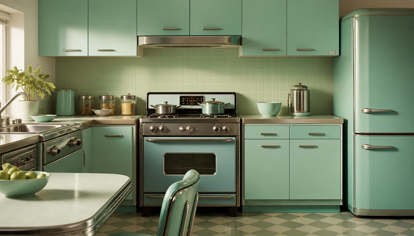
According to the Lazi Akademie, turquoise is considered a cross-culturally positive color that, in color psychology, combines calm, freshness, and clarity, and has been making its way from Turkey to Europe since the 13th century. It’s no coincidence that the kitchens of the 1960s were bathed in turquoise and mint: the color signaled hygiene and cleanliness exactly where it was needed most. Those who wear vintage sneakers from that era today are carrying a piece of that color philosophy on their feet. Turquoise rarely polarizes, yet makes a strong statement — and industrial designers and sneaker makers back then knew that just as well as they do today.
Turquoise and Mint Green in the 1960s Kitchen: What Color Psychology Really Tells Us
Turquoise is a mixed color between blue and green that, in color psychology, stands for freshness, clarity, calm, and relaxation, and is particularly associated with water, wellness, and clean technology. This explains why this color conquered the kitchen in the Sixties specifically: nowhere else did hygiene standards and optimism about the future collide so directly.
The Key Fact: A Color That Never Polarizes
According to the Lazi Akademie, turquoise combines the calm of blue with the freshness of green in color psychology, making it a balancing, harmonious color with no aggressive components. Added to this is a remarkable cultural universality: in ancient Egypt, turquoise served as a protective color; in Navajo culture, the turquoise stone is considered sacred; in Iran and Tibet, it is still used ceremonially today. This makes turquoise one of the few colors that is predominantly perceived positively across cultures.
In the 1960s, that became a selling point. Refrigerators, stoves, and tiles in mint green or turquoise signaled: order reigns here, everything is clean, the future has already arrived.
Practical Implications: What You Can Take Away for Your Home
1. Turquoise Calms Without Boring
Because turquoise carries neither the heaviness of a deep blue nor the intrusiveness of a bold green, it is especially suited to rooms where you want to feel both alert and relaxed at the same time. Kitchens, bathrooms, or home offices all benefit from it. A single statement piece in this color family is often enough to transform the feel of a room.
2. Mint and Turquoise as Retro Signals Still Work Today
The 60s kitchen used mint green deliberately as a signal for modernity. That code is now readable in reverse: anyone using mint or turquoise today is quoting an era when design and everyday culture were still effortlessly optimistic. A retro cushion in a matching style or a decorative cushion in the Bauhaus style can pick up on this look without having to redesign the entire kitchen.
3. The Color Combination with White or Black Determines the Effect
Turquoise on a white background feels hygienic and clear — which gave the kitchens of the 60s their characteristic “fresh” look. Turquoise on a dark background tips toward sci-fi and neon. Anyone wanting to emphasize the futuristic aspect of that decade can play with exactly that: for instance with a sci-fi decorative cushion or a neon cushion as a contrasting accent.
4. Wall Décor as a Color Medium Instead of Wall Paint
Not every rental apartment allows for turquoise walls. Posters and wall art take on that role flexibly. A vintage-style poster featuring turquoise and mint tones, or a Bauhaus poster, brings color psychology into play without committing to permanent color. For something even more iconic: the 60s-style travel poster Australia captures the aesthetic of the era very directly.
You can browse the full range in the reetro shop or go straight to the poster category and cushions.
Sources
FAQ
Why was turquoise so incredibly popular in 1960s kitchens?
In color psychology, turquoise sits exactly between blue and green, combining the calm of blue with the freshness of green. In a kitchen, this worked like a visual promise: clean, clear, modern. The 1960s were also obsessed with technology and visions of the future, and turquoise was already regarded as the color of clean technology and wellness. No wonder refrigerators, tiles, and laminate surfaces rolled out of factories in this shade.
What actually distinguishes turquoise from mint green, and does it make a difference in a kitchen?
Mint is simply a lighter turquoise — closer to white, airier and more delicate. Turquoise itself feels stronger and clearer. In color psychology, both shades are considered balancing and harmonious, with no aggressive components. In practice, in the kitchen this meant: mint green made small rooms look optically larger and brighter, while turquoise was used to set deliberate accents — on the refrigerator or cabinet doors, for example.
Does turquoise really have a historical connection to purity and protection, or is that just a marketing myth?
This is actually very well documented. In ancient Egypt, turquoise was used as a protective color — in scarab amulets and death masks, for example. In the Navajo culture of North America, the turquoise stone is considered sacred; in Iran and Tibet it is still used ceremonially to this day. This cross-culturally positive association makes turquoise one of the few colors that rarely polarizes. The kitchen manufacturers of the 1960s cleverly tapped into that trust, even if they rarely communicated it quite so directly.
Where does the name turquoise actually come from, and what does it have to do with the color?
The name comes from the gemstone of the same name, which reached Europe via Turkey in the 13th century. So the stone gives the color its name, not the other way around. Synonyms such as cyan, aqua, petrol for the darker shade, or mint for the lighter one, show how broad the spectrum of this color family is. In the 1960s, all these variations were freely mixed — often within a single kitchen.
Is the trend for turquoise and mint in the kitchen genuinely vintage, or was it already widespread before the 1960s?
The major breakthrough clearly came with the 1950s and 1960s, when household appliances became mass-market products and color suddenly became a selling point. In terms of color psychology, turquoise was a perfect fit for the zeitgeist: freshness, clarity, and the association with water and relaxation struck a chord with a society that wanted to reinvent the kitchen and home. Earlier kitchens tended to be a functional white. In that sense, turquoise and mint represented a genuine cultural break.
This article was generated automatically by an AI system. Disclosure pursuant to Article 50 of the EU AI Act.